 夜雨聆风
夜雨聆风


UniApp 实现瀑布流自定义多布局(支持图片、图文、视频等)
一个分享 技术 | 生活 | 社会 | 科技 | 经济 | 情感 的前端爱好者!
一、前言
在内容展示类应用中,瀑布流布局因其视觉美观、空间利用率高而被广泛使用。常见的如小红书、抖音、Pinterest 等都采用瀑布流来展示图文或视频内容。
UniApp 作为跨端开发框架,原生不提供瀑布流组件,但通过合理设计,我们可以实现一个高性能、可扩展、支持多类型内容(图片、图文、视频)的自定义瀑布流组件。
本文将带你从零搭建一个灵活的瀑布流组件,并支持动态加载、滚动到底自动请求、不同卡片类型混排等功能。
二、核心思路
1. 双列布局 + 动态分配
- 将内容分为左右两列(也可扩展为多列)
- 每次新数据到来时,将其插入到当前高度较小的那一列
- 使用
scroll-view或页面滚动监听实现懒加载
2. 自定义卡片组件
- 定义通用卡片基类,支持
type: 'image' | 'text-image' | 'video' - 通过
v-if或动态组件<component :is="...">渲染不同类型
3. 性能优化
- 虚拟列表(可选,适用于超长列表)
- 图片懒加载(
lazy-load) - 视频按需加载(进入可视区域再初始化)
三、代码实现
1. 数据结构设计
const dataList = [{ id: 1, type: 'image', url: 'https://xxx.jpg', height: 300 },{ id: 2, type: 'text-image', title: '标题', desc: '描述...', cover: 'https://yyy.jpg', height: 400 },{ id: 3, type: 'video', videoUrl: 'https://zzz.mp4', poster: 'https://poster.jpg', duration: 15, height: 500 }]
注意:每个 item 需要预知高度(可通过后端返回或前端预加载计算),这是瀑布流精准布局的关键。
2. 瀑布流主组件(Waterfall.vue)
<template><viewclass="waterfall-container"><viewclass="columns"><viewclass="column"ref="leftColumn"><card-itemv-for="item in leftList":key="item.id":data="item"/></view><viewclass="column"ref="rightColumn"><card-itemv-for="item in rightList":key="item.id":data="item"/></view></view><!-- 加载更多提示 --><viewv-if="loading"class="loading">加载中...</view><viewv-else-if="noMore"class="no-more">没有更多了</view></view></template><script>import CardItem from './CardItem.vue'export default {components: { CardItem },data() {return {leftList: [],rightList: [],loading: false,noMore: false,page: 1,pageSize: 10}},async onReady() {await this.loadData()},// 页面滚动到底部触发(仅 H5/APP 有效)onReachBottom() {if (!this.loading && !this.noMore) {this.page++this.loadData()}},methods: {// 分配 item 到较短列distributeItem(item) {const leftHeight = this.getColumnHeight('left')const rightHeight = this.getColumnHeight('right')if (leftHeight <= rightHeight) {this.leftList.push(item)} else {this.rightList.push(item)}},getColumnHeight(column) {const ref = column === 'left' ? this.$refs.leftColumn : this.$refs.rightColumnif (!ref || !ref[0]) return 0// 注意:uni-app 中 $refs 获取的是数组return ref[0].$el.offsetHeight || 0},async loadData() {this.loading = truetry {const res = await this.fetchData(this.page, this.pageSize)if (res.length === 0) {this.noMore = truereturn}res.forEach(item => this.distributeItem(item))} catch (e) {console.error('加载失败', e)} finally {this.loading = false}},// 模拟 API 请求fetchData(page, size) {return new Promise(resolve => {setTimeout(() => {const mock = []for (let i = 0; i < size; i++) {const id = (page - 1) * size + i + 1const type = ['image', 'text-image', 'video'][Math.floor(Math.random() * 3)]mock.push({id,type,// 模拟不同高度height: 200 + Math.random() * 300,url: `https://picsum.photos/300/${200 + Math.floor(Math.random() * 300)}`,title: `标题 ${id}`,desc: `这是第 ${id} 条内容的描述信息...`,videoUrl: 'https://example.com/video.mp4',poster: `https://picsum.photos/300/200?random=${id}`})}resolve(mock)}, 800)})}}}</script><stylescoped>.waterfall-container {display: flex;padding: 10rpx;}.columns {display: flex;width: 100%;gap: 20rpx;}.column {flex: 1;display: flex;flex-direction: column;gap: 20rpx;}.loading, .no-more {text-align: center;padding: 30rpx;color: #999;}</style>
3. 卡片组件(CardItem.vue)
<template><viewclass="card":style="{ height: data.height + 'rpx' }"><blockv-if="data.type === 'image'"><image:src="data.url"mode="widthFix"lazy-loadclass="img"/></block><blockv-else-if="data.type === 'text-image'"><image:src="data.cover"mode="widthFix"lazy-loadclass="img"/><viewclass="content"><textclass="title">{{ data.title }}</text><textclass="desc">{{ data.desc }}</text></view></block><blockv-else-if="data.type === 'video'"><video:src="data.videoUrl":poster="data.poster"controlsclass="video"/><viewclass="video-info"><text>{{ data.duration }}s</text></view></block></view></template><script>export default {props: {data: {type: Object,required: true}}}</script><stylescoped>.card {background: #fff;border-radius: 16rpx;overflow: hidden;box-shadow: 0 4rpx 12rpx rgba(0,0,0,0.08);}.img, .video {width: 100%;}.content {padding: 20rpx;}.title {font-size: 28rpx;font-weight: bold;display: block;}.desc {font-size: 24rpx;color: #666;margin-top: 10rpx;display: block;}.video-info {position: absolute;bottom: 20rpx;right: 20rpx;background: rgba(0,0,0,0.5);color: white;padding: 4rpx 12rpx;border-radius: 20rpx;font-size: 20rpx;}</style>
注意:video 组件在小程序中受平台限制较多,建议使用 cover-view 包裹信息。
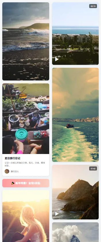
四、效果展示(示意图)
五、进阶优化
1. 高度预计算
onLoad 时用 uni.createSelectorQuery() 动态测量每张图片高度,再分配。recycle-list(App 端)或自定义虚拟列表减少 DOM 节点。onReachBottom。-
微信小程序:使用 wx.createIntersectionObserver监听视频进入视口再播放 -
App 端:可启用 webp、lazyLoad提升性能
通过双列动态分配 + 自定义卡片组件,我们成功在 UniApp 中实现了支持多类型内容的瀑布流布局。
-
核心实现是通过两列布局 + 高度计算 + 动态分配实现瀑布流效果,保证列高均衡。 -
采用动态组件方式实现多布局支持,为图片、图文、视频分别设计独立的子组件和高度计算规则。 -
组件具备自适应能力,通过计算屏幕宽度自动适配不同设备,同时支持懒加载优化性能。
