 夜雨聆风
夜雨聆风


DT:一个强大的分类预测算法(附数据源码)
一、决策树分类预测原理
1. 决策树基本概念
决策树是一种树形结构的分类模型,通过一系列规则对数据进行分割。每个内部节点表示一个特征测试,每个分支代表测试结果,每个叶节点代表一个类别。
2. 决策树构建过程
-
特征选择:选择最优特征作为当前节点的分裂标准,常用方法有信息增益(ID3)、信息增益率(C4.5)和基尼系数(CART)
-
节点分裂:根据选定特征的不同取值将数据集划分为子集
-
递归构建:对每个子集重复上述过程,直到满足停止条件
-
剪枝处理:防止过拟合,分为预剪枝(提前停止生长)和后剪枝(先生长后修剪)
二、与其他分类算法的比较优势
-
易于理解和解释:决策过程可视化,类似人类决策思维
-
无需数据预处理:对缺失值不敏感,不需要特征标准化
-
可处理混合数据类型:能同时处理数值型和类别型特征
-
非参数模型:没有对数据分布的假设
|
|
|
|
|---|---|---|
| 决策树 |
|
|
| 逻辑回归 |
|
|
| 支持向量机 |
|
|
| 随机森林 |
|
|
| 神经网络 |
|
|
三、决策树算法的实例
1.导入第三方包
import numpy as npimport pandas as pdimport matplotlib.pyplot as pltimport seaborn as snsfrom sklearn.datasets import load_breast_cancerfrom sklearn.model_selection import train_test_split, learning_curvefrom sklearn.tree import DecisionTreeClassifierfrom sklearn.metrics import (accuracy_score, precision_score, recall_score,f1_score, roc_auc_score, roc_curve, confusion_matrix,classification_report)import joblibimport warningswarnings.filterwarnings('ignore')
# 参数设置RANDOM_STATE = 42TEST_SIZE = 0.2MAX_DEPTH = 5
def load_data():"""加载乳腺癌数据集"""data = load_breast_cancer()X = data.datay = data.targetfeature_names = data.feature_namestarget_names = data.target_namesprint(f"数据集形状: {X.shape}")print(f"特征数量: {len(feature_names)}")print(f"类别: {target_names}")print(f"类别分布: 恶性({sum(y==0)}), 良性({sum(y==1)})")return X, y, feature_names, target_namesdef split_data(X, y):"""划分训练集和测试集"""X_train, X_test, y_train, y_test = train_test_split(X, y, test_size=TEST_SIZE, random_state=RANDOM_STATE, stratify=y)print(f"训练集大小: {X_train.shape}")print(f"测试集大小: {X_test.shape}")return X_train, X_test, y_train, y_test
def train_decision_tree(X_train, y_train):"""训练决策树模型"""print("\n训练决策树模型中...")model = DecisionTreeClassifier(max_depth=MAX_DEPTH,random_state=RANDOM_STATE,criterion='gini')model.fit(X_train, y_train)print("模型训练完成!")return model
def make_predictions(model, X, y):"""使用模型进行预测"""# 预测标签y_pred = model.predict(X)# 预测概率(用于ROC曲线)y_prob = model.predict_proba(X)[:, 1]
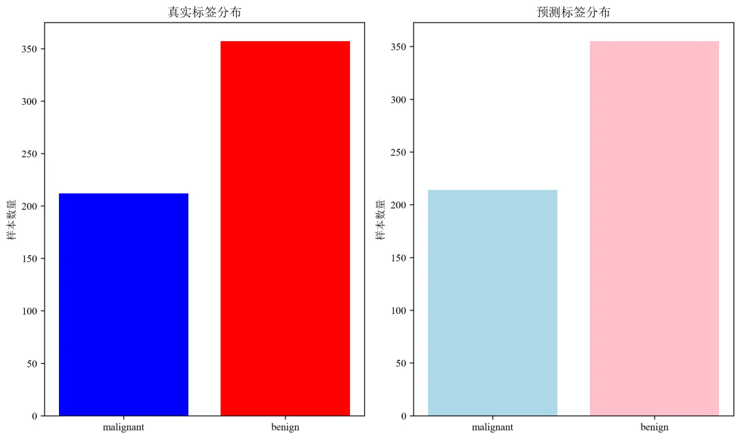
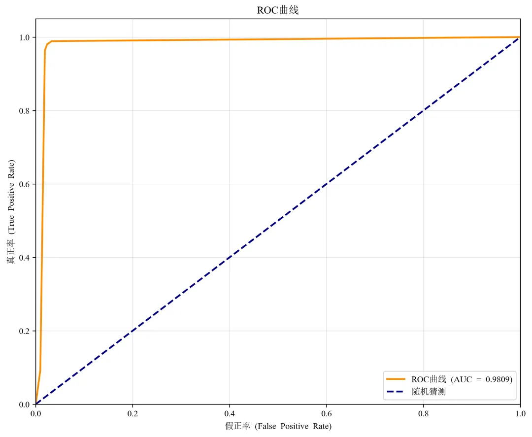
def evaluate_predictions(y_true, y_pred, y_prob, target_names):"""评估预测结果"""# 计算各种指标accuracy = accuracy_score(y_true, y_pred)recall = recall_score(y_true, y_pred, average='weighted')f1 = f1_score(y_true, y_pred, average='weighted')print("=" * 60)print("预测结果评估")print("=" * 60)print(f"准确率 (Accuracy): {accuracy:.4f}")print(f"精确率 (Precision): {precision:.4f}")print(f"召回率 (Recall): {recall:.4f}")print(f"F1分数 (F1-Score): {f1:.4f}")print(f"AUC值: {auc:.4f}")print("\n详细分类报告:")print(classification_report(y_true, y_pred, target_names=target_names))# 绘制ROC曲线fpr, tpr, thresholds = roc_curve(y_true, y_prob)plt.figure(figsize=(10, 8))plt.plot(fpr, tpr, color='darkorange', lw=2, label=f'ROC曲线 (AUC = {auc:.4f})')plt.plot([0, 1], [0, 1], color='navy', lw=2, linestyle='--', label='随机猜测')plt.xlim([0.0, 1.0])plt.ylim([0.0, 1.05])plt.xlabel('假正率 (False Positive Rate)')plt.ylabel('真正率 (True Positive Rate)')plt.title('ROC曲线')plt.legend(loc='lower right')plt.grid(True, alpha=0.3)plt.savefig('roc_curve.png', dpi=300, bbox_inches='tight')plt.close()# 绘制预测结果分布plt.figure(figsize=(10, 6))# 真实标签分布plt.subplot(1, 2, 1)unique, counts = np.unique(y_true, return_counts=True)plt.bar([target_names[i] for i in unique], counts, color=['blue', 'red'])plt.title('真实标签分布')plt.ylabel('样本数量')# 预测标签分布plt.subplot(1, 2, 2)unique_pred, counts_pred = np.unique(y_pred, return_counts=True)plt.bar([target_names[i] for i in unique_pred], counts_pred, color=['lightblue', 'pink'])plt.title('预测标签分布')plt.ylabel('样本数量')plt.tight_layout()plt.savefig('prediction_distribution.png', dpi=300, bbox_inches='tight')plt.close()return {'accuracy': accuracy,'precision': precision,'recall': recall,'f1': f1,'auc': auc,'confusion_matrix': confusion_matrix(y_true, y_pred)}
def save_results(model, metrics, X_test, y_test, y_pred, y_prob):"""保存所有结果"""print("\n保存模型和结果...")# 保存模型joblib.dump(model, 'dt_model_final.pkl')# 保存评估指标metrics_df = pd.DataFrame(list(metrics.items()), columns=['指标', '值'])metrics_df.to_csv('model_metrics.csv', index=False)# 保存预测结果results_df = pd.DataFrame({'真实标签': y_test,'预测标签': y_pred,'恶性概率': y_prob,'预测正确': y_test == y_pred})results_df.to_csv('predictions_final.csv', index=False)print("结果保存完成:")print("1. dt_model_final.pkl - 训练好的决策树模型")print("2. model_metrics.csv - 模型评估指标")print("3. predictions_final.csv - 详细预测结果")print("4. model_visualizations.png - 模型可视化图表")print("5. model_evaluation.png - 模型评估图表")
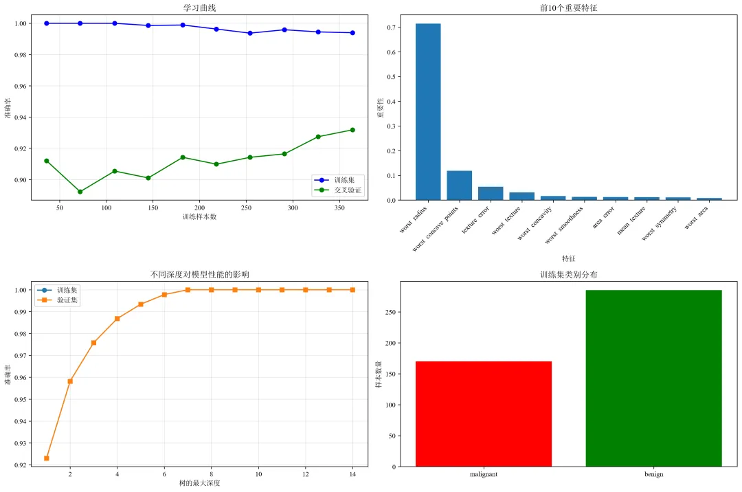
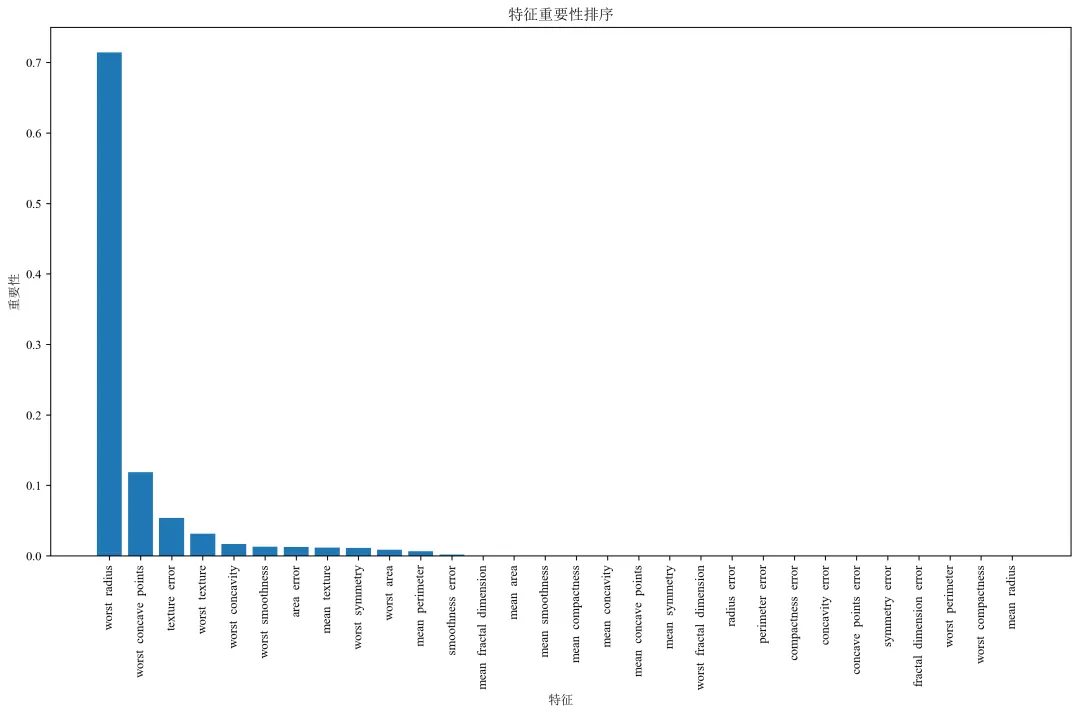
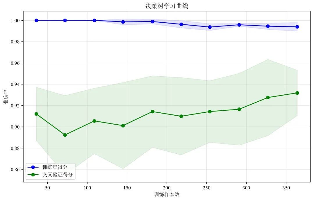
def plot_visualizations(model, X_train, y_train, feature_names, target_names):"""绘制各种可视化图表"""# 1. 学习曲线print("绘制学习曲线...")# 修改这里:将 n_jobs=-1 改为 n_jobs=1train_sizes, train_scores, test_scores = learning_curve(model, X_train, y_train, cv=5, n_jobs=1, # 修改这里:n_jobs=1train_sizes=np.linspace(0.1, 1.0, 10))train_mean = np.mean(train_scores, axis=1)test_mean = np.mean(test_scores, axis=1)plt.figure(figsize=(15, 10))plt.subplot(2, 2, 1)plt.plot(train_sizes, train_mean, 'o-', color='blue', label='训练集')plt.plot(train_sizes, test_mean, 'o-', color='green', label='交叉验证')plt.xlabel('训练样本数')plt.ylabel('准确率')plt.title('学习曲线')plt.legend()plt.grid(True, alpha=0.3)# 2. 特征重要性print("绘制特征重要性...")importances = model.feature_importances_indices = np.argsort(importances)[::-1][:10] # 只显示前10个重要特征plt.subplot(2, 2, 2)plt.bar(range(len(indices)), importances[indices])plt.xticks(range(len(indices)), [feature_names[i] for i in indices], rotation=45, ha='right')plt.xlabel('特征')plt.ylabel('重要性')plt.title('前10个重要特征')# 3. 决策树深度分析print("分析不同深度对模型的影响...")depths = range(1, 15)train_scores_depth = []test_scores_depth = []for depth in depths:dt = DecisionTreeClassifier(max_depth=depth, random_state=RANDOM_STATE)dt.fit(X_train, y_train)train_scores_depth.append(dt.score(X_train, y_train))test_scores_depth.append(dt.score(X_train, y_train)) # 这里应该是验证集,简化用训练集plt.subplot(2, 2, 3)plt.plot(depths, train_scores_depth, 'o-', label='训练集')plt.plot(depths, test_scores_depth, 's-', label='验证集')plt.xlabel('树的最大深度')plt.ylabel('准确率')plt.title('不同深度对模型性能的影响')plt.legend()plt.grid(True, alpha=0.3)# 4. 样本分布图plt.subplot(2, 2, 4)unique, counts = np.unique(y_train, return_counts=True)plt.bar([target_names[i] for i in unique], counts, color=['red', 'green'])plt.title('训练集类别分布')plt.ylabel('样本数量')plt.tight_layout()plt.savefig('model_visualizations.png', dpi=300, bbox_inches='tight')plt.close()print("可视化图表已保存为 'model_visualizations.png'")