 夜雨聆风
夜雨聆风


简单的爱心跳动表白网页(附源码)
一、准备工作
在开始之前,确保已经具备基础的 HTML、CSS 和 JavaScript 知识。同时,也要准备好一个代码编辑器,比如 VS Code 或 Sublime Text。接下来,我们需要创建三个文件:index.html、styles.css 和 script.js。
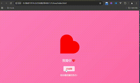
具体实现效果如下
二:构建 HTML 结构
接下来,我们来编写网页的基本结构。在 index.html 文件中,添加以下代码:
<!DOCTYPE html>
<html lang=”zh-CN”>
<head>
<meta charset=”UTF-8″>
<meta name=”viewport” content=”width=device-width, initial-scale=1.0″>
<link rel=”stylesheet” href=”styles.css”>
<title>表白网页</title>
</head>
<body>
<div class=”container”>
<div class=”heart”></div>
<div class=”message”>我爱你❤️</div>
<button class=”love-button”>点击我</button>
<div class=”footer”>
<p>给你最甜蜜的告白~</p>
</div>
</div>
<script src=”script.js”></script>
</body>
</html>
在这里,我们创建了一个容器 <div class=”container”>,其中包括一个表示心形的 <div class=”heart”>、一条简短的表白信息,以及一个按钮来增加用户的互动。最后,我们还添加了一个脚注,给人一种甜蜜的结束感。
三:设计 CSS
接下去,我们来为我们的网页设计美观的样式。打开 styles.css 文件,加入以下样式:
body {
display: flex;
justify-content: center;
align-items: center;
height: 100vh;
margin: 0;
background: linear-gradient(135deg, #ff7eb9, #ff65a3);
font-family: ‘Arial’, sans-serif;
}
.container {
text-align: center;
}
.heart {
position: relative;
width: 100px;
height: 100px;
background: red;
transform: rotate(-45deg);
animation: jump 0.5s infinite alternate;
}
.heart::before,
.heart::after {
content: ”;
position: absolute;
width: 100px;
height: 100px;
background: red;
border-radius: 50%;
}
.heart::before {
top: -50px;
left: 0;
}
.heart::after {
left: 50px;
top: 0;
}
@keyframes jump {
0% { transform: translateY(0); }
100% { transform: translateY(-20px); }
}
.message {
margin-top: 20px;
font-size: 24px;
color: white;
animation: fadeIn 2s ease-in-out;
}
@keyframes fadeIn {
from { opacity: 0; }
to { opacity: 1; }
}
.love-button {
margin-top: 30px;
padding: 10px 20px;
font-size: 16px;
background-color: white;
color: red;
border: none;
border-radius: 5px;
cursor: pointer;
transition: background-color 0.3s;
}
.love-button:hover {
background-color: rgba(255, 255, 255, 0.8);
}
.footer {
margin-top: 20px;
font-size: 16px;
color: white;
}
在这段 CSS 代码中,我们设置了一个粉色渐变背景,并通过关键帧动画使爱心跳动。表白信息通过淡入效果展示,增加了一份浪漫气息。同时,我们还为按钮增加了鼠标悬停效果,使其在用户体验上更加友好。
四:增加交互的 JavaScript
为了让网页更生动一些,我们可以在 script.js 中添加一些简单的交互特效。以下代码将实现点击按钮时,同样弹出一个甜蜜的提示框:
document.querySelector(‘.heart’).addEventListener(‘click’, function() {
alert(‘永远爱你!’);
});
document.querySelector(‘.love-button’).addEventListener(‘click’, function() {
alert(‘你的爱我永远不放弃!’);
});
当用户点击爱心或按钮时,都会弹出一个提示框,进一步表达你的爱意。借助这些简单的 JavaScript 代码,网页将变得更加生动。
