 夜雨聆风
夜雨聆风


CSS3立体感3D卡片人物样式!!附源码!!

效果展示
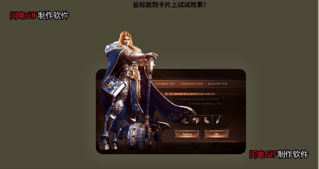

完整源码

<!DOCTYPE html><htmllang="zh"><head><metacharset="UTF-8"><metahttp-equiv="X-UA-Compatible"content="IE=edge,chrome=1"><metaname="viewport"content="width=device-width, initial-scale=1.0"><title>CSS3立体感3D卡片人物样式</title><linkrel="stylesheet"type="text/css"href="css/normalize.css" /><!--CSS RESET--><linkrel="stylesheet"href="css/main.css"></head><body><divclass="container"><h3style="text-align: center">鼠标放到卡片上试试效果!</h3><divclass="wrap"><divclass="card"><divclass="rolebg"><imgsrc="img/bg.jpg"alt=""></div><divclass="role"><imgsrc="img/role.png"alt=""></div><divclass="content"><h1>NO DAMAGE TO ELIMINATE 200 GOBLINE</h1><p>PlayStation 4 -Xbox</p></div></div></div></div></body></html>

* {margin: 0;padding: 0;box-sizing: border-box;}body {background: #4c4937;}.wrap {width: 100%;height: 600PX;display: flex;justify-content: center;align-items: center;}.card {position: relative;width: 440px;height: 250px;}.rolebg {width: 440px;height: 250px;border-radius: 20px;overflow: hidden;box-shadow: 0 0 30px 20px rgba(255,255,255,0.05);transform-origin: bottom;transition: 2s;}.rolebg img {width: 100%;height: 100%;object-fit: cover;}.role {position: absolute;bottom: 0;width: 300px;height: 370px;transform-origin: bottom;transition: 2s;}.role img {width: 100%;height: 100%;}.content {position: absolute;bottom: -50px;width: 440px;padding: 10px;color: #fff;opacity: 0;transition: 2s;}.content h1 {font-weight: 200;}.content p {padding-top: 10px;font-weight: 200;font-size: 14px;}.card:hover .rolebg {transform: perspective(1000px) rotateX(30deg) skewX(-20deg);}.card:hover .role {transform: scale(1.2);}.card:hover .content {opacity: 1;transform: translateY(90px);}

article,aside,details,figcaption,figure,footer,header,hgroup,main,nav,section,summary{display:block;}audio,canvas,video{display:inline-block;}audio:not([controls]){display:none;height:0;}[hidden]{display:none;}html{font-family:sans-serif;-ms-text-size-adjust:100%;-webkit-text-size-adjust:100%;}body{margin:0;}a:focus{outline:thin dotted;}a:active,a:hover{outline:0;}h1{font-size:2em;margin:0.67em 0;}abbr[title]{border-bottom:1px dotted;}b,strong{font-weight:bold;}dfn{font-style:italic;}hr{-moz-box-sizing:content-box;box-sizing:content-box;height:0;}mark{background:#ff0;color:#000;}code,kbd,pre,samp{font-family:monospace,serif;font-size:1em;}pre{white-space:pre-wrap;}q{quotes:"\201C" "\201D" "\2018" "\2019";}small{font-size:80%;}sub,sup{font-size:75%;line-height:0;position:relative;vertical-align:baseline;}sup{top:-0.5em;}sub{bottom:-0.25em;}img{border:0;}svg:not(:root){overflow:hidden;}figure{margin:0;}fieldset{border:1px solid #c0c0c0;margin:0 2px;padding:0.35em 0.625em 0.75em;}legend{border:0;padding:0;}button,input,select,textarea{font-family:inherit;font-size:100%;margin:0;}button,input{line-height:normal;}button,select{text-transform:none;}button,html input[type="button"],input[type="reset"],input[type="submit"]{-webkit-appearance:button;cursor:pointer;}button[disabled],html input[disabled]{cursor:default;}input[type="checkbox"],input[type="radio"]{box-sizing:border-box;padding:0;}input[type="search"]{-webkit-appearance:textfield;-moz-box-sizing:content-box;-webkit-box-sizing:content-box;box-sizing:content-box;}input[type="search"]::-webkit-search-cancel-button,input[type="search"]::-webkit-search-decoration{-webkit-appearance:none;}button::-moz-focus-inner,input::-moz-focus-inner{border:0;padding:0;}textarea{overflow:auto;vertical-align:top;}table{border-collapse:collapse;border-spacing:0;}
