 夜雨聆风
夜雨聆风


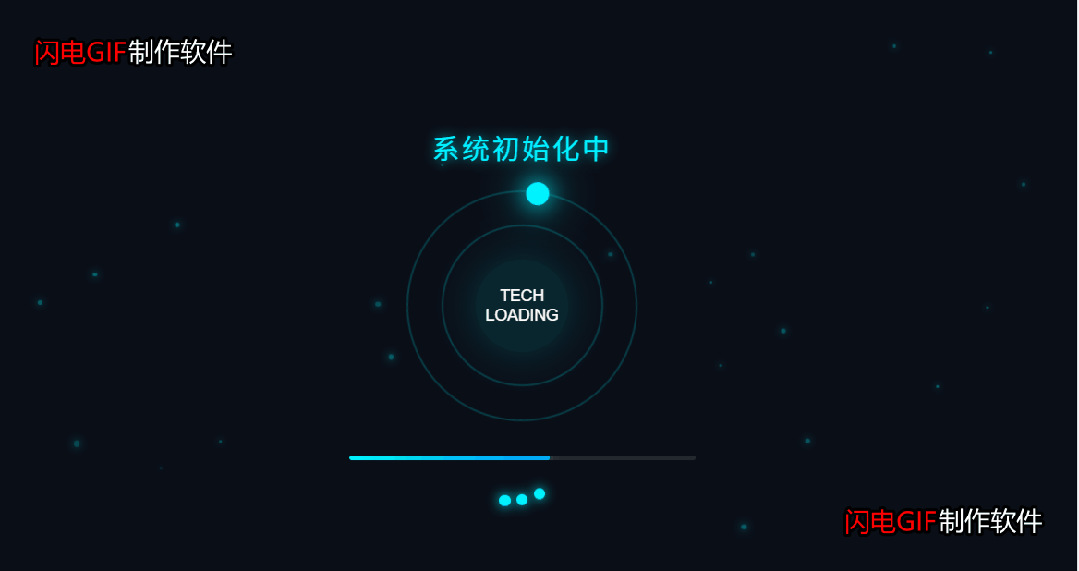
科技感加载loading效果!!附源码!!

效果展示

完整源码

<!DOCTYPE html><htmllang="zh-CN"><head><metacharset="UTF-8"><metaname="viewport"content="width=device-width, initial-scale=1.0"><title>科技感Loading页面</title><linkhref="css/css.css"rel="stylesheet" /></head><body><divclass="particles"id="particles"></div><divclass="container"><divclass="text">系统初始化中</div><divclass="loader"><divclass="orb"></div><divclass="inner-orb"></div><divclass="core">TECH LOADING</div></div><divclass="progress"><divclass="progress-bar"></div></div><divclass="dots"><divclass="dot"></div><divclass="dot"></div><divclass="dot"></div></div></div><scriptsrc="js/js.js"></script></body></html>

* {margin: 0;padding: 0;box-sizing: border-box;}body {background: #0a0e17;color: #00f3ff;font-family: 'Arial', sans-serif;min-height: 100vh;display: flex;justify-content: center;align-items: center;overflow: hidden;position: relative;}.container {text-align: center;z-index: 10;position: relative;}.loader {position: relative;width: 200px;height: 200px;margin: 0 auto 30px;}.orb {position: absolute;top: 0;left: 0;width: 100%;height: 100%;border-radius: 50%;border: 2px solid rgba(0, 243, 255, 0.2);animation: rotate 3s linear infinite;}.orb::before {content: '';position: absolute;top: -10px;left: 50%;transform: translateX(-50%);width: 20px;height: 20px;background: #00f3ff;border-radius: 50%;box-shadow: 0 0 20px #00f3ff, 0 0 40px #00f3ff;}.inner-orb {position: absolute;top: 30px;left: 30px;right: 30px;bottom: 30px;border-radius: 50%;border: 2px solid rgba(0, 243, 255, 0.2);animation: rotateReverse 2.5s linear infinite;}.core {position: absolute;top: 60px;left: 60px;right: 60px;bottom: 60px;border-radius: 50%;background: rgba(0, 243, 255, 0.1);box-shadow: 0 0 40px rgba(0, 243, 255, 0.2);animation: pulse 2s ease-in-out infinite alternate;display: flex;justify-content: center;align-items: center;color: #fff;font-size: 14px;}.progress {width: 300px;height: 4px;background: rgba(255, 255, 255, 0.1);border-radius: 4px;margin: 30px auto;overflow: hidden;}.progress-bar {height: 100%;width: 0%;background: linear-gradient(90deg, #00f3ff, #0099ff);box-shadow: 0 0 10px rgba(0, 243, 255, 0.6);animation: loading 5s ease-in-out infinite;border-radius: 4px;}.text {font-size: 24px;letter-spacing: 2px;margin-bottom: 20px;text-shadow: 0 0 10px rgba(0, 243, 255, 0.7);}.dots {display: flex;justify-content: center;gap: 5px;}.dot {width: 10px;height: 10px;background: #00f3ff;border-radius: 50%;box-shadow: 0 0 10px #00f3ff;animation: bounce 1.5s infinite ease-in-out;}.dot:nth-child(2) {animation-delay: 0.2s;}.dot:nth-child(3) {animation-delay: 0.4s;}.particles {position: absolute;top: 0;left: 0;width: 100%;height: 100%;z-index: 1;}@keyframes rotate {0% {transform: rotate(0deg);}100% {transform: rotate(360deg);}}@keyframes rotateReverse {0% {transform: rotate(0deg);}100% {transform: rotate(-360deg);}}@keyframes pulse {0% {box-shadow: 0 0 40px rgba(0, 243, 255, 0.2);transform: scale(1);}100% {box-shadow: 0 0 60px rgba(0, 243, 255, 0.4);transform: scale(1.05);}}@keyframes loading {0% {width: 0%;}70% {width: 90%;}100% {width: 100%;}}@keyframes bounce {0%, 100% {transform: translateY(0);}50% {transform: translateY(-15px);}}/* 响应式设计 */@media (max-width: 768px) {.loader {width: 150px;height: 150px;}.inner-orb {top: 20px;left: 20px;right: 20px;bottom: 20px;}.core {top: 40px;left: 40px;right: 40px;bottom: 40px;font-size: 12px;}.text {font-size: 20px;}.progress {width: 250px;}}@media (max-width: 480px) {.loader {width: 120px;height: 120px;}.inner-orb {top: 15px;left: 15px;right: 15px;bottom: 15px;}.core {top: 30px;left: 30px;right: 30px;bottom: 30px;font-size: 10px;}.text {font-size: 18px;}.progress {width: 200px;}}

// 创建粒子效果document.addEventListener('DOMContentLoaded', function() {const container = document.getElementById('particles');const particleCount = 50;for (let i = 0; i < particleCount; i++) {createParticle(container);}function createParticle(container) {const particle = document.createElement('div');particle.style.position = 'absolute';particle.style.width = Math.random() * 3 + 2 + 'px';particle.style.height = particle.style.width;particle.style.background = '#00f3ff';particle.style.boxShadow = '0 0 5px #00f3ff, 0 0 10px #00f3ff';particle.style.borderRadius = '50%';// 随机位置const posX = Math.random() * 100;const posY = Math.random() * 100;particle.style.left = posX + 'vw';particle.style.top = posY + 'vh';// 动画const duration = Math.random() * 10 + 5;particle.style.animation = `float ${duration}s linear infinite`;const keyframes = `@keyframes float {0% {transform: translate(0, 0);opacity: ${Math.random() * 0.5 + 0.2};}100% {transform: translate(${Math.random() * 100 - 50}px, ${Math.random() * 100 - 50}px);opacity: ${Math.random() * 0.5 + 0.2};}}`;const styleSheet = document.createElement('style');styleSheet.textContent = keyframes;document.head.appendChild(styleSheet);container.appendChild(particle);}});
