 夜雨聆风
夜雨聆风


论文绘图神器:集成训练/测试集分布的高级部分依赖图(PDP)绘制指南
!
参考文章
📜 论文标题:Soil heterogeneity shapes the responses of soybean yields to changing climates in China
📆 发表时间:2026 年
🔗 DOI:https://doi.org/10.1016/j.eja.2026.128053
-
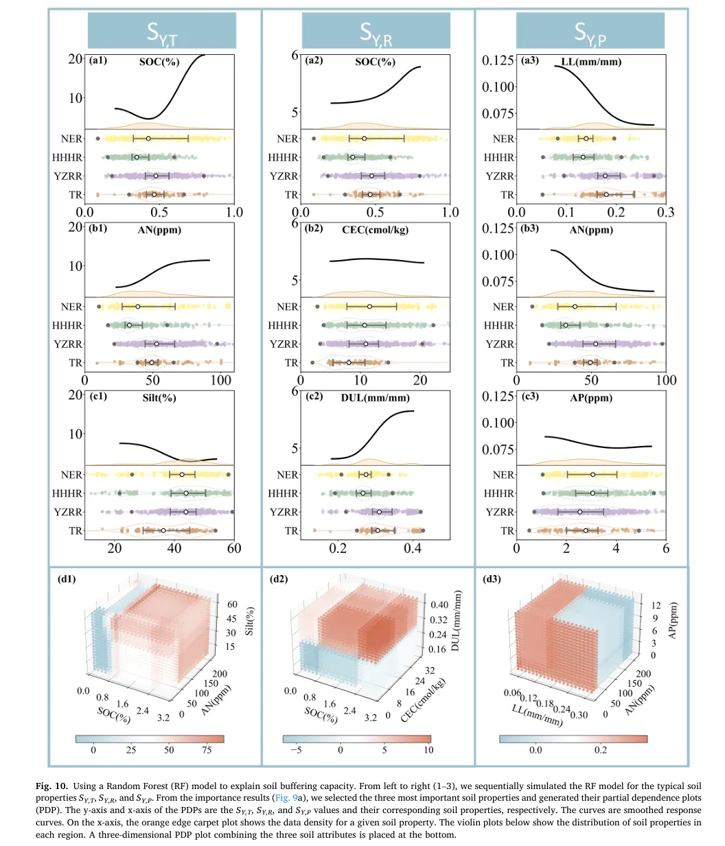
1. “上下联动”的一维可视化结构
-
– 上方(Partial Dependence Plot): 传统的 PDP 曲线往往是孤独的,读者不知道曲线背后的样本支撑有多少。该设计在曲线下方巧妙地融合了一个 橙色的密度分布带(Density Plot) 。这就像给曲线加了一个“置信度背景板”——波峰高的地方,说明样本多,曲线走势可信;波谷低的地方,样本稀疏,曲线可能存在偏差。
-
– 下方(Raincloud Plot 变体):多层级分布展示区 。它没有简单地堆叠直方图,而是采用 小提琴图(Violin Plot) + 箱线图(Box Plot) + 抖动散点(Jittered Scatter) 的组合。
-
– 作用: 这种设计实现了 训练集(Train)与测试集(Test)分布的直接对齐 。通过颜色区分(如黄色代表训练集,绿色/紫色代表测试集),一眼就能看出数据是否存在 协变量偏移(Covariate Shift) 。如果训练集和测试集的分布错位,那么模型在该特征上的预测能力就需要打问号。这种“模型+数据”的双重验证,是传统 PDP 图无法比拟的。
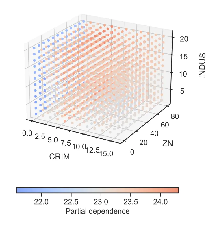
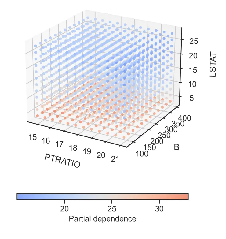
2. “立体感知”的三维PDP交互空间
-
– 创意点:三特征交互的直观切片
-
– 空间映射: 传统的 PDP 只能看一个或两个特征。该设计通过 3D 散点图,一次性将 三个重要特征 映射到 X、Y、Z 轴,构建立体特征空间。
-
– 色彩编码: 利用颜色的冷暖变化(如蓝-红渐变)来表示模型预测值(Partial Dependence)的高低。这种视觉编码让读者能直观感受到:在三维空间的哪个角落,模型的响应值最高(红色聚集区),哪个角落最低(蓝色聚集区)。
-
– 点阵密度: 散点的疏密程度也隐式地反映了该区域特征组合的常见程度。
-
– 作用: 它突破了二维平面的限制,能够揭示 高阶交互作用(High-order Interaction)
01
!
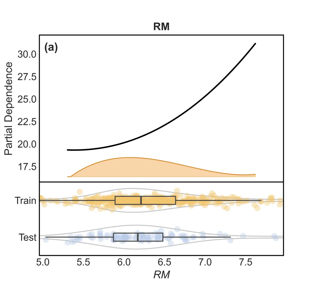
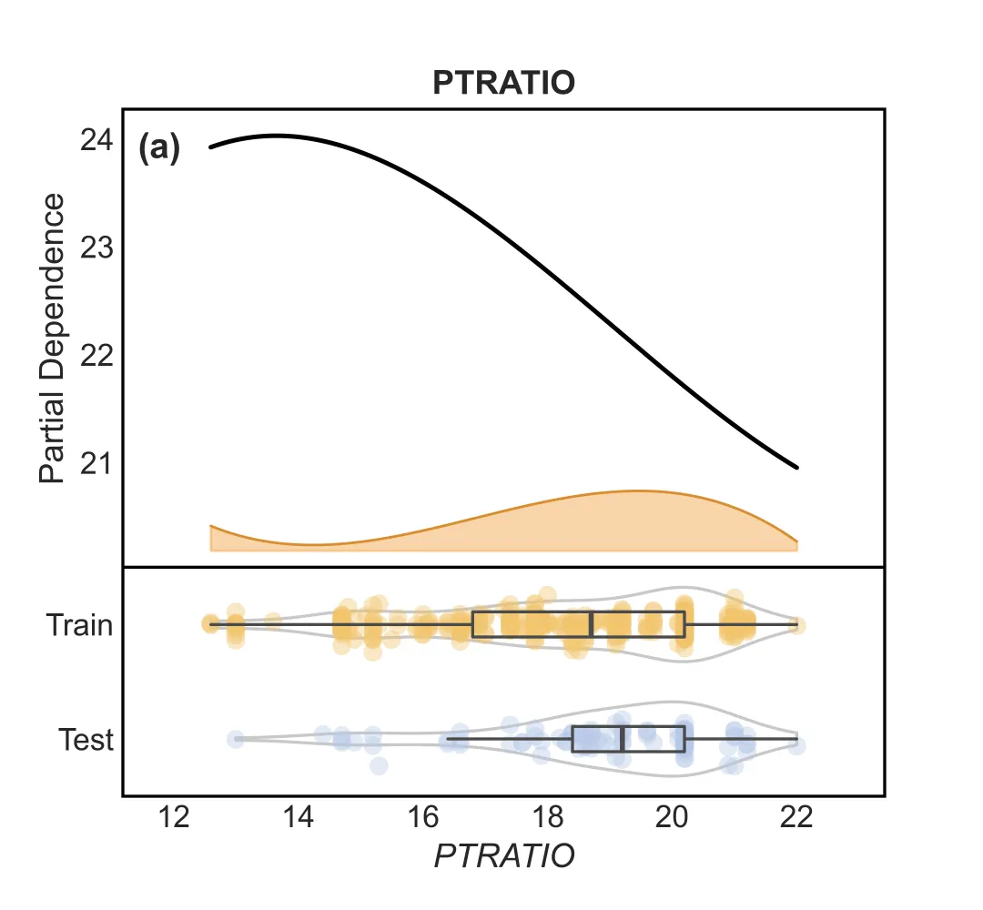
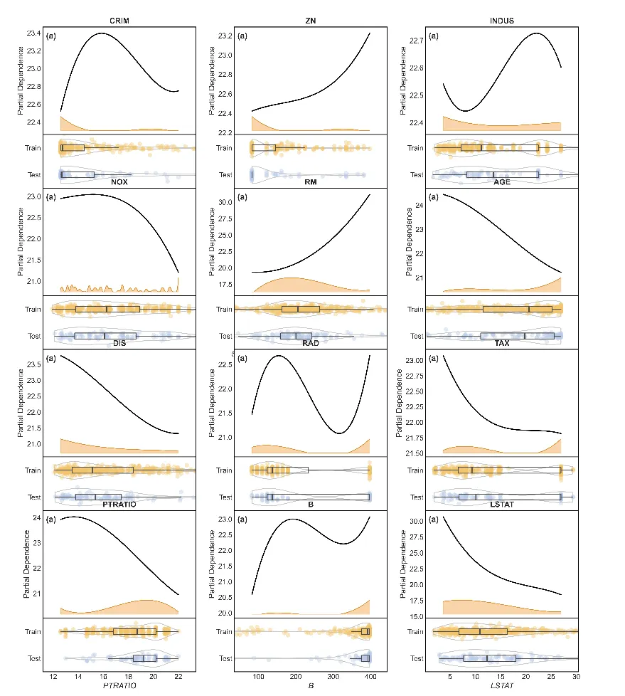
1.“上下联动”的一维PDP
这张图由上下两部分组成,信息量极高:
– 上半部分(模型解释):
– 黑色实线 :平滑处理后的 PDP 曲线,直观展示特征对预测结果的影响趋势。
– 橙色波浪 :特征的密度分布(Density Plot)。波峰越高,说明该处的数据越密集,PDP 曲线的可信度越高。
– 下半部分(数据分布):
– 这是一个 组合图(Raincloud Plot 变体) ,专门用于对比 训练集(Train) 和 测试集(Test),当然也可以像原文中对比不同数据集,不一定非要是训练集和测试集的对比,这边用这个作为示范 。
– 小提琴图 :展示数据的整体分布形态。
– 箱线图 :展示中位数、四分位数。
– 抖动散点 :展示每一个真实样本点的位置。

import seaborn as snsimport matplotlib.pyplot as pltfrom scipy.interpolate import splev, splrepfeatures = columnsfor i in features:sns.set_theme(style="white", font_scale=1.1)fig = plt.figure(figsize=(5.4, 5.0), dpi=150)gs = fig.add_gridspec(nrows=2, ncols=1, height_ratios=[3.2, 1.6], hspace=0.0)ax = fig.add_subplot(gs[0, 0])ax_dist = fig.add_subplot(gs[1, 0], sharex=ax)pdp = partial_dependence(best_model,X,[i],kind="average",method="brute",grid_resolution=50,)plot_x = pdp["grid_values"][0]plot_y = np.asarray(pdp["average"][0]).ravel()x_min = float(np.min(plot_x))x_max = float(np.max(plot_x))x_pad = 0.15 * max(x_max - x_min, 1e-9)x_smooth = np.linspace(x_min, x_max, 200)tck = splrep(plot_x, plot_y, k=3, s=max(1.0, len(plot_x) * 0.5))plot_y_smooth = splev(x_smooth, tck)y_min = float(np.min(plot_y_smooth))y_max = float(np.max(plot_y_smooth))y_range = max(y_max - y_min, 1e-9)band_base = y_min - 0.25 * y_rangeband_height = 0.18 * y_rangefeature_data = X[i].dropna()density, edges = np.histogram(feature_data, bins=60, range=(x_min, x_max), density=True)centers = 0.5 * (edges[:-1] + edges[1:])tck_d = splrep(centers, density, k=3, s=max(1.0, len(centers) * 0.1))density_smooth = np.clip(splev(x_smooth, tck_d), 0, None)density_scaled = density_smooth / max(np.max(density_smooth), 1e-9) * band_heightax.fill_between(x_smooth,band_base,band_base + density_scaled,color="#f1a340",alpha=0.45,zorder=1,)ax.plot(x_smooth, band_base + density_scaled, color="#d98d2f", linewidth=1.0, zorder=2)ax.plot(x_smooth, plot_y_smooth, color="black", linewidth=1.8, zorder=5)ax.text(0.02,0.95,"(a)",transform=ax.transAxes,ha="left",va="top",fontsize=14,fontweight="bold",)ax.set_ylabel("Partial Dependence")ax.set_title(str(i), fontweight="bold", pad=6)ax.tick_params(direction="in", length=4, width=1.0)for spine in ax.spines.values():spine.set_linewidth(1.2)spine.set_color("black")ax.grid(False)ax.set_xlim(x_min - x_pad, x_max + x_pad)ax.set_ylim(band_base - 0.05 * y_range, y_max + 0.08 * y_range)ax.tick_params(axis="x", labelbottom=False)ax.margins(x=0)ax.spines["bottom"].set_visible(False)train_data = X_train[i].dropna().to_numpy()test_data = X_test[i].dropna().to_numpy()y_data = [train_data, test_data]positions = [1, 0]colors = ["#f2c56d", "#b7c9e8"]violins = ax_dist.violinplot(y_data,positions=positions,widths=0.65,vert=False,bw_method="silverman",showmeans=False,showmedians=False,showextrema=False,)for pc in violins["bodies"]:pc.set_facecolor("none")pc.set_edgecolor("#4a4a4a")pc.set_linewidth(1.2)ax_dist.boxplot(y_data,positions=positions,vert=False,widths=0.22,showfliers=False,showcaps=False,medianprops=dict(linewidth=2.0, color="#4a4a4a"),whiskerprops=dict(linewidth=1.2, color="#4a4a4a"),boxprops=dict(linewidth=1.2, color="#4a4a4a"),)jitter = 0.06for pos, vals, c in zip(positions, y_data, colors):y_jittered = np.full(len(vals), pos) + st.t(df=6, scale=jitter).rvs(len(vals))ax_dist.scatter(vals, y_jittered, s=55, color=c, alpha=0.4, edgecolors="none")ax_dist.set_yticks(positions)ax_dist.set_yticklabels(["Train", "Test"])ax_dist.set_ylim(-0.5, 1.5)ax_dist.margins(x=0)ax_dist.tick_params(direction="in", length=3, width=1.0)for spine in ax_dist.spines.values():spine.set_linewidth(1.2)spine.set_color("black")ax_dist.spines["top"].set_visible(True)ax_dist.grid(False)ax_dist.set_xlabel(str(i), fontstyle="italic")ax_dist.set_ylabel("")plt.savefig(f"1D_PDP_{i}.png", dpi=600)plt.tight_layout()plt.show()
也可以将每个特征的PDP图换成子图,用一整个图表示全部特征

import seaborn as snsimport matplotlib.pyplot as pltimport mathfrom scipy.interpolate import splev, splrepfeatures = columnssns.set_theme(style="white", font_scale=1.1)n_features = len(features)ncols = 3nrows = int(math.ceil(n_features / ncols))fig = plt.figure(figsize=(5.4 * ncols, 5.0 * nrows), dpi=150)height_ratios = [3.2, 1.6] * nrowsgs = fig.add_gridspec(nrows=2 * nrows, ncols=ncols, height_ratios=height_ratios, hspace=0.0, wspace=0.25)for idx, i in enumerate(features):row = (idx // ncols) * 2col = idx % ncolsax = fig.add_subplot(gs[row, col])ax_dist = fig.add_subplot(gs[row + 1, col], sharex=ax)pdp = partial_dependence(best_model,X,[i],kind="average",method="brute",grid_resolution=50,)plot_x = pdp["grid_values"][0]plot_y = np.asarray(pdp["average"][0]).ravel()x_min = float(np.min(plot_x))x_max = float(np.max(plot_x))x_pad = 0.15 * max(x_max - x_min, 1e-9)x_smooth = np.linspace(x_min, x_max, 200)tck = splrep(plot_x, plot_y, k=3, s=max(1.0, len(plot_x) * 0.5))plot_y_smooth = splev(x_smooth, tck)y_min = float(np.min(plot_y_smooth))y_max = float(np.max(plot_y_smooth))y_range = max(y_max - y_min, 1e-9)band_base = y_min - 0.25 * y_rangeband_height = 0.18 * y_rangefeature_data = X[i].dropna()density, edges = np.histogram(feature_data, bins=60, range=(x_min, x_max), density=True)centers = 0.5 * (edges[:-1] + edges[1:])tck_d = splrep(centers, density, k=3, s=max(1.0, len(centers) * 0.1))density_smooth = np.clip(splev(x_smooth, tck_d), 0, None)density_scaled = density_smooth / max(np.max(density_smooth), 1e-9) * band_heightax.fill_between(x_smooth,band_base,band_base + density_scaled,color="#f1a340",alpha=0.45,zorder=1,)ax.plot(x_smooth, band_base + density_scaled, color="#d98d2f", linewidth=1.0, zorder=2)ax.plot(x_smooth, plot_y_smooth, color="black", linewidth=1.8, zorder=5)ax.text(0.02,0.95,"(a)",transform=ax.transAxes,ha="left",va="top",fontsize=14,fontweight="bold",)ax.set_ylabel("Partial Dependence")ax.set_title(str(i), fontweight="bold", pad=6)ax.tick_params(direction="in", length=4, width=1.0)for spine in ax.spines.values():spine.set_linewidth(1.2)spine.set_color("black")ax.grid(False)ax.set_xlim(x_min - x_pad, x_max + x_pad)ax.set_ylim(band_base - 0.05 * y_range, y_max + 0.08 * y_range)ax.tick_params(axis="x", labelbottom=False)ax.margins(x=0)ax.spines["bottom"].set_visible(False)train_data = X_train[i].dropna().to_numpy()test_data = X_test[i].dropna().to_numpy()y_data = [train_data, test_data]positions = [1, 0]colors = ["#f2c56d", "#b7c9e8"]violins = ax_dist.violinplot(y_data,positions=positions,widths=0.65,vert=False,bw_method="silverman",showmeans=False,showmedians=False,showextrema=False,)for pc in violins["bodies"]:pc.set_facecolor("none")pc.set_edgecolor("#4a4a4a")pc.set_linewidth(1.2)ax_dist.boxplot(y_data,positions=positions,vert=False,widths=0.22,showfliers=False,showcaps=False,medianprops=dict(linewidth=2.0, color="#4a4a4a"),whiskerprops=dict(linewidth=1.2, color="#4a4a4a"),boxprops=dict(linewidth=1.2, color="#4a4a4a"),)jitter = 0.06for pos, vals, c in zip(positions, y_data, colors):y_jittered = np.full(len(vals), pos) + st.t(df=6, scale=jitter).rvs(len(vals))ax_dist.scatter(vals, y_jittered, s=55, color=c, alpha=0.4, edgecolors="none")ax_dist.set_yticks(positions)ax_dist.set_yticklabels(["Train", "Test"])ax_dist.set_ylim(-0.5, 1.5)ax_dist.margins(x=0)ax_dist.tick_params(direction="in", length=3, width=1.0)for spine in ax_dist.spines.values():spine.set_linewidth(1.2)spine.set_color("black")ax_dist.spines["top"].set_visible(True)ax_dist.grid(False)ax_dist.set_xlabel(str(i), fontstyle="italic")ax_dist.set_ylabel("")plt.tight_layout()plt.savefig(f"1D_PDP_.png", dpi=600)plt.show()
02
!
2. “立体感知”的三维PDP交互空间.
除了看单个特征,我们还想看特征之间的 交互作用 。代码中还包含了一个 3D 散点图绘制功能,每三个特征一组,通过颜色深浅展示联合影响。
– 蓝红配色 :冷暖色调清晰区分数值高低。
– 3D 散点 :直观展示三个特征空间中的模型响应面

# 每 3 个特征绘制一张三维 PDP 图import matplotlib.colors as mcolorscolumns_list = list(columns)for idx in range(0, len(columns_list), 3):if idx + 2 >= len(columns_list):breakf1, f2, f3 = columns_list[idx], columns_list[idx + 1], columns_list[idx + 2]pdp_3 = partial_dependence(best_model,X=X_train,features=[(idx, idx + 1, idx + 2)],grid_resolution=12,)vals1, vals2, vals3 = pdp_3['values']P = pdp_3['average'][0]F1, F2, F3 = np.meshgrid(vals1, vals2, vals3, indexing='ij')Xpts = F1.ravel()Ypts = F2.ravel()Zpts = F3.ravel()Cpts = P.ravel()fig = plt.figure(figsize=(7, 5.5))ax = fig.add_subplot(111, projection='3d')base_cmap = plt.get_cmap("coolwarm")cmap = mcolors.LinearSegmentedColormap.from_list("coolwarm_soft",base_cmap(np.linspace(0.2, 0.8, 256)),)sc = ax.scatter(Xpts,Ypts,Zpts,c=Cpts,cmap=cmap,s=18,alpha=0.9,edgecolors="none",depthshade=False,)ax.view_init(elev=22, azim=-60)ax.set_xlabel(f1, labelpad=10)ax.set_ylabel(f2, labelpad=10)ax.set_zlabel(f3, labelpad=10)ax.set_title("", pad=0)cbar = plt.colorbar(sc, ax=ax, orientation="horizontal", pad=0.12, shrink=0.55, aspect=30)cbar.set_label("Partial dependence", fontsize=12)plt.tight_layout()plt.savefig(f"3D_PDP_scatter_{f1}_{f2}_{f3}.png", dpi=600)plt.show()
总结
这不仅是一张模型结果图,更是一份模型诊断书 。它创造性地将 模型解释性(PDP) 与 数据质量监控(分布对比) 融为一体,通过“一维精细刻画 + 三维宏观交互”的组合拳,为复杂机器学习模型提供了一个既美观又严谨的透明化窗口。
!
点击蓝字 关注我们