 夜雨聆风
夜雨聆风
让 AI 写一个 dashboard,回车一敲,生成的结果九成是这样:蓝紫渐变铺满背景,白色卡片浮在上面,左上角一个 🚀,标题字号比正文大了三倍,底部一排按钮,主按钮亮蓝色,副按钮是半透明毛玻璃。每次都像从同一个模板里吐出来的。
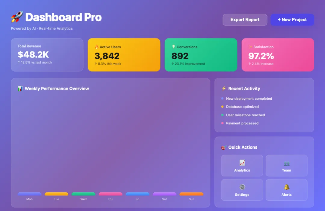
不用看代码,一眼就知道是 AI 写的。
问题不出在 AI 的能力上——它能写出结构合理的组件、能处理响应式、能把状态管理接得很干净。问题出在审美默认值上:不加约束的时候,AI 会自动往一种固定方向走,而那个方向恰好一眼就能认出来。把约束先写进配置文件,让 AI 在动手之前就知道什么不能做,出来的东西就不一样了。
下面是五个踩过最多次的反模式。每个都有对比效果、解决思路和对应的 prompt 片段,最后汇总成一份完整版,可以直接丢进 CLAUDE.md、.cursorrules 或 system prompt。
配色层:蓝紫渐变是第一重灾区
AI 对"科技感"的第一联想就是蓝紫渐变。linear-gradient(to right, #6366f1, #8b5cf6) 这类写法几乎成了肌肉记忆——不管是写一个登录页还是一个设置面板,背景大概率是这个色。
配色上还有另一个问题:颜色太多太散。一个组件里同时出现五六种颜色,主色、辅色、强调色、状态色全部摊开,看起来像组件库的演示页,不像一个真正在用的产品。

锁住配色的办法: 给 AI 一套固定的颜色变量,明确主色和中性色的边界,再加一个禁止清单。
Color Rules:- Primary: use CSS variable --color-primary only- Background: white (#ffffff) or light gray (#f8f9fa) only, no gradients- Text: #111827 for primary text, #6b7280 for secondary- Accent: one accent color only, use sparingly- Forbidden: blue-purple gradients, neon colors, rainbow palettes- No more than 3 brand colors in any single view这条规则的核心不是限制 AI 的发挥,而是把"配色"这件事从每次随机生成变成从预设系统里取值。一旦颜色锁定在变量上,整个页面的一致性会直接提升一个档次。
装饰层:emoji 和毛玻璃
Emoji 是毁掉仪表盘质感最快的方式。没有图标库的时候,AI 会直接拿 🔥💡✅🚀 充数——产品界面和聊天消息的气质完全不同,emoji 一上来就把整体感拉低了。
毛玻璃是另一个重灾区。backdrop-filter: blur(10px) 加半透明背景,AI 特别喜欢用这个来表达"高级感"。但毛玻璃要成立,需要很特定的底色和层次关系。随手加上去,大多数时候出来的效果不是通透,而是脏。
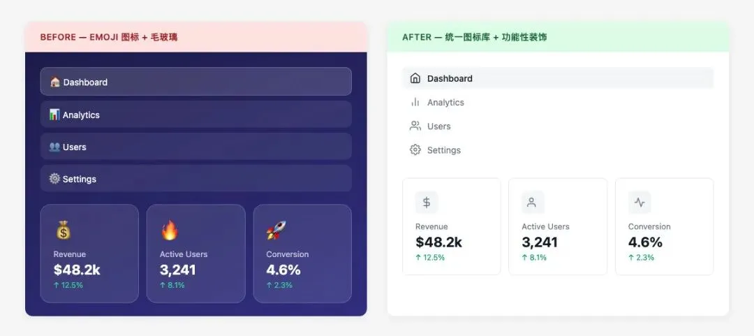
指定图标库,把 emoji 和毛玻璃踢出默认选项:
Decoration Rules:- Icons: use Lucide, Heroicons, or Phosphor — pick one set and stick to it- Icon size: 16px inline with text, 20px standalone- No emoji as functional icons in any UI element- No glassmorphism (backdrop-filter: blur) unless explicitly requested- No decorative gradients on containers or backgrounds- Shadows: functional only, not decorative图标库的选择不太重要,重要的是统一。Lucide、Heroicons、Phosphor 都行,选一个之后全部用它,不要混着来。
结构层:卡片堆砌和阴影滥用
让 AI 设计一个界面,大概率得到一堆卡片。每张卡片都有 box-shadow,有时还有 border-radius: 16px,再叠一层 border: 1px solid rgba(255,255,255,0.1)。
单看一张卡片没问题。但整个页面都是这个结构,就会有一种廉价感——不是设计出来的布局,而是用同一个模子堆叠出来的。阴影尤其明显,当每个元素都在"浮"的时候,层次感反而消失了。

砍掉多余的阴影层: 卡片用 border 或 shadow 二选一,不要两者叠加。
Structure Rules:- Cards: use either border (1px solid #e5e7eb) OR light shadow, not both- Shadow scale: only 2 levels allowed - Level 1: box-shadow: 0 1px 3px rgba(0,0,0,0.08) - Level 2: box-shadow: 0 4px 12px rgba(0,0,0,0.1)- Border radius: 6px or 8px only, no 16px+ rounded corners- No shadow on every element — use it to indicate elevation hierarchy- Page layout should use whitespace and alignment, not just card grids一个页面最多两层阴影深度。大部分元素不需要阴影,只有确实需要表达"浮起来"的地方才用。这条规则加上去之后,AI 生成的页面会干净很多。
字体层:层级乱、单位混
字体层的问题不是某个字号写错了,而是根本没有阶梯。一处写 font-size: 1.5rem,另一处写 font-size: 24px,第三处又是 font-size: large——三种单位、三种取值逻辑,散在不同组件里,累积下来整个页面的文字层级就乱了。
AI 每次都是就地取一个"看起来差不多"的值。没有统一阶梯可以参照,一致性就是碰运气。

给一个固定阶梯,锁死单位:
Typography Rules:- Font scale (px): 12 / 14 / 16 / 20 / 24 / 32- Define as CSS variables: --text-xs, --text-sm, --text-base, --text-lg, --text-xl, --text-2xl- Body text: font-weight 400- Headings: font-weight 600- Line height: 1.5 for body, 1.25 for headings- Unit: use rem or px consistently — do not mix units- No arbitrary font sizes outside the defined scale字号阶梯不需要多复杂,六个值就够覆盖绝大多数场景。关键是让 AI 只从这六个值里选,而不是每次自己算一个。
工程层:内联样式和魔法值
AI 生成的代码里,内联样式几乎是必然出现的。style={{ paddingTop: '13px', marginLeft: '7px' }} 这种写法,每次都是不同的随机数字,完全无法复用和维护。
颜色也一样。#1a73e8 出现在这里,#4285f4 出现在那里,两个都是蓝色,但没有任何关联,也没有语义变量名。改一个地方要全局搜索替换,漏一个就是视觉 bug。
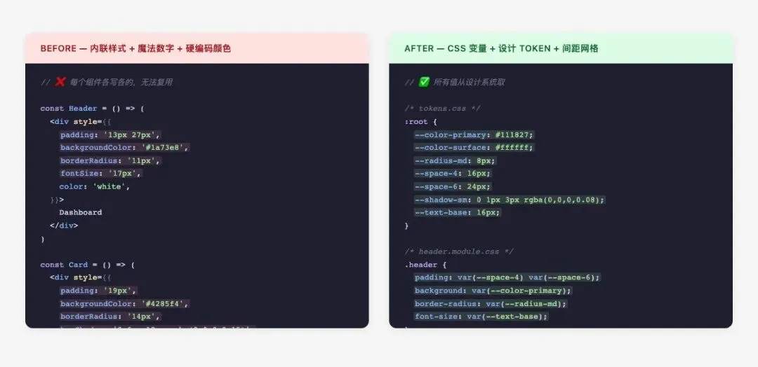
所有设计值走变量,禁止内联样式和魔法值:
Engineering Rules:- All colors must use CSS variables (--color-*)- All spacing must use design tokens (--space-*)- All font sizes must use typography scale variables (--text-*)- No inline styles for layout, color, or typography- No magic numbers: every value must map to a defined token- Spacing grid: 4px base — allowed values are 4/8/12/16/24/32/48/64- No arbitrary values like 13px, 7px, 23px- Component styles must be consistent across the entire page这条规则的效果不只是规范。一旦强制要求 AI 用变量,生成的组件之间自然就有了一致性——它们在引用同一套设计系统,而不是各自硬编码。
模型选择:前端生成优先试 Gemini
上面这些规则在 Claude 和 GPT 上都能用。但专门聊前端生成,Gemini 会更好用——CSS 布局、组件结构、比例感和留白,同一套 prompt 喂进去,它出来的页面后续调整次数会少很多。不是说其他模型不能用,而是专业领域就不一样。
完整设计规则 prompt
五个维度的约束汇总在这里,直接复制进 CLAUDE.md、AGENTS.md 或 system prompt 就能用。
# Frontend Design System Rules## Color System- Define CSS variables: --color-primary, --color-secondary, --color-neutral-*, --color-success, --color-warning, --color-error- Backgrounds: white (#ffffff) or light gray (#f8f9fa, #f3f4f6) only- No gradients on backgrounds or buttons- No blue-purple gradients (linear-gradient with purple/violet/indigo) anywhere- No neon colors, no rainbow palettes- No more than 3 brand colors in any single view- Text colors: #111827 (primary), #6b7280 (secondary), #9ca3af (tertiary)## Typography- Font scale: 12px / 14px / 16px / 20px / 24px / 32px- CSS variables: --text-xs, --text-sm, --text-base, --text-lg, --text-xl, --text-2xl- Body: font-weight 400, line-height 1.5- Headings: font-weight 600, line-height 1.25- Do not mix px, rem, em — pick one unit system- No arbitrary font sizes outside the defined scale## Spacing- 4px base grid: 4 / 8 / 12 / 16 / 24 / 32 / 48 / 64px- CSS variables: --space-1 through --space-16- No magic numbers (13px, 7px, 23px, etc.)- Consistent padding within component families## ComponentsCards:- Use either border (1px solid #e5e7eb) OR shadow, not both- Shadow level 1: 0 1px 3px rgba(0,0,0,0.08)- Shadow level 2: 0 4px 12px rgba(0,0,0,0.1)- Border radius: 6px or 8px, no 16px+Buttons:- Primary: solid fill, no gradient- Secondary: outline or ghost- Hover: darken by 10%, not color switch- No rounded-full on rectangular buttonsInputs:- Border: 1px solid #d1d5db- Border radius: 6px- Focus: border-color change + outline, no glow## Icons- Use one icon set consistently: Lucide / Heroicons / Phosphor- Size: 16px inline, 20px standalone- No emoji as functional icons## Forbidden Patterns- No blue-purple gradients- No glassmorphism unless explicitly requested- No emoji icons- No excessive shadows on every element- No inline styles for color, spacing, or typography- No magic numbers — every value must reference a design token- No more than 2 shadow depth levels per page加了规则之后能做到什么程度
光讲规则不直观。下面是一个用完整 prompt 加 Gemini 生成的页面,没有手动调整样式,直接一次生成的结果。
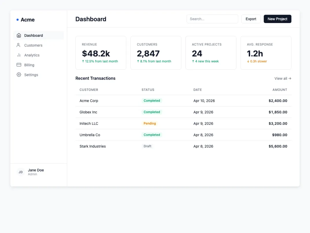
不是说它完美,但它不再是"一眼 AI"了。配色从变量里取,间距在网格上,阴影只有需要层次的地方才出现,字号严格走阶梯。这些加起来,就是从"AI 风"到"产品风"的差距。
规则本身不复杂,复杂的是意识到需要它。大多数时候不是 AI 写不好前端,而是没人告诉它什么不能做。
