 夜雨聆风
夜雨聆风
书接上文。上次讲了 oiyo 在 App.vue 赋予的能力,不少朋友说想看实际例子,光说概念不够直观。
行,今天拿 UniApp 最常见的痛点之一来抛砖引玉:多主题色变更
1. 赋能差异
众所周知,小程序侧在设计上就没有 "根部视图" 这一层概念。导致 UniApp 的 App.vue 只承担生命周期 hook,不参与渲染。你在 <template> 里写再多结构,UniApp 也不会把它呈现给用户。
先感受一下 oiyo 赋能之间的差异
未赋能前
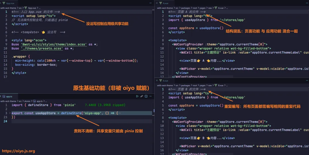
你在原生 UniApp 里能做什么:
在 App.vue 里放
<ConfigProvider>统一控制主题?不行,没有渲染根节点。 在 App.vue 写
<template>节点让所有页面共享?只能靠复制代码到每个页面。 在 App.vue 定义一个可以被 A、B、C 页面共同控制变量?
不能,只能承担部分应用级功能。
这就是上图这种 "每个页面重复定义" 的根源。
被赋能后
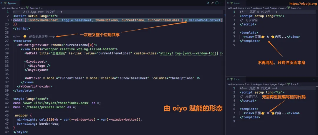
你使用 Oiyo 赋能后能够做到:
App.vue 是真正的根部视图,主题状态定义一次,所有页面共享。 ConfigProvider 包裹全应用,一个应用级共享 themeVars变化全域响应。页面 A 主动切换了主题色,页面B以及其他页面均立刻感知到变化。
这种赋能方式解决了过去在 UniApp 里很难做到的跨页面状态共享问题。
2. 用 30 秒创建验证项目
概念层面已经清楚 Oiyo 能解决什么问题了。如果你现在就想在真实项目里跑通主题切换,先花 30 秒搭一个 Oiyo 项目。
pnpm create oiyo@latest --preset=standard脚手架会交互式引导你指定安装位置,用于创建一份 包含 wot-ui v2 等基础功能 的最佳实践项目:
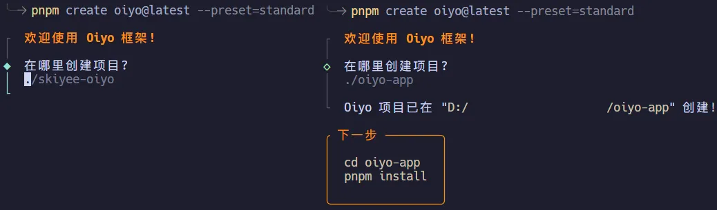
别忘记进行项目安装,按照脚手架提示的 “下一步” 引导就可以正常安装。
现在你有了一个具备 oiyo + wot-ui 组件库的可用项目。接下来在这个项目中实现主题切换。
3. 两步实现全局主题切换
前提都具备后,接入流程变成一条直线。
第一步:在 App.vue 中组合根部视图
<!-- 入口 src/App.vue 的文件 --><script setup lang="ts">const { isShowThemeSheet, toggleThemeSheet, themeOptions, currentTheme, currentThemeLabel } = defineRootContext(() => { const isShowThemeSheet = ref(false) const toggleThemeSheet = () => isShowThemeSheet.value = !isShowThemeSheet.value const themeOptions = ref([ { label: 'Shadcn', value: 'shadcn' }, { label: 'NutUI', value: 'nutui' }, { label: 'Vant', value: 'vant' }, { label: 'TDesign', value: 'tdesign' }, { label: 'Cartoon', value: 'cartoon' }, { label: 'Illustration', value: 'illustration' }, ]) const currentTheme = ref(['shadcn']) const currentThemeLabel = computed(() => { return themeOptions.value.find(item => item.value === currentTheme.value[0])?.label }) return { isShowThemeSheet, toggleThemeSheet, themeOptions, currentTheme, currentThemeLabel }})</script><template> <WdConfigProvider :theme="currentTheme[0]"> <view class="wrapper relative wot-bg-filled-bottom"> <WdCell title="主题预设" is-link :value="currentThemeLabel" custom-class="sticky! top-[var(--window-top)] z-10" @click="toggleThemeSheet" /> <OiyoLayout> <OiyoPage /> </OiyoLayout> <WdPicker v-model="currentTheme" v-model:visible="isShowThemeSheet" :columns="themeOptions" /> </view> </WdConfigProvider></template><style lang="scss">@use '@wot-ui/ui/styles/theme/index.scss' as *;@use './themes/presets.scss' as *;.wrapper { min-height: calc(100vh - var(--window-top) - var(--window-bottom)); box-sizing: border-box;}</style>这一步同时用到了 Oiyo 的两项能力:<template> 渲染让 <WdConfigProvider> 有了放置位置,defineRootContext 让主题变化可以从根部扩散到所有页面。
第二步:在页面中放入感受直观的 UI 组件
<!-- 页面 src/pages/home/index.vue 的文件 --><script setup lang="ts">definePageMeta({ type: 'home', style: { navigationBarTitleText: '首页', },})const switchValue = ref(true)const checkboxValue = ref(true)const radioValue = ref('1')const inputValue = ref('')</script><template> <view class="p-3"> <!-- 按钮 --> <WdCellGroup title="按钮 Button" border> <WdCell title-width="0" center> <view class="flex flex-wrap gap-2"> <WdButton type="primary" size="small">主要</WdButton> <WdButton type="success" size="small">成功</WdButton> <WdButton type="info" size="small">信息</WdButton> <WdButton type="warning" size="small">警告</WdButton> <WdButton type="danger" size="small">危险</WdButton> </view> </WdCell> <WdCell title-width="0" center> <view class="flex flex-wrap gap-2"> <WdButton type="primary" variant="plain" size="small">主要</WdButton> <WdButton type="success" variant="plain" size="small">成功</WdButton> <WdButton type="info" variant="plain" size="small">信息</WdButton> <WdButton type="warning" variant="plain" size="small">警告</WdButton> <WdButton type="danger" variant="plain" size="small">危险</WdButton> </view> </WdCell> <WdCell title-width="0" center> <view class="flex flex-wrap gap-2"> <WdButton type="primary" round size="small">圆角</WdButton> <WdButton type="success" round size="small">圆角</WdButton> <WdButton type="info" round size="small">圆角</WdButton> </view> </WdCell> <WdCell title-width="0" center> <view class="flex flex-wrap gap-2"> <WdButton type="primary" loading size="small" /> <WdButton type="primary" disabled size="small">禁用</WdButton> <WdButton type="danger" size="small"> <WdIcon name="delete" size="14px" /> </WdButton> </view> </WdCell> </WdCellGroup> <!-- 标签 --> <WdCellGroup title="标签 Tag" border> <WdCell title-width="0" center> <view class="flex flex-wrap gap-2"> <WdTag type="primary">primary</WdTag> <WdTag type="success">success</WdTag> <WdTag type="default">info</WdTag> <WdTag type="warning">warning</WdTag> <WdTag type="danger">danger</WdTag> <WdTag>default</WdTag> </view> </WdCell> <WdCell title-width="0" center> <view class="flex flex-wrap gap-2"> <WdTag type="primary" mark>mark</WdTag> <WdTag type="success" mark>mark</WdTag> <WdTag type="default" mark>mark</WdTag> </view> </WdCell> <WdCell title-width="0" center> <view class="flex flex-wrap gap-2"> <WdTag type="primary" round>round</WdTag> <WdTag type="success" round>round</WdTag> <WdTag type="danger" round>round</WdTag> </view> </WdCell> </WdCellGroup> <!-- 输入框 --> <WdCellGroup title="输入框 Input" border> <WdCell title-width="0"> <WdInput v-model="inputValue" placeholder="请输入内容" clearable prefix-icon="search" suffix-icon="scan" show-word-limit :maxlength="20" /> </WdCell> <WdCell title-width="0"> <WdInput v-model="inputValue" placeholder="密码输入框" show-password clearable prefix-icon="lock" /> </WdCell> <WdCell title-width="0"> <WdInput v-model="inputValue" placeholder="禁用状态" disabled /> </WdCell> </WdCellGroup> <!-- 开关与复选框 --> <WdCellGroup title="开关与选择" border> <WdCell title="开关 Switch" center> <WdSwitch v-model="switchValue" /> </WdCell> <WdCell title="复选框 Checkbox" center> <WdCheckbox v-model="checkboxValue">同意协议</WdCheckbox> </WdCell> <WdCell title-width="0"> <WdRadioGroup v-model="radioValue" shape="button"> <WdRadio value="1">选项一</WdRadio> <WdRadio value="2">选项二</WdRadio> <WdRadio value="3">选项三</WdRadio> </WdRadioGroup> </WdCell> </WdCellGroup> <!-- 加载 --> <WdCellGroup title="加载 Loading" border> <WdCell title-width="0" center> <view class="flex flex-wrap gap-4 items-center"> <WdLoading /> <WdLoading type="circular" /> <WdLoading color="#e91e63" /> </view> </WdCell> </WdCellGroup> <!-- 进度条 --> <WdCellGroup title="进度条 Progress" border> <WdCell title-width="0"> <view class="flex flex-col gap-3"> <WdProgress :percentage="30" /> <WdProgress :percentage="60" status="success" /> <WdProgress :percentage="90" status="danger" /> </view> </WdCell> </WdCellGroup> </view></template>整个过程中,你不需要手写任何样式覆盖逻辑,不需要在页面间传递事件,不需要处理初始化时序。
当用户切换 “主题预设” 时,这些 UI 组件的样式会在全局生效。
4. 不止是主题切换
全局主题切换是 Oiyo 赋能最直观的例子,但不是唯一场景。App.vue 能渲染根部视图后,凡是需要"根部统一控制、全应用共享"的能力,都能放进去:
全局 Loading/Error 状态管理 统一的权限拦截布局 多语言切换 Provider 应用级 Toast/Notify 挂载
Oiyo 做的只是把小程序侧缺失的那层"根部视图"还给开发者。这一层补上,UniApp 的开发体验就向标准 Vue 靠拢了一大步。
回到主题切换这件事本身。不需要手写样式覆盖,不需要页面间事件传递,不需要操心初始化时序。Oiyo 在底层只做了一件事:把 App.vue 的渲染权真正交给你。
但就是这一步,把"每个页面重复定义"的痛点变成了"定义一次,全局生效"。
关于
我是 skiyee 你也可以叫我 sky
完整文档在 oiyo 官网: oiyo.js.org[1]
组件文档在 wot 官网:wot-ui.cn[2]
最佳实践项目仓库地址: github[3] / gitee[4] (need star!!!)
需要添加社群,请看 官方文档交流群[5]
如果这篇文章对你有帮助,可以 👍点赞、💬评论、⭐收藏,让我更有动力写下一篇!
引用链接
[1]oiyo.js.org: https://oiyo.js.org/
[2]wot-ui.cn: https://wot-ui.cn/
[3]github: https://github.com/skiyee/oiyo
[4]gitee: https://gitee.com/skiyee/oiyo
[5]官方文档交流群: https://oiyo.js.org/docs/community/assist