 夜雨聆风
夜雨聆风大家好!想从WinForm换个"赛道"到WPF吗?这个学习合集就是你的专属导航!不敢说写得有多精彩,但我会用心分享:从最基础的语法开始,连招带看、手把手教你从WinForm平稳过渡到WPF,无论你是新手还是有经验的开发者,这里都有属于你的学习路径!
🎯 你是不是也遇到过这些抓狂的时刻?
做WPF项目的时候,产品经理拿着一张设计稿过来说:"这个按钮要做成圆角的,悬停变色,点击有波纹效果。"然后你打开代码,发现默认的Button长这样——方方正正,毫无生气。
改样式?Style只能改颜色、字体、边距,根本动不了控件的骨架。于是你开始Google,翻StackOverflow,最后发现一个词:ControlTemplate(控件模板)。
这玩意儿,才是WPF外观定制的真正核武器。
我在项目中统计过,超过60%的UI定制需求,Style解决不了,必须上ControlTemplate。而很多开发者在第一次接触它时,往往因为概念模糊、结构复杂而望而却步,白白浪费了WPF最强大的特性之一。
读完这篇文章,你将掌握:
• ControlTemplate的底层机制与工作原理 • 3个渐进式实战方案(从简单改造到完全重绘) • 常见踩坑点与规避策略
🔍 问题深度剖析:Style能做什么,做不到什么?
很多同学刚开始学WPF,把Style和ControlTemplate混为一谈,这是第一个误区。
Style(样式) 的本质是属性集合——它能批量设置控件的Background、FontSize、Margin、Padding等依赖属性,也能通过触发器(Trigger)响应状态变化。但它改不了控件的视觉结构,因为控件的视觉结构由ControlTemplate决定。
换个比喻:Style是给一栋房子刷漆、换地板、装窗帘;而ControlTemplate是重新设计这栋房子的建筑图纸,连墙的位置都能改。
WPF中每个控件(Button、TextBox、ListBox等)都有一个默认的ControlTemplate,由系统主题提供。这个模板定义了控件长什么样、由哪些元素组成。当你需要彻底改变控件的外观时,就必须替换这个模板。
常见的错误认知:
• ❌ "用Style加个圆角就行了" → Border的CornerRadius不是Button的直接属性,Style改不到 • ❌ "ControlTemplate太复杂,能不用就不用" → 一旦UI需求复杂,逃不掉的 • ❌ "重写模板会丢失控件功能" → 只要正确使用TemplatePart和TemplateBinding,功能完全保留
💡 核心要点提炼:ControlTemplate的底层机制
🧱 视觉树与逻辑树的分离
WPF有两棵树:逻辑树(LogicalTree) 和 视觉树(VisualTree)。逻辑树描述控件的层次关系,视觉树描述实际渲染的元素结构。ControlTemplate替换的正是控件的视觉树部分,而逻辑树保持不变。
这意味着:你完全重写了Button的外观,但Button的Click事件、Command绑定、IsEnabled状态依然正常工作。逻辑与视觉彻底解耦,这是WPF架构最优雅的地方之一。
🔗 TemplateBinding:模板与控件的数据桥梁
在ControlTemplate内部,子元素无法直接读取外部控件的属性。这时就需要TemplateBinding——它是一种专为模板设计的单向绑定,性能比普通Binding更高(不需要反射查找,编译时确定)。
xml1<!-- TemplateBinding示例:将控件的Background传递给模板内的Border -->2<Border Background="{TemplateBinding Background}"3 CornerRadius="8"/🎯 ContentPresenter:内容的占位符
对于ContentControl(Button、Label等),模板内必须有一个ContentPresenter来告诉WPF"把控件的Content放在这里"。少了它,你设置的Button文字或图标就消失了。
🔄 VisualStateManager:状态驱动的现代方案
相比老式的Trigger,VisualStateManager(VSM) 是更现代、更推荐的状态管理方式。它将控件状态(Normal、MouseOver、Pressed、Disabled)与视觉变化解耦,支持平滑动画过渡,代码可读性更强。
🚀 解决方案设计:三个渐进式实战方案
方案一:基础改造——圆角渐变按钮
应用场景: 替换系统默认按钮外观,实现圆角、渐变背景、悬停效果,适合大多数业务系统的通用按钮定制。
csharp1// 测试环境:.NET 8 + WPF,Windows 11,Visual Studio 20222// 以下XAML定义一个完整的圆角渐变Button模板xml1<Window x:Class="AppWpfTemplate.MainWindow"2 xmlns="http://schemas.microsoft.com/winfx/2006/xaml/presentation"3 xmlns:x="http://schemas.microsoft.com/winfx/2006/xaml"4 xmlns:d="http://schemas.microsoft.com/expression/blend/2008"5 xmlns:mc="http://schemas.openxmlformats.org/markup-compatibility/2006"6 xmlns:local="clr-namespace:AppWpfTemplate"7 mc:Ignorable="d"8 Title="MainWindow" Height="450" Width="800"9 <Window.Resources10 <Style x:Key="RoundedButtonStyle" TargetType="Button"11 <Setter Property="Template"12 <Setter.Value13 <ControlTemplate TargetType="Button"14 <Border x:Name="border"15 CornerRadius="8"16 BorderThickness="0"17 Padding="{TemplateBinding Padding}"18<!-- 渐变背景 -->19 <Border.Background20 <LinearGradientBrush StartPoint="0,0" EndPoint="0,1"21 <GradientStop Color="#4A90E2" Offset="0"/22 <GradientStop Color="#357ABD" Offset="1"/23 </LinearGradientBrush24 </Border.Background2526<!-- 内容区域 -->27 <ContentPresenter HorizontalAlignment="Center"28 VerticalAlignment="Center"/2930<!-- 状态管理 -->31 <VisualStateManager.VisualStateGroups32 <VisualStateGroup x:Name="CommonStates"33<!-- 正常状态 -->34 <VisualState x:Name="Normal"/3536<!-- 鼠标悬停:背景变亮 -->37 <VisualState x:Name="MouseOver"38 <Storyboard39 <ColorAnimation40 Storyboard.TargetName="border"41 Storyboard.TargetProperty="(Border.Background).(GradientBrush.GradientStops)[0].(GradientStop.Color)"42 To="#5BA3F5" Duration="0:0:0.15"/43 </Storyboard44 </VisualState4546<!-- 按下状态:轻微缩放 -->47 <VisualState x:Name="Pressed"48 <Storyboard49 <DoubleAnimation50 Storyboard.TargetName="border"51 Storyboard.TargetProperty="(UIElement.RenderTransform).(ScaleTransform.ScaleX)"52 To="0.97" Duration="0:0:0.05"/53 <DoubleAnimation54 Storyboard.TargetName="border"55 Storyboard.TargetProperty="(UIElement.RenderTransform).(ScaleTransform.ScaleY)"56 To="0.97" Duration="0:0:0.05"/57 </Storyboard58 </VisualState5960<!-- 禁用状态:降低透明度 -->61 <VisualState x:Name="Disabled"62 <Storyboard63 <DoubleAnimation64 Storyboard.TargetName="border"65 Storyboard.TargetProperty="Opacity"66 To="0.4" Duration="0"/67 </Storyboard68 </VisualState69 </VisualStateGroup70 </VisualStateManager.VisualStateGroups7172<!-- 为Pressed缩放准备RenderTransform -->73 <Border.RenderTransform74 <ScaleTransform ScaleX="1" ScaleY="1"75 CenterX="0.5" CenterY="0.5"/76 </Border.RenderTransform77 <Border.RenderTransformOrigin0.5,0.5</Border.RenderTransformOrigin78 </Border79 </ControlTemplate80 </Setter.Value81 </Setter82<!-- 默认属性 -->83 <Setter Property="Foreground" Value="White"/84 <Setter Property="FontSize" Value="14"/85 <Setter Property="Padding" Value="16,8"/86 <Setter Property="Cursor" Value="Hand"/87 </Style88 </Window.Resources89 <StackPanel Margin="20"90 <Button Style="{StaticResource RoundedButtonStyle}" Content="立即提交"/91 </StackPanel92</Window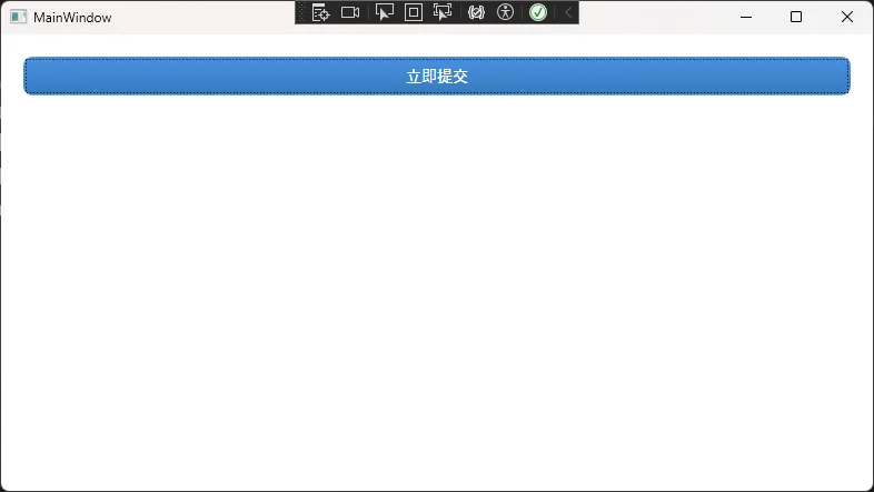
踩坑预警:
ScaleTransform的CenterX/CenterY在RenderTransform中设置无效,必须通过RenderTransformOrigin在元素上设置。否则缩放效果会从左上角开始,看起来很奇怪。
方案二:中级进阶——带图标的自定义CheckBox
应用场景: 完全重绘CheckBox,使用自定义SVG路径替代系统默认的勾选框,适合设计感强的后台管理系统或工具类软件。
xml1<Window x:Class="AppWpfTemplate.Window1"2 xmlns="http://schemas.microsoft.com/winfx/2006/xaml/presentation"3 xmlns:x="http://schemas.microsoft.com/winfx/2006/xaml"4 xmlns:d="http://schemas.microsoft.com/expression/blend/2008"5 xmlns:mc="http://schemas.openxmlformats.org/markup-compatibility/2006"6 xmlns:local="clr-namespace:AppWpfTemplate"7 mc:Ignorable="d"8 Title="Window1" Height="450" Width="800"910 <Window.Resources11 <Style x:Key="ModernCheckBoxStyle" TargetType="CheckBox"12 <Setter Property="Template"13 <Setter.Value14 <ControlTemplate TargetType="CheckBox"15 <StackPanel Orientation="Horizontal"16 VerticalAlignment="Center"1718<!-- 自定义勾选框区域 -->19 <Border x:Name="checkBorder"20 Width="20" Height="20"21 CornerRadius="4"22 BorderBrush="#CCCCCC"23 BorderThickness="2"24 Background="White"2526<!-- 勾选图标(使用Path绘制) -->27 <Path x:Name="checkMark"28 Data="M3,10 L8,15 L17,5"29 Stroke="White"30 StrokeThickness="2.5"31 StrokeStartLineCap="Round"32 StrokeEndLineCap="Round"33 Visibility="Collapsed"34 Stretch="Uniform"35 Margin="3"/36 </Border3738<!-- 标签文字 -->39 <ContentPresenter Margin="8,0,0,0"40 VerticalAlignment="Center"/4142 <VisualStateManager.VisualStateGroups43 <VisualStateGroup x:Name="CommonStates"44 <VisualState x:Name="Normal"/45 <VisualState x:Name="MouseOver"46 <Storyboard47 <ColorAnimation48 Storyboard.TargetName="checkBorder"49 Storyboard.TargetProperty="BorderBrush.Color"50 To="#4A90E2" Duration="0:0:0.1"/51 </Storyboard52 </VisualState53 </VisualStateGroup5455 <VisualStateGroup x:Name="CheckStates"56 <VisualState x:Name="Unchecked"/57<!-- 选中状态:背景变蓝,显示勾号 -->58 <VisualState x:Name="Checked"59 <Storyboard60 <ColorAnimation61 Storyboard.TargetName="checkBorder"62 Storyboard.TargetProperty="Background.Color"63 To="#4A90E2" Duration="0:0:0.15"/64 <ColorAnimation65 Storyboard.TargetName="checkBorder"66 Storyboard.TargetProperty="BorderBrush.Color"67 To="#4A90E2" Duration="0:0:0.15"/68 <ObjectAnimationUsingKeyFrames69 Storyboard.TargetName="checkMark"70 Storyboard.TargetProperty="Visibility"71 <DiscreteObjectKeyFrame KeyTime="0"72 Value="{x:Static Visibility.Visible}"/73 </ObjectAnimationUsingKeyFrames74 </Storyboard75 </VisualState76 </VisualStateGroup77 </VisualStateManager.VisualStateGroups78 </StackPanel79 </ControlTemplate80 </Setter.Value81 </Setter82 <Setter Property="Foreground" Value="#333333"/83 <Setter Property="FontSize" Value="14"/84 <Setter Property="Cursor" Value="Hand"/85 </Style86 </Window.Resources87 <StackPanel88<!-- 使用方式 -->89 <CheckBox Style="{StaticResource ModernCheckBoxStyle}"90 Content="记住我的选择"91 IsChecked="True"/92 </StackPanel93</Window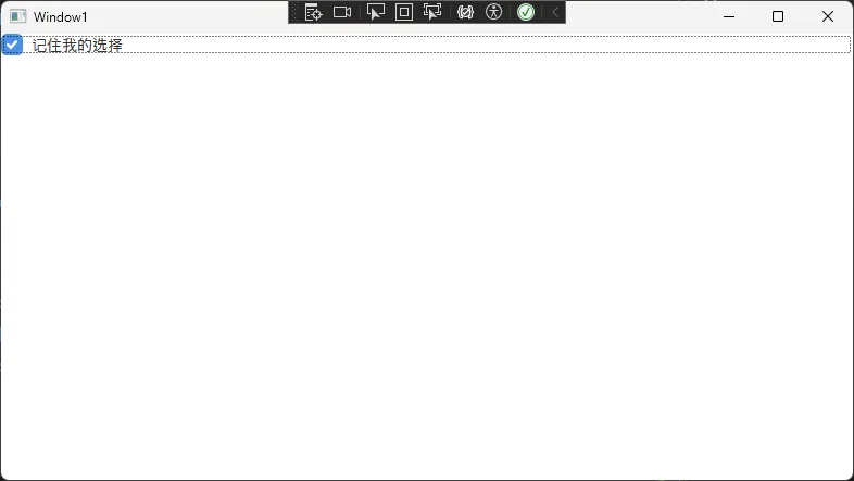
踩坑预警:
CheckBox有两个VisualStateGroup:
CommonStates(Normal/MouseOver/Pressed/Disabled)和CheckStates(Checked/Unchecked/Indeterminate)。这两组必须同时声明,否则状态切换会出现异常——这是我在项目里踩过的真实坑,排查了半天才发现少了一个StateGroup。
方案三:高级实战——完全自定义的进度条控件
应用场景: 重写ProgressBar,实现带百分比文字、渐变填充、圆角效果的现代化进度条,常见于数据大屏或仪表盘类项目。
xml1<Style x:Key="ModernProgressBarStyle" TargetType="ProgressBar"2 <Setter Property="Template"3 <Setter.Value4 <ControlTemplate TargetType="ProgressBar"5 <Grid6<!-- 背景轨道 -->7 <Border x:Name="PART_Track"8 Background="#E8E8E8"9 CornerRadius="10"10 Height="{TemplateBinding Height}"/1112<!-- 进度填充区域(使用ClipToBounds裁剪圆角) -->13 <Border CornerRadius="10"14 ClipToBounds="True"15 Height="{TemplateBinding Height}"16 <Border x:Name="PART_Indicator"17 HorizontalAlignment="Left"18 CornerRadius="10"19 <Border.Background20 <LinearGradientBrush StartPoint="0,0" EndPoint="1,0"21 <GradientStop Color="#4A90E2" Offset="0"/22 <GradientStop Color="#7B61FF" Offset="1"/23 </LinearGradientBrush24 </Border.Background25 </Border26 </Border2728<!-- 百分比文字叠加 -->29 <TextBlock HorizontalAlignment="Center"30 VerticalAlignment="Center"31 FontSize="12"32 FontWeight="Bold"33 Foreground="White"34 <TextBlock.Text35 <MultiBinding StringFormat="{}{0:0}%"36 <Binding Path="Value"37 RelativeSource="{RelativeSource TemplatedParent}"/38 </MultiBinding39 </TextBlock.Text40 </TextBlock41 </Grid42 </ControlTemplate43 </Setter.Value44 </Setter45 <Setter Property="Height" Value="24"/46</Stylecsharp1// 在后台代码中绑定进度值(ViewModel示例)2public class DashboardViewModel : INotifyPropertyChanged3{4private double _progress;5public double Progress6 {7get => _progress;8set9 {10 _progress = value;11OnPropertyChanged(nameof(Progress));12 }13 }1415// 模拟异步任务进度更新16public async Task RunTaskAsync()17 {18for (int i = 0; i <= 100; i++)19 {20Progress = i;21await Task.Delay(50); // 模拟耗时操作22 }23 }2425public event PropertyChangedEventHandler PropertyChanged;26protected void OnPropertyChanged(string name) =>27PropertyChanged?.Invoke(this, new PropertyChangedEventArgs(name));28}xml1<!-- XAML绑定 -->2<ProgressBar Style="{StaticResource ModernProgressBarStyle}"3 Value="{Binding Progress}"4 Minimum="0" Maximum="100"5 Width="300"/c1var viewModel = new DashboardViewModel();2this.DataContext = viewModel;3Loaded += async (s, e) => await viewModel.RunTaskAsync();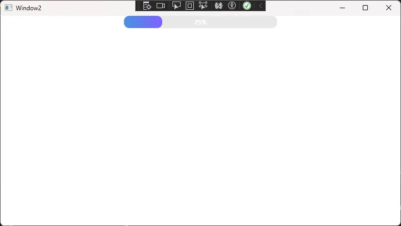
踩坑预警:
ProgressBar的
PART_Indicator是一个命名约定(TemplatePart),WPF内部通过GetTemplateChild("PART_Indicator")来找到它并控制宽度。如果你把这个名字改了,进度条就不动了。凡是看到PART_前缀的命名,都是框架保留的关键节点,千万不要随意重命名。
📊 三个方案横向对比
💬 互动话题
话题一: 你在项目中有没有遇到过"Style改不了,必须上ControlTemplate"的场景?当时是怎么解决的?欢迎在评论区分享你的思路。
话题二: 对于复杂的UI定制,你更倾向于在XAML里手写ControlTemplate,还是用Blend可视化设计?两种方式各有什么体感上的差异?
🎯 实战小挑战: 尝试基于本文的方案一,为Button增加一个"加载中"状态——当IsEnabled=False且绑定了某个IsLoading属性时,按钮内部显示一个旋转的圆形动画。实现后欢迎截图分享!
🏁 总结与学习路径
三点核心收获:
1. ControlTemplate是WPF外观定制的终极手段,Style只能改属性值,Template才能重构视觉结构; 2. TemplateBinding + ContentPresenter + VisualStateManager 是模板开发的三件套,缺一不可; 3. PART_命名约定是框架与模板之间的隐式契约,必须严格遵守。
学习路线图:
如果你想继续深入WPF样式与模板体系,推荐按以下路径推进:
• 基础层: Style→Trigger→DataTrigger• 进阶层: ControlTemplate→VisualStateManager→TemplatePart• 高阶层: DataTemplate→ItemsPanelTemplate→ 自定义控件(继承Control类)• 工程化:将模板抽取到 ResourceDictionary,按模块拆分,通过MergedDictionaries统一管理
控件模板这条路,入门容易精通难。但一旦真正掌握了它,你会发现WPF的UI定制能力几乎没有上限——任何设计稿,都只是时间问题。
💾 收藏理由: 本文包含3个可直接复用的ControlTemplate代码模板,涵盖Button、CheckBox、ProgressBar三种高频控件,下次遇到UI定制需求直接拿来改改就能用。
📢 觉得有收获的话,转发给你的WPF同行吧 —— 说不定能帮他们少踩几个坑,少熬几个夜。
🏷️ 标签:
C#WPF控件模板XAMLUI开发性能优化设计模式
