 夜雨聆风
夜雨聆风

为了避免各位错过最新的推文教程,强烈建议大家将“科研后花园”设置为“星标”!


在科研数据分析中,我们经常需要展示多个集合之间的重叠关系。传统韦恩图(Venn Diagram)画3个集合还算凑合,画4个勉强能看,但到了5个以上就直接变成“意大利面”了。
为了克服这个限制,UpSet 图应运而生。而
ggupset这个 R 包,更是把 UpSet 图和ggplot2的优雅语法完美结合在了一起。今天,我就带大家系统学习
ggupset这个包,从安装到基础绘图,再到与各种 ggplot2 图层混搭的高级玩法,用几个可复现的案例帮你彻底掌握它。
一、UpSet 图是什么?为什么需要它?
ggupset 是一个基于 ggplot2 的 R 包,它能用组合矩阵(combination matrix)来替代普通的分类坐标轴,从而可视化复杂的集合重叠情况。它可以接收包含列表列(list-column)的数据,并将其自动转换成适合绘制 UpSet 图的格式。
ggupset 的核心思路是:
不画出所有组合的交集圆
而是用矩阵 + 柱状图的方式呈现每个组合的大小
视觉上更清晰,信息量更足,且可以轻松处理10个以上的集合
ggupset已在 CRAN 上发布多年,广受好评,也是 ggplot2 生态中 UpSet 图的最常用扩展包。
二、安装与加载
# 从 CRAN 安装(稳定版)install.packages("ggupset")# 或者从 GitHub 安装开发版(可能有新功能)devtools::install_github("const-ae/ggupset")
三、数据准备:两种常见格式
3.1 列表列格式(推荐)
ggupset 要求的数据格式是:每一行是一个观测(例如一本书、一个病人、一个基因),其中一个列必须是列表列(list-column),该列包含了当前观测所属的所有集合。
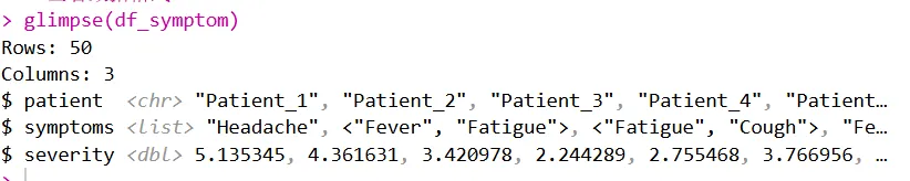
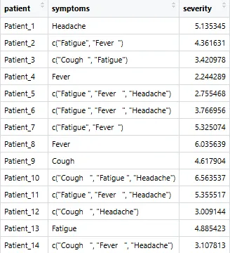
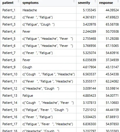
# 模拟一个症状数据集set.seed(2025)symptoms <- c("Fever", "Cough", "Fatigue", "Headache")patients <- paste0("Patient_", 1:50)symptom_list <- lapply(patients, function(p) {n <- sample(1:3, 1)chosen <- sample(symptoms, n, replace = FALSE)sort(chosen) # 关键:排序})df_symptom <- tibble(patient = patients,symptoms = symptom_list,severity = rnorm(50, mean = 5, sd = 1.5))# 查看数据格式glimpse(df_symptom)
3.2 从0/1矩阵转换
如果你手里是宽矩阵格式(行为基因,列为通路),可以这样转换:
# 宽矩阵转列表列df_long <- mat %>%as.data.frame() %>%rownames_to_column("gene") %>%pivot_longer(-gene, names_to = "pathway", values_to = "member") %>%filter(member == 1) %>%group_by(gene) %>%summarise(pathways = list(pathway))
四、基础绘图
4.1 基础 UpSet 图(柱状图)
# 宽矩阵转列表列df_long <- mat %>%as.data.frame() %>%rownames_to_column("gene") %>%pivot_longer(-gene, names_to = "pathway", values_to = "member") %>%filter(member == 1) %>%group_by(gene) %>%summarise(pathways = list(pathway))
运行后你会看到一张完整的 UpSet 图:
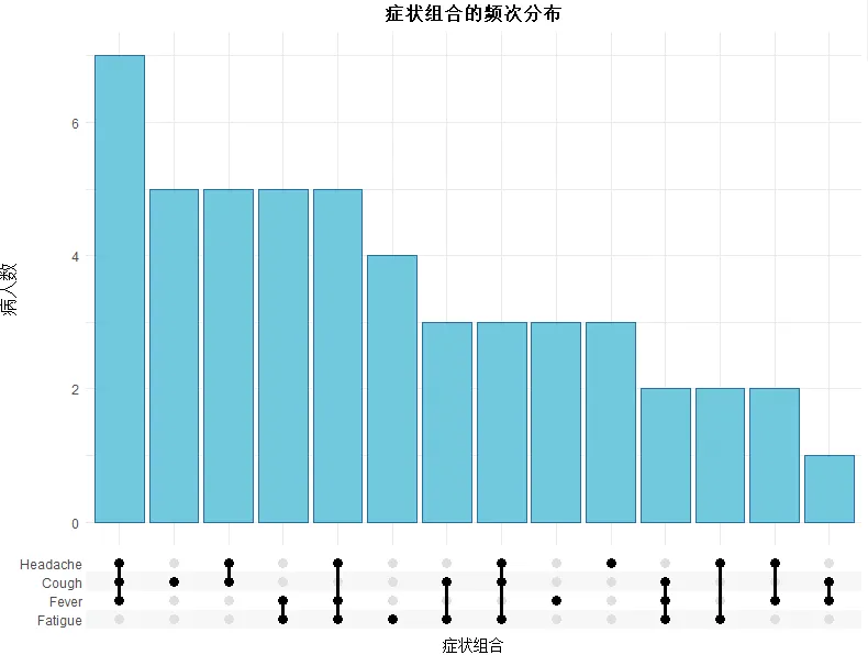
X 轴不再是单一症状,而是“症状组合”的矩阵点阵图
每个组合下方有竖向柱状图,表示该组合出现的频次
矩阵中的点表示该组合包含哪些症状
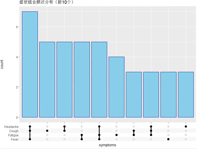
4.2 仅显示前 N 个组合
ggplot(df_symptom, aes(x = symptoms)) +scale_x_upset(n_intersections = 10) + # 只显示前10个组合geom_bar(fill = "skyblue", color = "navy") +labs(title = "症状组合频次分布(前10个)")
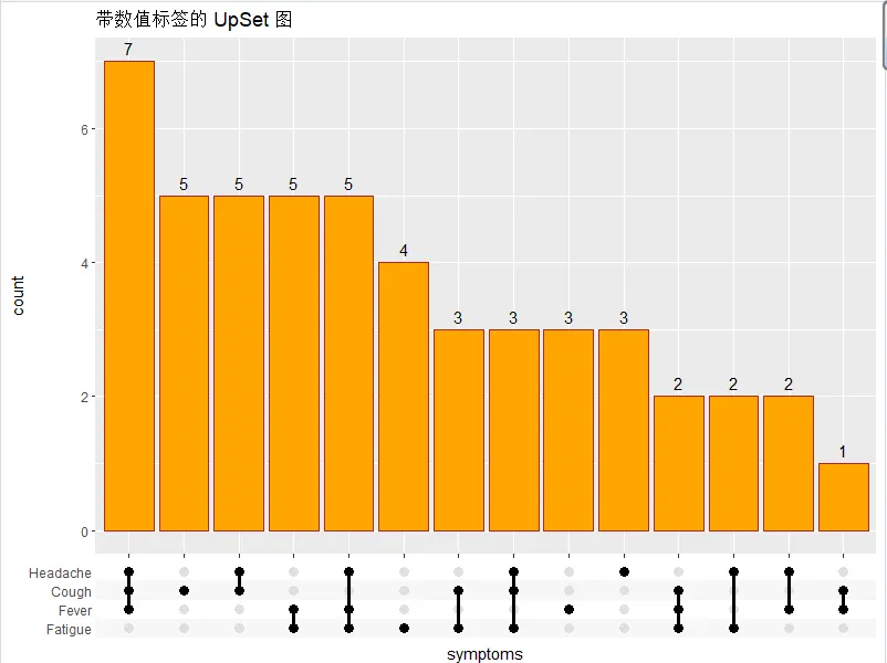
4.3 在柱子上方添加数量标签
ggplot(df_symptom, aes(x = symptoms)) +scale_x_upset() +geom_bar(fill = "orange", color = "brown") +geom_text(stat = "count", aes(label = after_stat(count)),vjust = -0.5, size = 4) +labs(title = "带数值标签的 UpSet 图")
4.4 控制排序方式
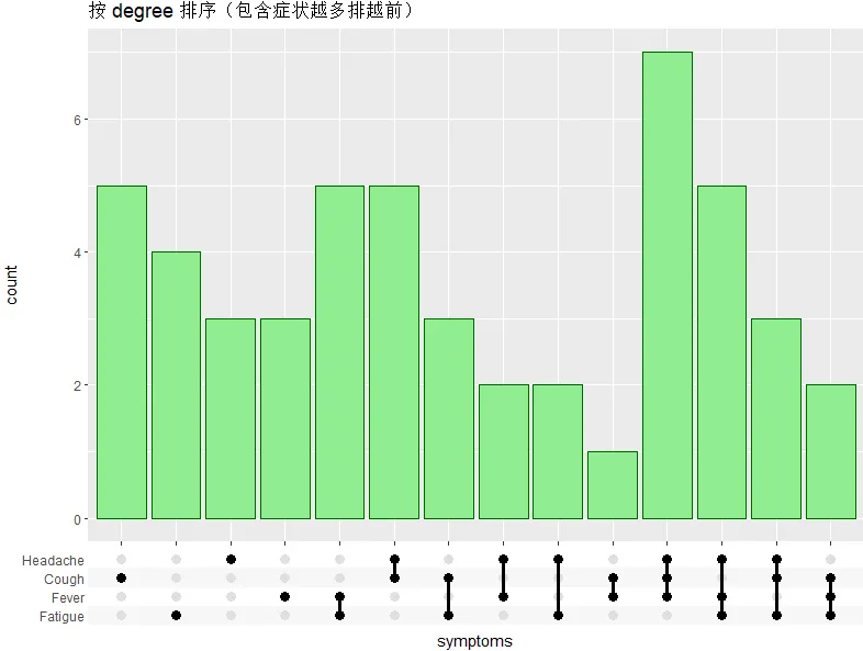
# 按组合中包含的集合数量排序(degree)ggplot(df_symptom, aes(x = symptoms)) +scale_x_upset(order_by = "degree") +geom_bar(fill = "lightgreen", color = "darkgreen") +labs(title = "按 degree 排序(包含症状越多排越前)")
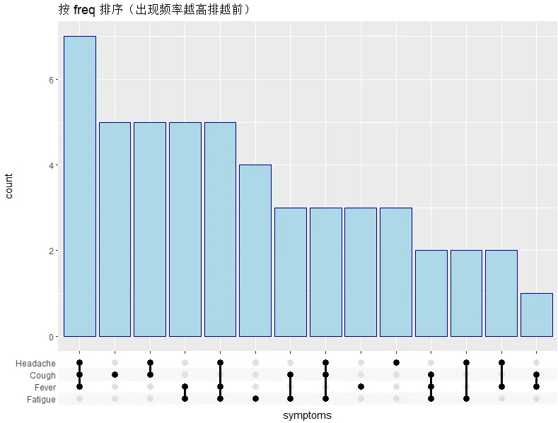
# 按组合出现频率排序(freq,默认)ggplot(df_symptom, aes(x = symptoms)) +scale_x_upset(order_by = "freq") +geom_bar(fill = "lightblue", color = "darkblue") +labs(title = "按 freq 排序(出现频率越高排越前)")
4.5 矩阵区域的美化
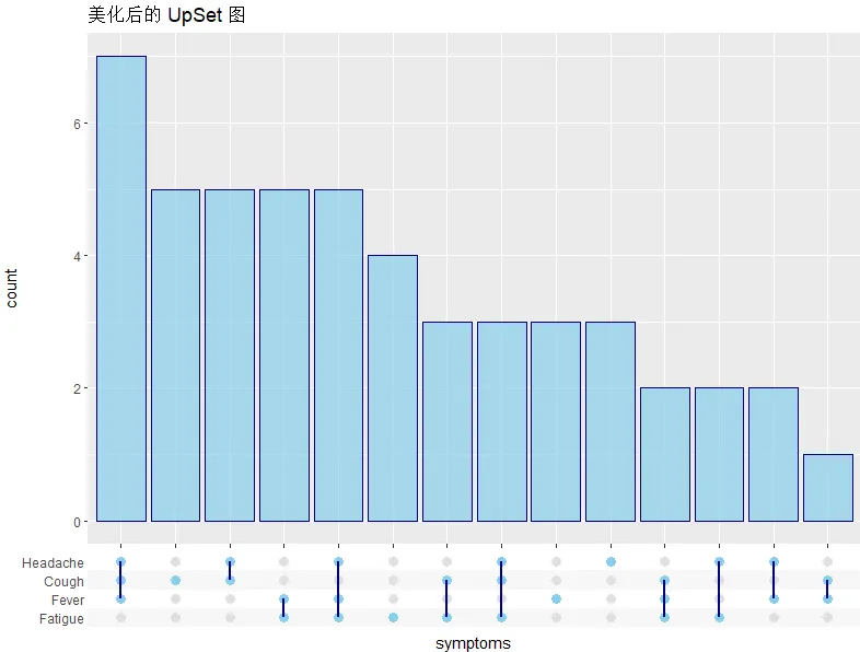
ggplot(df_symptom, aes(x = symptoms)) +scale_x_upset() +geom_bar(fill = "skyblue", color = "navy", alpha = 0.7) +theme_combmatrix(combmatrix.panel.point.color.fill = "skyblue", # 矩阵点的填充色combmatrix.panel.line.color = "navy", # 矩阵连线的颜色combmatrix.panel.line.size = 1, # 连线粗细combmatrix.label.make_space = TRUE # 标签区域留白) +labs(title = "美化后的 UpSet 图")
五、进阶用法:与 ggplot2 图层混搭
这部分是 ggupset 最强大的能力——由于完全融入 ggplot2 生态,你可以把 UpSet 图的 x 轴组合矩阵应用于任何几何对象,实现各种自定义可视化。
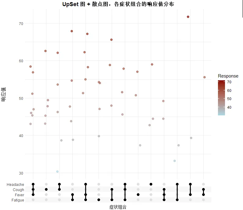
5.1 叠加散点图(展示每个样本的严重程度)
# 生成一个随机响应值(例如治疗效果评分)set.seed(123)df_with_response <- df_symptom %>%mutate(response = rnorm(50, mean = 50, sd = 10))# 为每个组合添加散点,展示响应值的分布ggplot(df_with_response, aes(x = symptoms, y = response)) +scale_x_upset() +geom_jitter(aes(color = response), width = 0.2, alpha = 0.7, size = 2.5) +scale_color_gradient(low = "lightblue", high = "darkred", name = "Response") +labs(title = "UpSet 图 + 散点图:各症状组合的响应值分布",x = "症状组合",y = "响应值") +theme_minimal() +theme(axis.text.x = element_text(angle = 45, hjust = 1),plot.title = element_text(hjust = 0.5, face = "bold"))
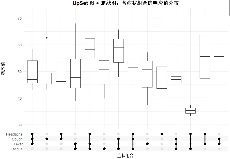
5.2 叠加箱线图(展示分布特征)
# 绘制箱线图ggplot(df_with_response, aes(x = symptoms, y = response)) +geom_boxplot(width = 0.7) +scale_x_upset() +labs(title = "UpSet 图 + 箱线图:各症状组合的响应值分布",x = "症状组合",y = "响应值") +theme_minimal() +theme(axis.text.x = element_text(angle = 45, hjust = 1),plot.title = element_text(hjust = 0.5, face = "bold"))
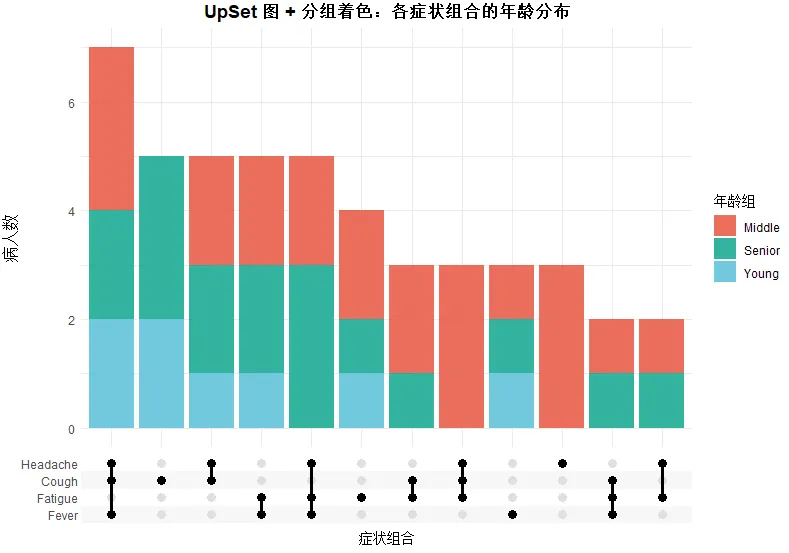
5.3 按分组着色(映射离散变量)
# 添加分组信息(例如年龄段)df_grouped <- df_with_response %>%mutate(age_group = sample(c("Young", "Middle", "Senior"), 50, replace = TRUE))ggplot(df_grouped, aes(x = symptoms, fill = age_group)) +scale_x_upset(n_intersections = 12) +geom_bar(position = "stack", alpha = 0.8) +scale_fill_manual(values = c("Young" = "#4DBBD5", "Middle" = "#E64B35", "Senior" = "#00A087"),name = "年龄组") +labs(title = "UpSet 图 + 分组着色:各症状组合的年龄分布",x = "症状组合",y = "病人数") +theme_minimal() +theme(axis.text.x = element_text(angle = 45, hjust = 1),plot.title = element_text(hjust = 0.5, face = "bold"))
5.4 分面展示多组数据
# 模拟多个研究队列df_facet <- bind_rows(df_grouped %>% mutate(cohort = "Cohort_A"),df_grouped %>% mutate(cohort = "Cohort_B", response = response + 5),df_grouped %>% mutate(cohort = "Cohort_C", response = response - 3))ggplot(df_facet, aes(x = symptoms)) +scale_x_upset(n_intersections = 10) +geom_bar(aes(fill = cohort), position = "dodge", alpha = 0.7) +facet_wrap(~cohort, ncol = 1, scales = "free_y") +scale_fill_manual(values = c("Cohort_A" = "#4DBBD5", "Cohort_B" = "#E64B35", "Cohort_C" = "#00A087"),name = "研究队列") +labs(title = "UpSet 图 + 分面:不同队列的症状组合对比",x = "症状组合",y = "病人数") +theme_minimal() +theme(axis.text.x = element_text(angle = 45, hjust = 1),plot.title = element_text(hjust = 0.5, face = "bold"),strip.text = element_text(face = "bold"))

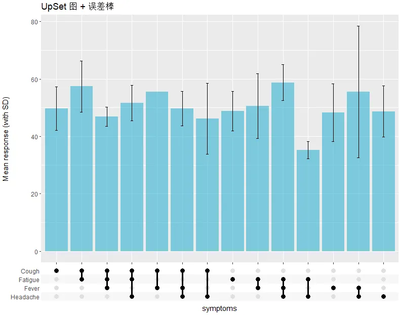
5.5 添加误差棒(Error bars)
df_stats <- df_with_response %>%mutate(comb_str = as.character(map(symptoms, ~ paste(sort(.x), collapse = ",")))) %>%group_by(comb_str, symptoms) %>%summarise(mean_resp = mean(response), sd_resp = sd(response), .groups = "drop")ggplot(df_stats, aes(x = symptoms)) +scale_x_upset() +geom_col(aes(y = mean_resp), fill = "#4DBBD5", alpha = 0.7) +geom_errorbar(data = df_stats[!is.na(df_stats$sd_resp), ],aes(x = symptoms,ymin = mean_resp - sd_resp, ymax = mean_resp + sd_resp), width = 0.1) +labs(title = "UpSet 图 + 误差棒", y = "Mean response (with SD)")
 六、本推文参考资料
ggupset GitHub Repository: https://github.com/const-ae/ggupset
ggupset CRAN Page: https://cran.r-project.org/package=ggupset
七、最后说两句
ggupset 不是唯一画 UpSet 图的 R 包(UpSetR、ComplexUpset 都挺强),但它最大的优势就是融入了整个 ggplot2 生态。无论是修改主题、添加注释,还是叠加额外图层,都顺手。
以上就是本期的全部内容,希望能帮你彻底掌握 ggupset 的用法。如果你对 UpSet 图有其他疑问,欢迎在评论区留言。
公众号:科研后花园原创教程,转载请注明出处
PS: 以上内容是小编个人学习代码笔记分享,仅供参考学习,欢迎大家一起交流学习。

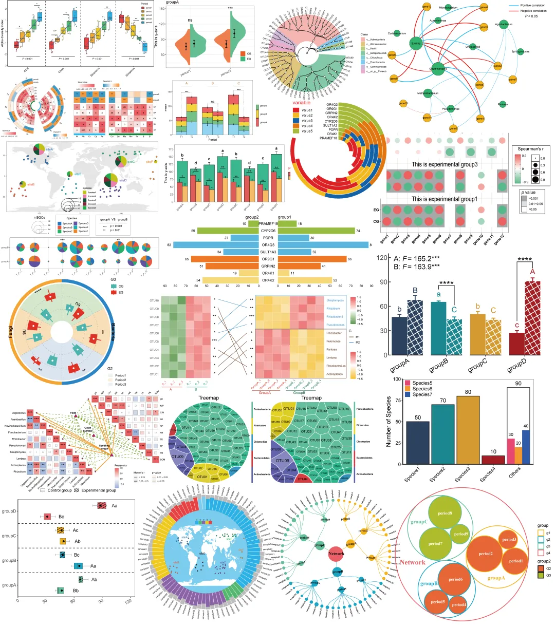
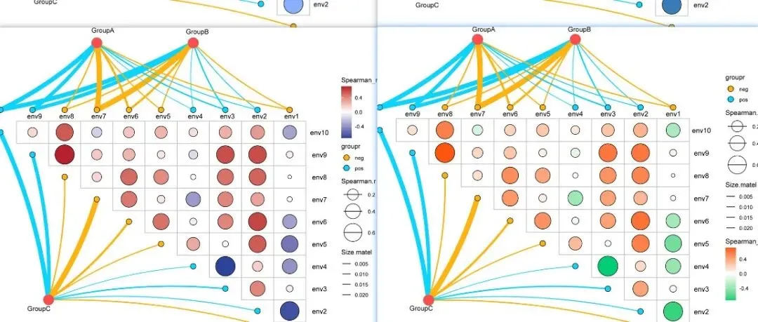
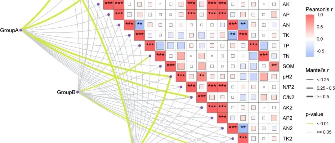
「R绘图模板」Mantel test 进阶玩法:多组学整合分析可视化(附R代码)!!!
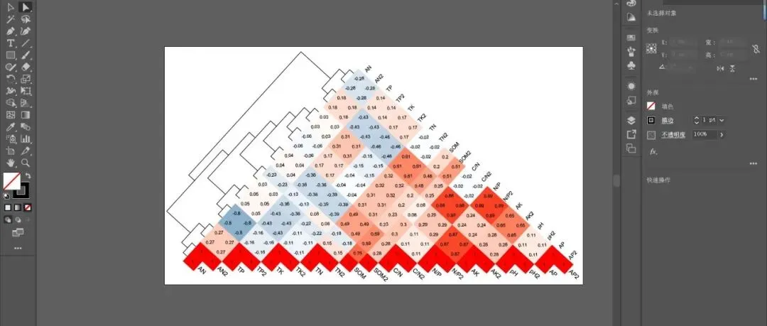
「R绘图模板」正三角相关性热图+聚类树:一张图看懂变量间的“朋友圈”!!!
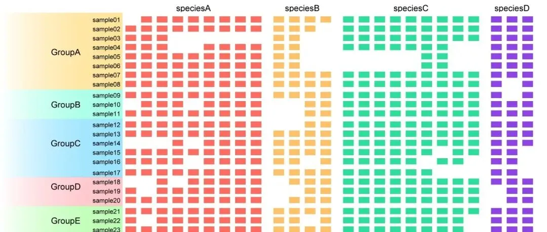
「R绘图模板」存在-缺失热图:一张图看懂数据的“有”和“无”!!!
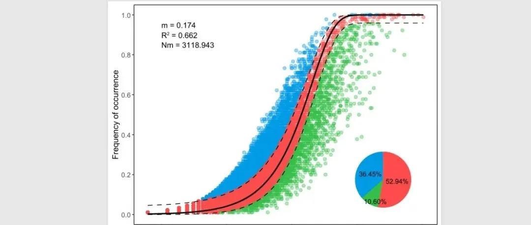
「R绘图模板」中性群落模型:解密微生物群落构建的“随机密码”!!!
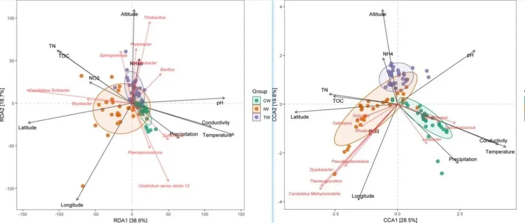
「R绘图模板」RDA&dbRDA&CCA可视化!!!
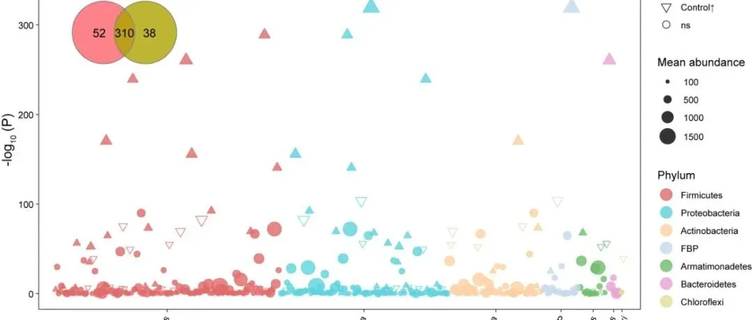
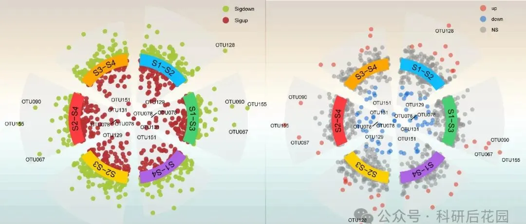
「R绘图模板」Communications Earth & Environment | 组合图系列—曼哈顿图+Venn图展示富集OTU情况!!!
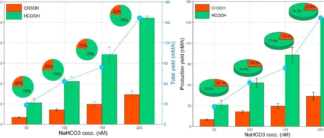
「R绘图模板」Science Advances | 组合图-并列柱状图+饼图+折线图!!!
「R绘图模板」J. Agric. Food Chem. | 分面组合图-字母标记显著性柱状图+传统显著性标记箱线图!!!
「R绘图模板」主成分分析(PCA)+各类型边缘图!!!
「R绘图模板」Field Crops Res. | 组合图系列—三元图+条形图展示微生物丰度信息!!!
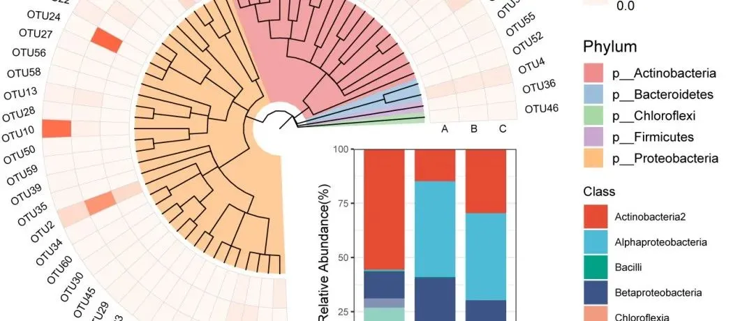
「R绘图模板」Nat. Commun | 复杂tree注释—分支颜色+多层离散热图+分组条形图!!!
「R绘图模板」多色系热图+分组气泡图!!!
「R绘图模板」配对连线图+均值点及连线+显著性+嵌套分组!!!