 夜雨聆风
夜雨聆风和前端开发不同,NativeScript 目标运行于 APP 之上故而有其独特的布局系统。今天我们就好好了解一下 NativeScript 的布局机制。
网上有很好的学习资源 https://www.nslayouts.com/[1],我们翻译一下转为该教程。
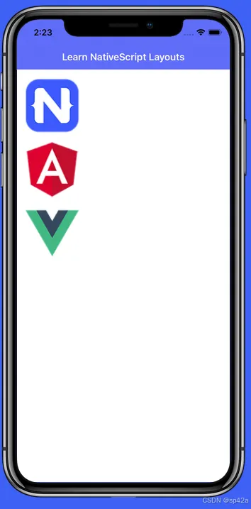
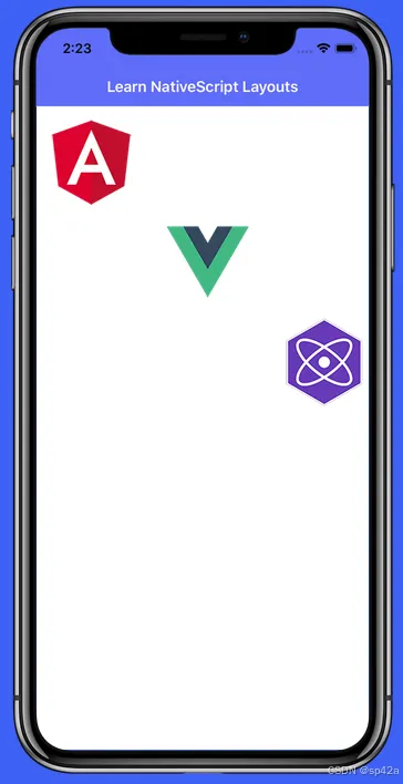
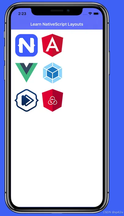
<StackLayout>布局
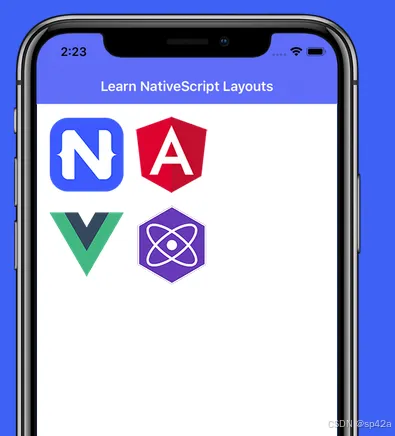
StackLayout 布局,默认按照垂直方向排列元素。
<StackLayoutorientation="vertical"><Imagesrc="res://nativescript"stretch="none"></Image><Imagesrc="res://angular"stretch="none"></Image><Imagesrc="res://vue"stretch="none"></Image></StackLayout>
修改属性StackLayout orientation="horizontal"为水平方向布局: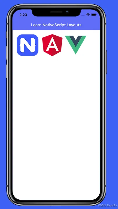
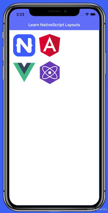
居中显示
设定<StackLayout orientation="horizontal" horizontalAlignment="center">: 水平、垂直居中
<StackLayout orientation="horizontal" horizontalAlignment="center" verticalAlignment="center">:
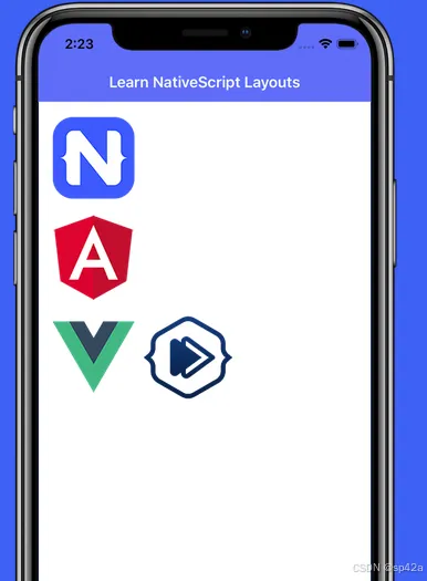
 子元素自己也可以设置水平对齐:
<StackLayoutorientation="vertical"><Imagesrc="res://angular"stretch="none"horizontalAlignment="left"></Image><Imagesrc="res://vue"stretch="none"horizontalAlignment="center"></Image><Imagesrc="res://preact"stretch="none"horizontalAlignment="right"></Image></StackLayout>
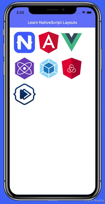
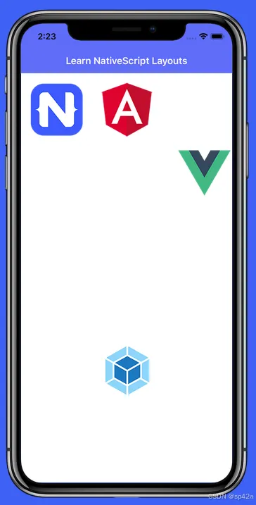
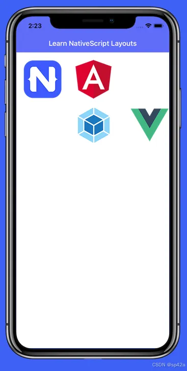
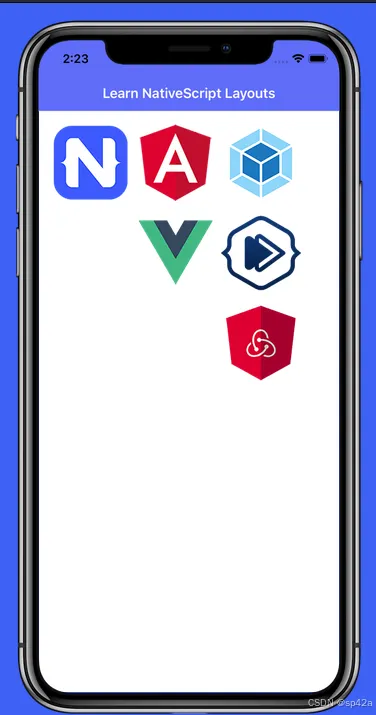
<WrapLayout>布局
<WrapLayout>布局将组件彼此环绕,填满可用空间(要么水平方向——按行,要么垂直方向——按列)。默认情况下,<WrapLayout>的方向是水平的。
<WrapLayoutorientation="horizontal"><Imagesrc="res://nativescript"stretch="none"></Image><Imagesrc="res://angular"stretch="none"></Image><Imagesrc="res://vue"stretch="none"></Image><Imagesrc="res://preact"stretch="none"></Image><Imagesrc="res://webpack"stretch="none"></Image><Imagesrc="res://redux"stretch="none"></Image><Imagesrc="res://nativescripting"stretch="none"></Image></WrapLayout>
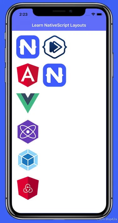
 改为垂直方向,也就是按列(Column)排列
<WrapLayoutorientation="vertical"><Imagesrc="res://nativescript"stretch="none"></Image><Imagesrc="res://angular"stretch="none"></Image><Imagesrc="res://vue"stretch="none"></Image><Imagesrc="res://preact"stretch="none"></Image><Imagesrc="res://webpack"stretch="none"></Image><Imagesrc="res://redux"stretch="none"></Image><Imagesrc="res://nativescripting"stretch="none"></Image></WrapLayout>
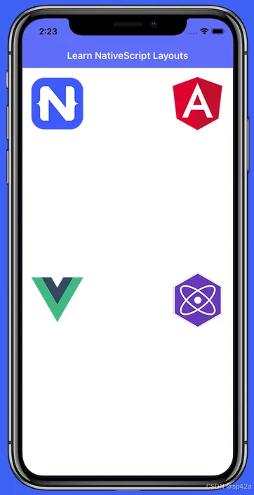
<AbsoluteLayout>绝对布局
<AbsoluteLayout>类似于 Web 的绝对布局,通过布局容器的 top/left 值来定位组件。如下所示,只需为每个 Image 组件分配 top 和 left 属性,:
<Image src="res://nativescript" stretch="none" top="10" left="10" />[...] top="10" left="170"[...] top="170" left="10"[...] top="170" left="170"
⚠️ 提示:top/left 属性的值是"密度无关像素"(一种测量单位,允许布局设计独立于屏幕密度)。
<AbsoluteLayout><Imagesrc="res://nativescript"stretch="none"top="10"left="10"></Image><Imagesrc="res://angular"stretch="none"top="10"left="170"></Image><Imagesrc="res://vue"stretch="none"top="170"left="10"></Image><Imagesrc="res://preact"stretch="none"top="170"left="170"></Image></AbsoluteLayout>
 当你需要用其他布局容器无法实现的方式来定位组件时,就能看出
<AbsoluteLayout>的真正强大之处。例如假设你想让组件重叠。我们该如何实现呢?显而易见的方法是简单地设置新的 top/left 值就完事了。不过我们要尝试一种不同的方法,那就是给元素添加一个 margin 属性。是的,就是你在网页上使用的相同 CSS margin!
在这个例子中,继续给第二个 Image 元素添加 30 的 margin,看看会发生什么。
<AbsoluteLayout><Imagesrc="res://webpack"stretch="none"top="10"left="10"></Image><Imagesrc="res://redux"stretch="none"top="10"left="10"margin="30"></Image></AbsoluteLayout>
<DockLayout>布局
通常在想要将元素定位在其父容器(通常是页面/视图本身)的侧面时使用 <DockLayout>。这里我们把图标停靠在屏幕的左侧/顶部/右侧/底部。请注意 stretchLastChild 属性,因为这将在下一课中发挥作用。
<DockLayoutstretchLastChild="false"><Imagesrc="res://nativescript"stretch="none"dock="left"></Image><Imagesrc="res://angular"stretch="none"dock="top"></Image><Imagesrc="res://vue"stretch="none"dock="right"></Image><Imagesrc="res://webpack"stretch="none"dock="bottom"></Image></DockLayout>
 将
将 stretchLastChild 设置为 true 实际上可以让你在父容器的中间"停靠"一个项目。名称中的 LastChild 部分是关键,它告诉你列出的最后一个元素将是被拉伸或居中显示在你的布局中的元素。
这次,继续将 stretchLastChild 设置为 true,看看我们的元素会发生什么变化。
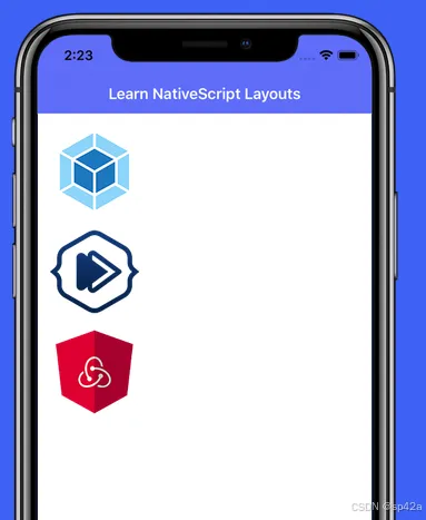
<GridLayout>布局
<GridLayout> 跟 HTML 表格很类似,一样有行和列,你需要指定行/列的大小(以及每个元素应该放入哪个行/列)。
这个例子将创建一个两列布局,并且两列都使用自动调整大小(稍后会有更多介绍)。你只需要在下面的每个元素中填入适当的基于 0 的索引列即可。
<GridLayoutcolumns="auto, auto"rows="auto"><Imagesrc="res://nativescripting"stretch="none"row="0"col=""></Image><Imagesrc="res://redux"stretch="none"row="0"col=""></Image></GridLayout>
下面例子中对 <GridLayout> 中添加一些行,将六个图像元素组织成一个两列三行的布局。同样,我们会在后续课程中解释 auto 到底是什么意思。
<GridLayoutcolumns="auto, auto"rows="auto, auto, auto"><Imagesrc="res://nativescript"stretch="none"row=""col="0"></Image><Imagesrc="res://angular"stretch="none"row=""col="1"></Image><Imagesrc="res://vue"stretch="none"row=""col="0"></Image><Imagesrc="res://webpack"stretch="none"row=""col="1"></Image><Imagesrc="res://nativescripting"stretch="none"row=""col="0"></Image><Imagesrc="res://redux"stretch="none"row=""col="1"></Image></GridLayout>
现在我们可以看看 <GridLayout> 的下一个类似 HTML 的属性,colSpan。就像 HTML 表格一样,我们可以使用这个属性让一个元素跨越多列。
下例子中设置第二行中的图像跨越所有三列。
<GridLayoutcolumns="auto, auto, auto"rows="auto, auto"><Imagesrc="res://nativescript"stretch="none"row="0"col="0"></Image><Imagesrc="res://angular"stretch="none"row="0"col="1"></Image><Imagesrc="res://vue"stretch="none"row="0"col="2"></Image><Imagesrc="res://preact"stretch="none"row="1"col="0"colSpan="3"></Image></GridLayout>
 现在我们把
现在我们把 <GridLayout> 颠倒过来 🙃 并学习一下 rowSpan 属性。同样,像 HTML 表格一样,使用 rowSpan 我们可以让一个元素跨越多行。
现在我们可以让我们的布局更加巧妙,以独特的方式排列我们的图像元素。继续并使用 rowSpan 属性作用于前两列中的元素,使得第一列有一个图像,第二列有两个,第三列有三个。
<GridLayoutcolumns="auto, auto, auto"rows="auto, auto, auto"><Imagesrc="res://nativescript"row="0"col="0"rowSpan="3"></Image><Imagesrc="res://angular"row="0"col="1"></Image><Imagesrc="res://vue"row="1"col="1"rowSpan="2"></Image><Imagesrc="res://webpack"row="0"col="2"></Image><Imagesrc="res://nativescripting"row="1"col="2"></Image><Imagesrc="res://redux"row="2"col="2"></Image></GridLayout>
 回想一下之前的课程中我们使用的语法,如
 columns="auto" 和 rows="auto"?当我们使用 auto 时,我们是在告诉我们的布局根据元素的实际大小自动调整列/行的尺寸。
但是如果我们想要给某一列使用特定的宽度怎么办?幸运的是,我们可以通过简单地代入一个数值来处理这个问题。让我们把图像稍微分散一点,并在我们的第一列上使用 200 的固定宽度,在我们的第一行上也使用 200 的固定宽度。
<GridLayoutcolumns=", auto"rows=", auto"><Imagesrc="res://webpack"stretch="none"row="0"col="0"></Image><Imagesrc="res://nativescripting"stretch="none"row="0"col="1"></Image><Imagesrc="res://redux"stretch="none"row="1"col="0"></Image><Imagesrc="res://preact"stretch="none"row="1"col="1"></Image></GridLayout>

我们通过查看调整行或列大小的最后一种方式来结束 <GridLayout> 的学习,那就是星号(*)大小调整。星号大小调整允许行/列在为固定宽度和自动宽度列分配空间后(在所有星号大小的列中按比例分配),占据尽可能多的空间。您是否还感到困惑 😕?可以这样理解:
•"星号" == 贪婪(占据所有它可以占据的空间)•"自动" == 吝啬(只占据它需要的空间)
看看一个类似于上一课中图像放置的示例。但这次将使用星号大小调整并添加乘数,使第一列和第一行的空间加倍(提示:2* 给您两倍于*的空间)。
<GridLayoutcolumns="2*, *"rows="2*, *"><Imagesrc="res://nativescript"stretch="none"row="0"col="0"></Image><Imagesrc="res://angular"stretch="none"row="0"col="1"></Image><Imagesrc="res://vue"stretch="none"row="1"col="0"></Image><Imagesrc="res://preact"stretch="none"row="1"col="1"></Image></GridLayout>
嵌套布局
通过将布局相互嵌套,您可以创建几乎任何可能的用户界面。但我们先从简单的开始,只需将一个<StackLayout>嵌套在另一个<StackLayout>内部即可。
<StackLayout><StackLayout><Imagesrc="res://webpack"stretch="none"></Image><Imagesrc="res://nativescripting"stretch="none"></Image><Imagesrc="res://redux"stretch="none"></Image></StackLayout></StackLayout>
 诚然,这不是嵌套布局最现实的用法,因为输出结果与仅使用一个
 <StackLayout> 相同!
通过在一个单独的 <StackLayout> 中嵌入两个 <StackLayout> 元素,并将这两个布局水平对齐。⚠️ 在这种情况下,您会发现第一个 <StackLayout> 的 orientation 属性仅适用于其直接子容器(在这种情况下是另外两个布局)。
<StackLayoutorientation="horizontal"><StackLayout><Imagesrc="res://nativescript"stretch="none"></Image><Imagesrc="res://vue"stretch="none"></Image></StackLayout><StackLayout><Imagesrc="res://angular"stretch="none"></Image><Imagesrc="res://preact"stretch="none"></Image></StackLayout><StackLayout>
 最后总结一下嵌套布局。这个例子将使用一个单列、两行的
 <GridLayout>(具有自动调整大小的行/列),其中包含两个 <StackLayout> 元素,每个元素都有不同的方向来放置它们包含的图像。
<GridLayoutcolumns="auto"rows="auto, auto"><StackLayoutorientation="vertical"row="0"col="0"><Imagesrc="res://nativescript"stretch="none"></Image><Imagesrc="res://angular"stretch="none"></Image></StackLayout><StackLayoutorientation="horizontal"row="1"col="0"><Imagesrc="res://vue"stretch="none"></Image><Imagesrc="res://nativescripting"stretch="none"></Image></StackLayout><GridLayout>
<RootLayout>布局
<RootLayout> 是用于以编程API动态分层视图的布局容器。
<RootLayout> 是一种布局容器,旨在用作应用程序的主要根布局容器,内置API可轻松控制动态视图层。它扩展了 GridLayout,因此具有 GridLayout 的所有功能,并增强了额外的API。
参见官网教程[2]。
<FlexboxLayout>布局
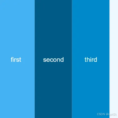
<FlexboxLayout>跟 CSS Flexbox 很类似,可以在水平和垂直方向上排列子组件。子组件按照声明的顺序放置,除非被 order 子属性覆盖。
以下示例创建了一行三个等大的元素,这些元素跨越屏幕的整个高度。
<FlexboxLayoutbackgroundColor="#3c495e"><Labeltext="first"width="70"backgroundColor="#43B3F4" /><Labeltext="second"width="70"backgroundColor="#075B88" /><Labeltext="third"width="70"backgroundColor="#1089CA" /></FlexboxLayout>
•参见官网教程[3]。•A Quick Introduction to Flexbox in NativeScript[4]•例子 http://flexboxfroggy.com/[5]
References
[1]: https://www.nslayouts.com/[2] 官网教程: https://docs.nativescript.org/ui/root-layout[3] 官网教程: https://docs.nativescript.org/ui/flexbox-layout[4] A Quick Introduction to Flexbox in NativeScript: https://blog.nativescript.org/a-quick-introduction-to-flexbox-in-nativescript/[5]: http://flexboxfroggy.com/
