 夜雨聆风
夜雨聆风日常开发 UniApp H5 页面时,接口请求、页面渲染都需要加载提示,但框架自带 loading 样式单一,文字过长还会自动换行,交互体验较差。这里封装一款居中圆点动画加载弹窗,样式精致、文字自适应不挤压,开箱即用,适配微信/浏览器 H5 环境。
具体效果如下
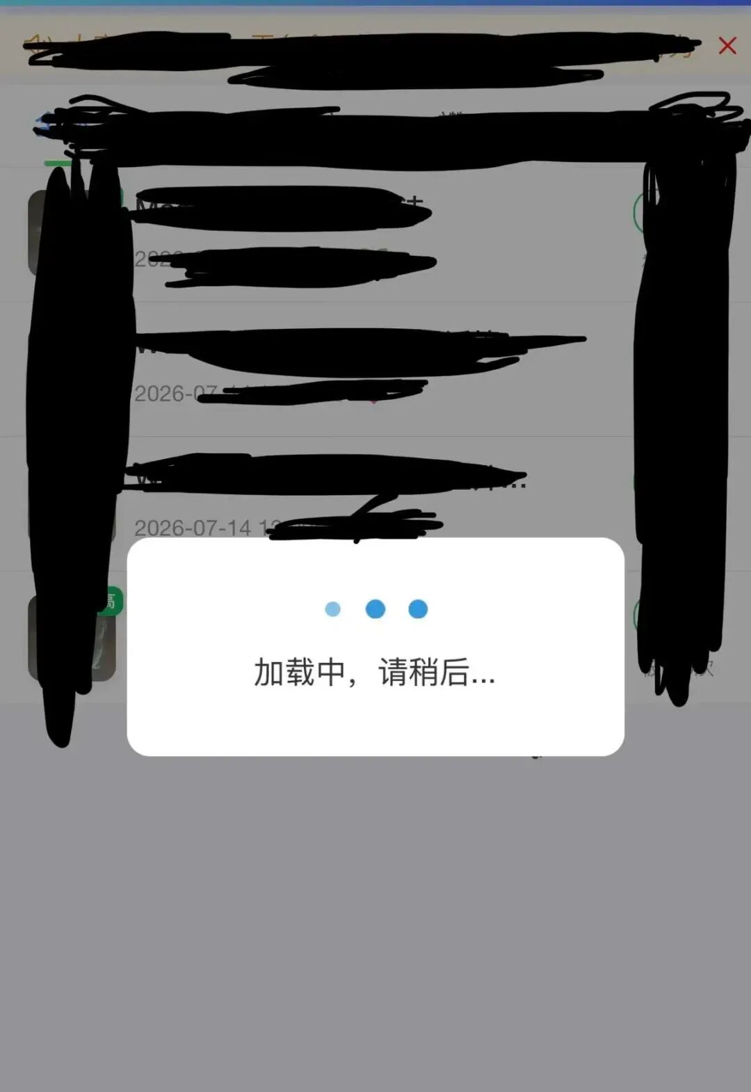
具体使用方法如下
壹、自定义 LoadingPopup 弹窗组件
为了方便使用,我们将这个提示框封装成一个单独的组件,新建文件路径:components/loading-popup/loading-popup.vue
完整组件代码如下
<template>
	<uni-popup ref="popup" type="center" :maskClick="false">
		<view class="loading-popup">
			<view class="loading-spinner">
				<view class="spinner-dot" v-for="i in 3" :key="i" :style="{animationDelay: (i - 1) * 0.15 + 's'}"></view>
			</view>
			<text class="loading-text">{{ text }}</text>
		</view>
	</uni-popup>
</template>

<script>
	export default {
		name: 'LoadingPopup',
		props: {
			text: {
				type: String,
				default: '加载中,请稍后...'
			}
		},
		methods: {
			open() {
				this.$refs.popup.open()
			},
			close() {
				this.$refs.popup.close()
			}
		}
	}
</script>

<style lang="scss" scoped>
	.loading-popup {
		width: 480rpx;
		padding: 60rpx 40rpx;
		background: #fff;
		border-radius: 24rpx;
		display: flex;
		flex-direction: column;
		align-items: center;
		justify-content: center;
	}

	.loading-spinner {
		display: flex;
		justify-content: center;
		align-items: center;
		margin-bottom: 30rpx;
	}

	.spinner-dot {
		width: 20rpx;
		height: 20rpx;
		border-radius: 50%;
		background-color: #3498db;
		margin: 0 12rpx;
		animation: spinner-bounce 1.2s ease-in-out infinite;
	}

	@keyframes spinner-bounce {
		0%, 80%, 100% {
			transform: scale(0.6);
			opacity: 0.4;
		}
		40% {
			transform: scale(1.2);
			opacity: 1;
		}
	}

	.loading-text {
		font-size: 30rpx;
		color: #333;
	}
</style>
组件说明
基于 uni-popup 实现居中遮罩弹窗,禁止点击遮罩关闭加载框,避免接口中途中断 三段圆点弹性缩放动画,视觉柔和不刺眼 圆角白色容器,宽度固定,长文本不会错乱换行,整体视觉统一美观
❝现在提示信息是写在组件里面了,如果需要可以封装单独的属性。
贰、使用教程
在需要使用的页面,直接引入组件即可使用
2.1、引入组件
import LoadingPopup from '@/components/loading-popup/loading-popup.vue'
components: {
			LoadingPopup
		},
2.2、页面放入组件
全局加载弹窗,放置页面根节点任意位置即可
<!-- 加载弹窗 -->
<LoadingPopup ref="loadingPopup"></LoadingPopup>
2.3、实际使用
接口请求、数据加载场景直接通过ref调用open() / close() 控制显隐
//打开弹窗
that.$refs.loadingPopup.open()

// 此处编写接口请求、数据渲染等业务逻辑

//关闭弹窗
that.$refs.loadingPopup.close()

