 夜雨聆风
夜雨聆风


黑色科技感背景HTML页面!!附源码!!

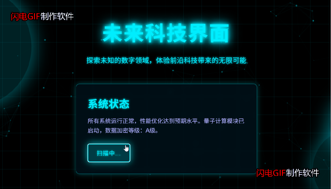
效果展示

完整源码

<!DOCTYPE html><htmllang="zh-CN"><head><metacharset="UTF-8"><metaname="viewport"content="width=device-width, initial-scale=1.0"><title>黑色科技感背景</title><linkhref="css.css"rel="stylesheet" /></head><body><divclass="grid"></div><canvasclass="particles"id="particles"></canvas><divclass="glow-elements"><divclass="glow-element element1"></div><divclass="glow-element element2"></div><divclass="glow-element element3"></div></div><divclass="container"><h1>未来科技界面</h1><pclass="subtitle">探索未知的数字领域,体验前沿科技带来的无限可能</p><divclass="tech-card"><h2>系统状态</h2><p>所有系统运行正常,性能优化达到预期水平。量子计算模块已启动,数据加密等级:A级。</p><buttonclass="btn">启动深度扫描</button></div></div><scriptsrc="js.js"></script></body></html>

* {margin: 0;padding: 0;box-sizing: border-box;}body {background-color: #000;color: #0ef;font-family: 'Arial', sans-serif;overflow: hidden;height: 100vh;position: relative;}.container {position: relative;width: 100%;height: 100vh;display: flex;flex-direction: column;justify-content: center;align-items: center;z-index: 10;}h1 {font-size: 3.5rem;margin-bottom: 1.5rem;text-transform: uppercase;letter-spacing: 3px;text-shadow: 0 0 10px #0ef, 0 0 20px #0ef, 0 0 40px #0ef;animation: pulse 2s infinite alternate;}.subtitle {font-size: 1.2rem;margin-bottom: 2rem;text-align: center;max-width: 600px;line-height: 1.6;text-shadow: 0 0 5px #0ef;}.grid {position: absolute;top: 0;left: 0;width: 100%;height: 100%;background-image:linear-gradient(rgba(0, 238, 255, 0.1) 1px, transparent 1px),linear-gradient(90deg, rgba(0, 238, 255, 0.1) 1px, transparent 1px);background-size: 50px 50px;z-index: 1;animation: gridMove 20s linear infinite;}.particles {position: absolute;top: 0;left: 0;width: 100%;height: 100%;z-index: 2;}.glow-elements {position: absolute;top: 0;left: 0;width: 100%;height: 100%;z-index: 3;}.glow-element {position: absolute;border-radius: 50%;background: rgba(0, 238, 255, 0.2);box-shadow: 0 0 40px 10px rgba(0, 238, 255, 0.5);animation: glow 5s infinite alternate;}.element1 {width: 300px;height: 300px;top: 10%;left: 5%;animation-delay: 0s;}.element2 {width: 200px;height: 200px;bottom: 10%;right: 10%;animation-delay: 2.5s;}.element3 {width: 150px;height: 150px;top: 50%;left: 80%;animation-delay: 1s;}.tech-card {background: rgba(0, 20, 30, 0.7);border: 1px solid rgba(0, 238, 255, 0.5);border-radius: 10px;padding: 2rem;margin: 1rem;max-width: 500px;box-shadow: 0 0 15px rgba(0, 238, 255, 0.3);backdrop-filter: blur(5px);z-index: 10;}.tech-card h2 {color: #0ef;margin-bottom: 1rem;font-size: 1.8rem;text-shadow: 0 0 5px #0ef;}.tech-card p {color: #aaf;line-height: 1.6;margin-bottom: 1.5rem;}.btn {background: transparent;border: 1px solid #0ef;color: #0ef;padding: 0.8rem 1.5rem;border-radius: 5px;cursor: pointer;font-size: 1rem;text-transform: uppercase;letter-spacing: 1px;transition: all 0.3s ease;text-shadow: 0 0 5px #0ef;box-shadow: 0 0 10px rgba(0, 238, 255, 0.3);}.btn:hover {background: rgba(0, 238, 255, 0.2);box-shadow: 0 0 15px rgba(0, 238, 255, 0.5);}@keyframes pulse {0% {text-shadow: 0 0 10px #0ef, 0 0 20px #0ef, 0 0 40px #0ef;}100% {text-shadow: 0 0 5px #0ef, 0 0 10px #0ef, 0 0 20px #0ef, 0 0 30px #0ef;}}@keyframes gridMove {0% {background-position: 0 0;}100% {background-position: 50px 50px;}}@keyframes glow {0% {opacity: 0.3;transform: scale(1);}100% {opacity: 0.7;transform: scale(1.1);}}/* 响应式设计 */@media (max-width: 768px) {h1 {font-size: 2.5rem;}.subtitle {font-size: 1rem;padding: 0 1rem;}.tech-card {margin: 1rem;padding: 1.5rem;}}

// 粒子系统const canvas = document.getElementById('particles');const ctx = canvas.getContext('2d');// 设置Canvas尺寸function resizeCanvas() {canvas.width = window.innerWidth;canvas.height = window.innerHeight;}resizeCanvas();window.addEventListener('resize', resizeCanvas);// 粒子类class Particle {constructor() {this.x = Math.random() * canvas.width;this.y = Math.random() * canvas.height;this.size = Math.random() * 2 + 0.5;this.speedX = Math.random() * 1 - 0.5;this.speedY = Math.random() * 1 - 0.5;this.color = `rgba(0, 238, 255, ${Math.random() * 0.5 + 0.1})`;}update() {this.x += this.speedX;this.y += this.speedY;// 边界检查if (this.x > canvas.width) this.x = 0;if (this.x < 0) this.x = canvas.width;if (this.y > canvas.height) this.y = 0;if (this.y < 0) this.y = canvas.height;}draw() {ctx.fillStyle = this.color;ctx.beginPath();ctx.arc(this.x, this.y, this.size, 0, Math.PI * 2);ctx.fill();}}// 创建粒子const particles = [];const particleCount = 150;for (let i = 0; i < particleCount; i++) {particles.push(new Particle());}// 动画循环function animate() {ctx.clearRect(0, 0, canvas.width, canvas.height);// 绘制连接线for (let i = 0; i < particles.length; i++) {for (let j = i; j < particles.length; j++) {const dx = particles[i].x - particles[j].x;const dy = particles[i].y - particles[j].y;const distance = Math.sqrt(dx * dx + dy * dy);if (distance < 100) {ctx.beginPath();ctx.strokeStyle = `rgba(0, 238, 255, ${0.2 * (1 - distance/100)})`;ctx.lineWidth = 0.5;ctx.moveTo(particles[i].x, particles[i].y);ctx.lineTo(particles[j].x, particles[j].y);ctx.stroke();}}}// 更新和绘制粒子particles.forEach(particle => {particle.update();particle.draw();});requestAnimationFrame(animate);}animate();// 添加交互效果document.querySelector('.btn').addEventListener('click', function() {this.textContent = '扫描中...';this.style.boxShadow = '0 0 20px rgba(0, 238, 255, 0.8)';setTimeout(() => {this.textContent = '扫描完成';setTimeout(() => {this.textContent = '启动深度扫描';this.style.boxShadow = '0 0 10px rgba(0, 238, 255, 0.3)';}, 2000);}, 1500);});