ARTICLE · 1379211
Nova Post App 设计研究与全套展板
发布时间:2026-11-19 06:51:32 最近访问:2026-11-19 06:51:33
Nova Post App 设计研究与全套展板
Nova Post App 设计研究与展板规划
Nova Post App Design Study & Exhibition Board Plan
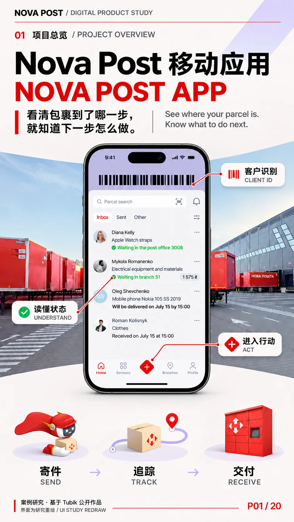
案例的核心,是把包裹的物理旅程转译成用户能读懂的状态,再让每个状态指向当下可做的事。 用户在首页快速识别哪件包裹需要关注,进入详情核对路线、时间和费用,在临近交付时再决定导航、联系快递员或调整收件安排。这三层信息分别服务于扫读、核对和行动。
The app translates a parcel’s physical journey into readable states and pairs those states with timely actions. The home screen helps users spot what needs attention, parcel details explain the route and timing, and delivery controls support decisions close to handover.
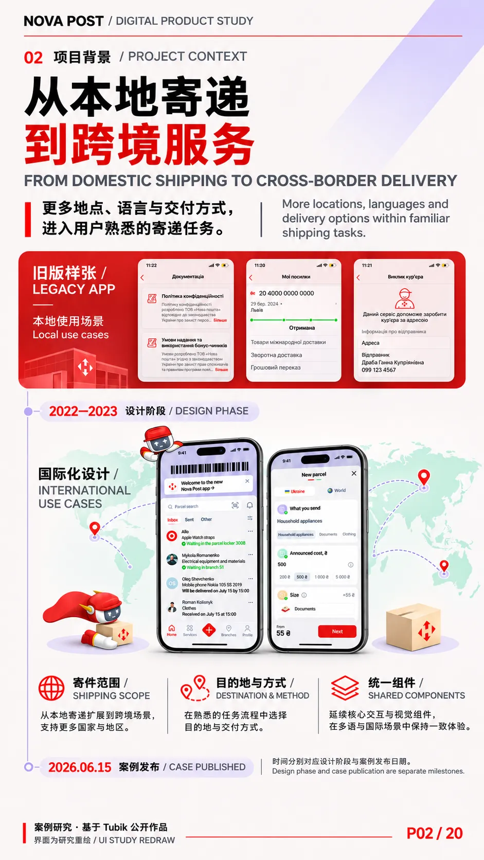
Tubik 在 2022–2023 年为走向欧洲市场的 Nova Post 重设计移动应用,并重建可延伸到其他数字产品的设计系统。艺术指导为 Ernest Asanov。Behance 案例发布于 2026 年 6 月 15 日。Behance 主页面直接访问受限,项目背景与署名通过其索引核对,界面、图标和动效分析依据 Tubik 官网原图、演示视频及其公开补充案例。
01|项目策略与双语文案
Project Strategy & Bilingual Copy
| | |
|---|
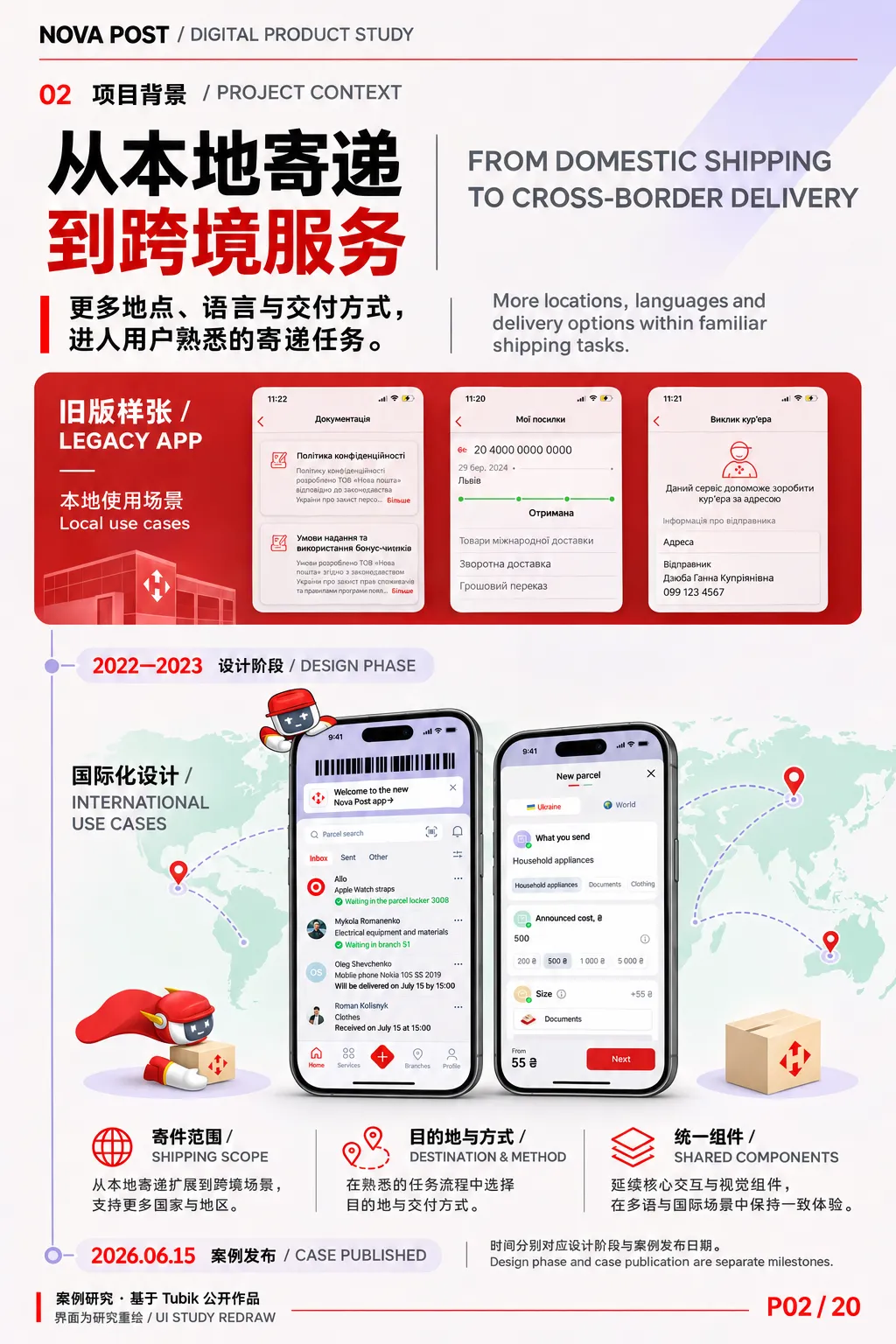
| 设计背景 | 旧版应用主要面向乌克兰本地寄递。向欧洲扩展后,界面需要容纳不同语言、寄件范围和交付方式,同时保持常用任务的入口容易辨认。 | The original app served domestic shipping in Ukraine. European expansion introduced more languages, shipment types and delivery options, while everyday tasks still needed familiar entry points. |
| 产品定位 | 把寄件、查件、网点选择和交付管理放进同一套移动体验。首页按包裹组织信息,详情页按任务提供操作。 | Sending, tracking, finding locations and managing delivery share one mobile experience. The home screen is organised around parcels, and detail screens surface actions in context. |
| 体验逻辑 | 首页先回答「哪一件需要我看」,详情回答「它到了哪一步」,地图和派送界面回答「我现在能做什么」。 | The home screen answers “Which parcel needs my attention?” Details explain progress, and maps and delivery screens clarify what the user can do now. |
| 表达语气 | 状态写明地点和时间,动作写明对象。表单先问「寄什么」「寄到哪里」,再展开需要填写的字段。Sendy 在需要解释或确认的时刻介入。 | Status messages name a place or time, and action labels name their object. Forms introduce each task before showing its fields. Sendy appears when guidance or confirmation is useful. |
以上归纳基于工作室的项目说明、首页架构和实际界面样张。
展板统领文案|Exhibition Line
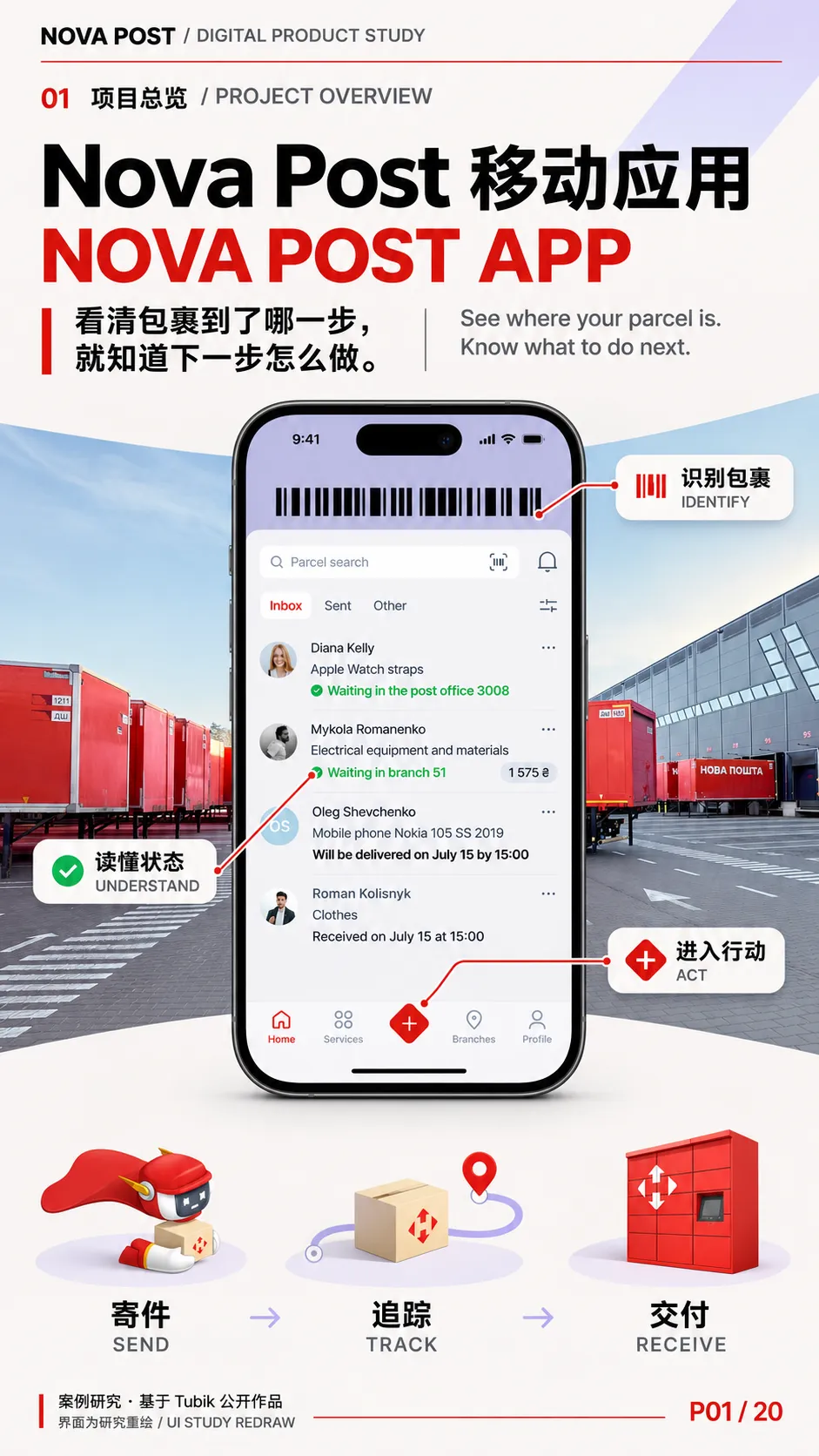
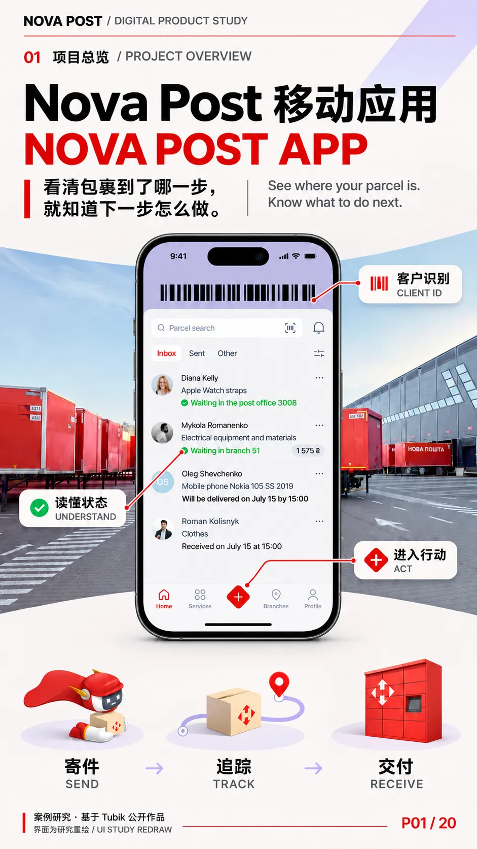
看清包裹到了哪一步,就知道下一步怎么做。See where your parcel is. Know what to do next.
这句是本次展板的提炼文案。界面术语统一采用 网点 / Branch、自提柜 / Parcel Locker、服务点 / Service Point、运单 / Waybill、改派 / Redirection。其中「改派」用于已创建包裹的交付变更,「寄件」用于创建新运单,两者在流程图中分开。
02|数字 VI 与视觉语言
Digital VI & Visual Language
这里的 VI 指原有品牌识别如何延伸到移动应用、网页与推广画面。项目图中的车辆、分拣中心与柜机可用来对照线下识别和屏幕识别。Tubik 公开的设计范围集中在应用、设计系统、插画、动效和推广页面。
| | |
|---|
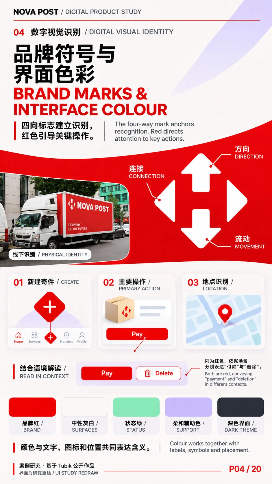
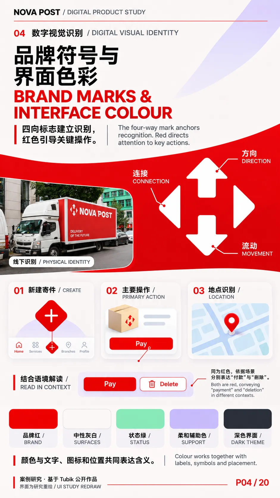
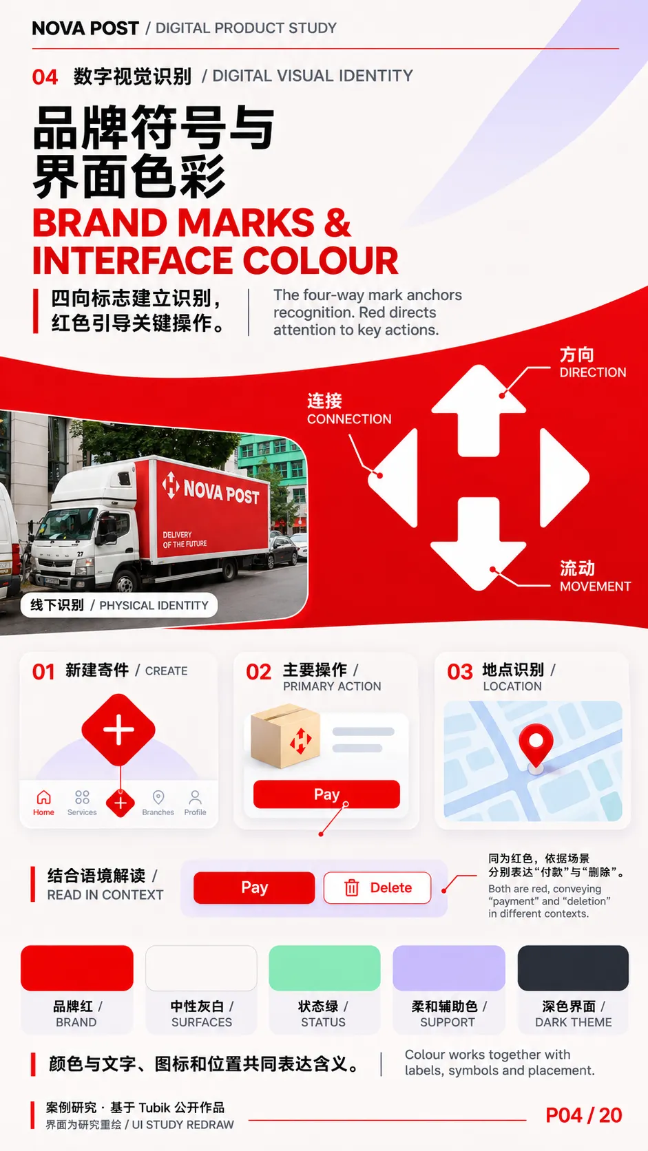
| 标志与形状 / Mark & Shape | 四向箭头和红白组合在线下车辆、设施和界面素材中反复出现。应用底栏中央的红色菱形加号与品牌轮廓形成呼应,将「新建寄件」变成容易找到的入口。 | The four-way mark and red-and-white pairing connect physical and digital touchpoints. The central diamond-shaped add button echoes the brand silhouette and makes parcel creation easy to locate. |
| 主色与界面层级 / Colour & Hierarchy | 红色集中在品牌标记、主要按钮、选中项和部分地图标记。浅灰页面托住白色卡片,深色版用近黑底和深灰卡片保持分层。红色也出现在删除操作中,因此需结合标签和位置解读。 | Red marks brand elements, primary actions, selected items and some map pins. Neutral surfaces preserve hierarchy in both themes. Labels and placement distinguish a primary action from a destructive one. |
| 辅助色与状态 / Supporting & Semantic Colour | 薄荷绿、淡紫、浅蓝和浅黄用于划分表单模块、提示场景和插画背景。绿色勾选承担已完成或已设置等语义,和文字、符号搭配使用。 | Pastel colours distinguish form groups, prompts and illustrations. Green checkmarks signal completion or a configured item in conjunction with text and symbols. |
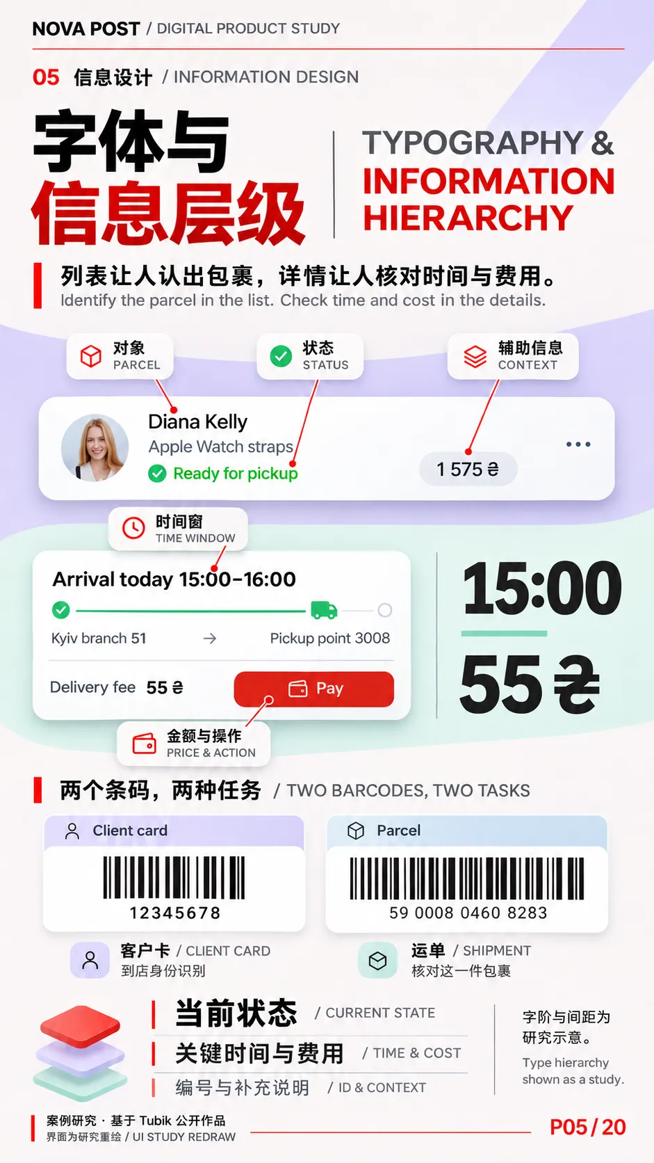
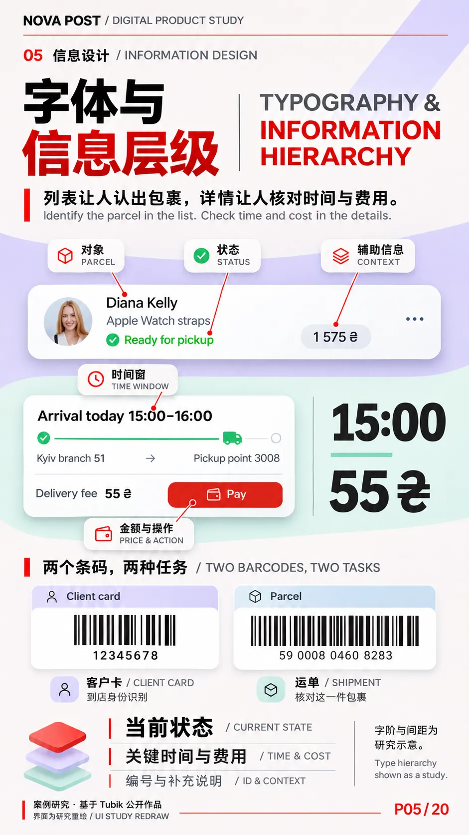
| 字体与数字 / Typography & Numbers | 无衬线字体贯穿标题、正文和字段。列表里需要快速辨认的是包裹及其当前状态,详情里则是时间窗、费用和运单编号。首页的客户卡条码与详情的运单条码应分别注释。 | Sans-serif type supports the interface hierarchy. Lists prioritise the parcel and its state, while detail screens emphasise time windows, fees and tracking numbers. Client and shipment barcodes serve different tasks. |
| 容器与图像 / Surfaces & Imagery | 圆角卡片将路线、金额、地点和操作拆成可复用模块。纪实影像交代物流发生在哪里,三维物件解释服务,角色插画负责提示与反馈。 | Rounded cards organise routes, prices, locations and actions into reusable modules. Photography establishes the setting, 3D objects explain services, and character illustration supports guidance and feedback. |
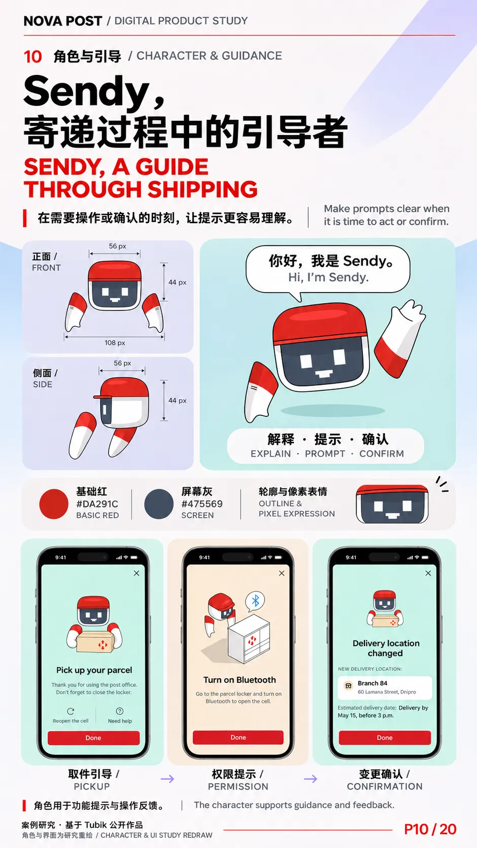
公开案例图可以用来分析视觉关系和使用场景。字体名称、全局色值及组件尺寸在本套规划中按待核实规范处理。P10 可引用角色设定图明确标注的基础红 #DA291C,标为 Sendy 角色用色。
03|Icon、三维图形与角色
Icons, 3D Graphics & Character Design
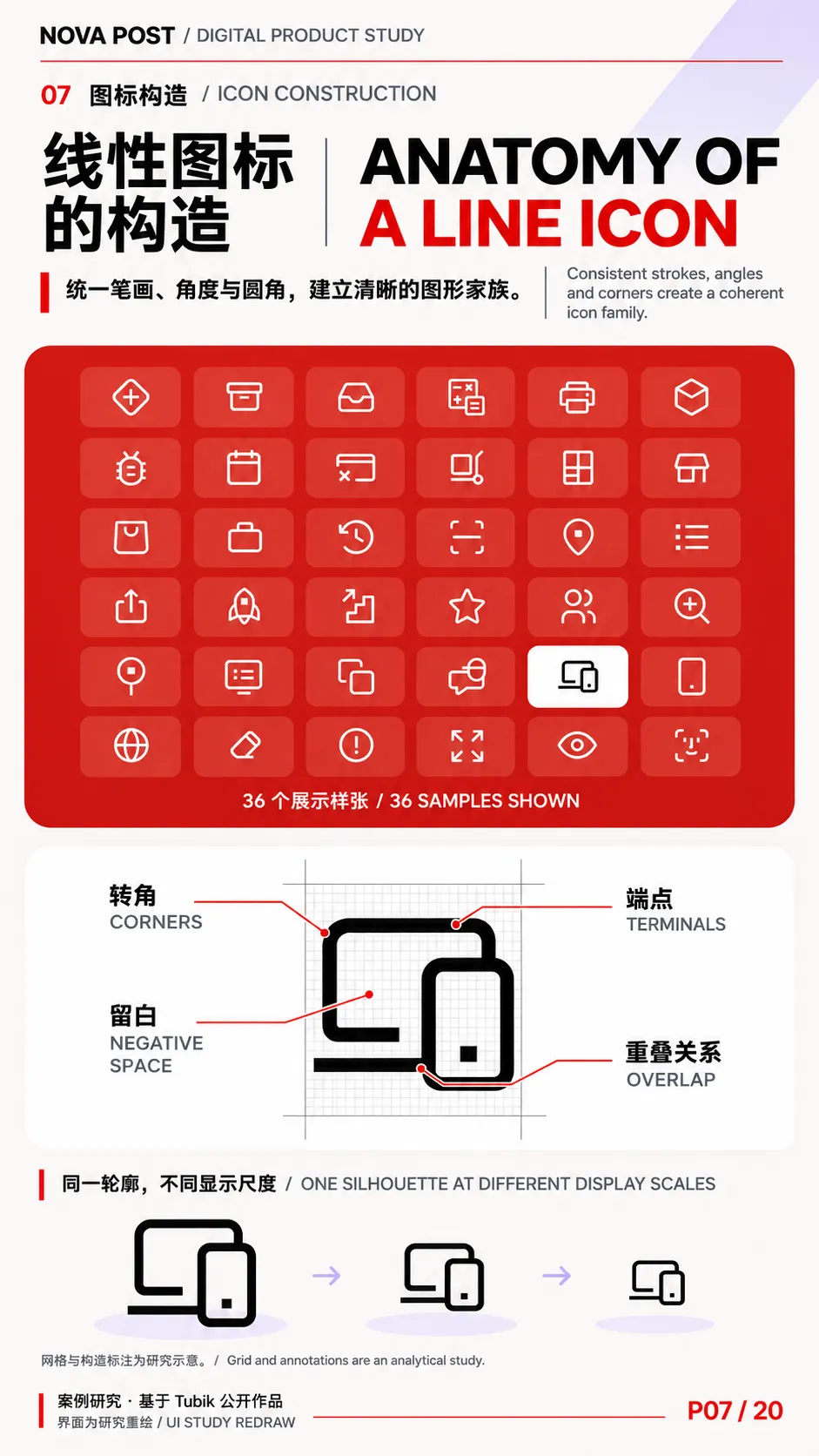
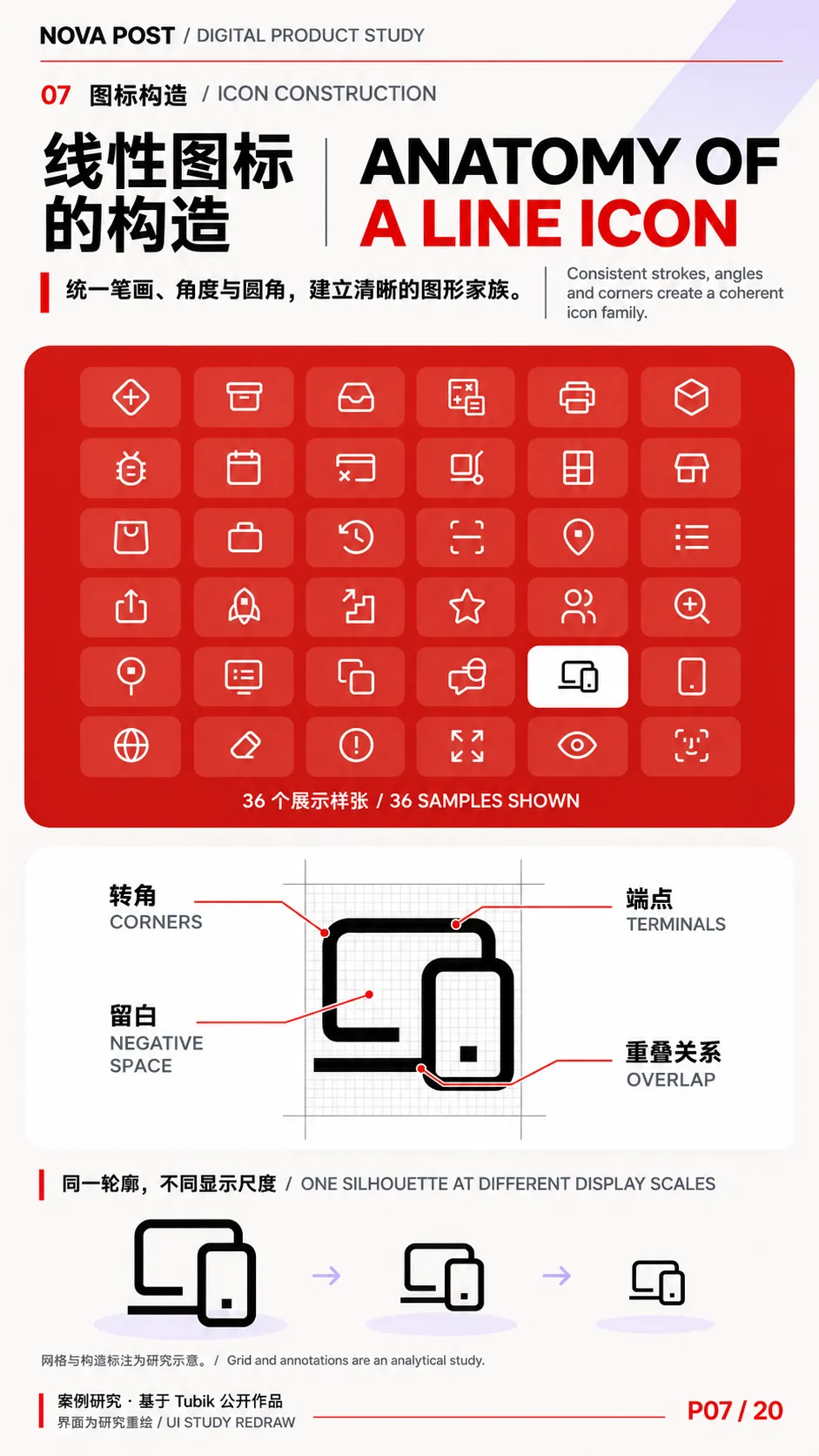
Tubik 公布的是 300 多个图标与插画的合计。官网图标样张实际展示了 6×6 的 36 个线性图标,右侧用「电脑+手机」放大演示网格构造。工作室明确提到以线宽、角度与圆角统一图形语言。
| | |
|---|
| 线性功能图标 / Functional Line Icons | 扫描用开放的取景框,柜机用分格结构,网点用门店轮廓。构造分析可放大转角、端点、负空间和重叠处理。设备图标尤其适合示范如何用断开的轮廓交代前后关系。 | Scan, locker and branch icons use recognisable silhouettes. The device icon demonstrates how a break in the outline can establish overlap while keeping a small glyph legible. |
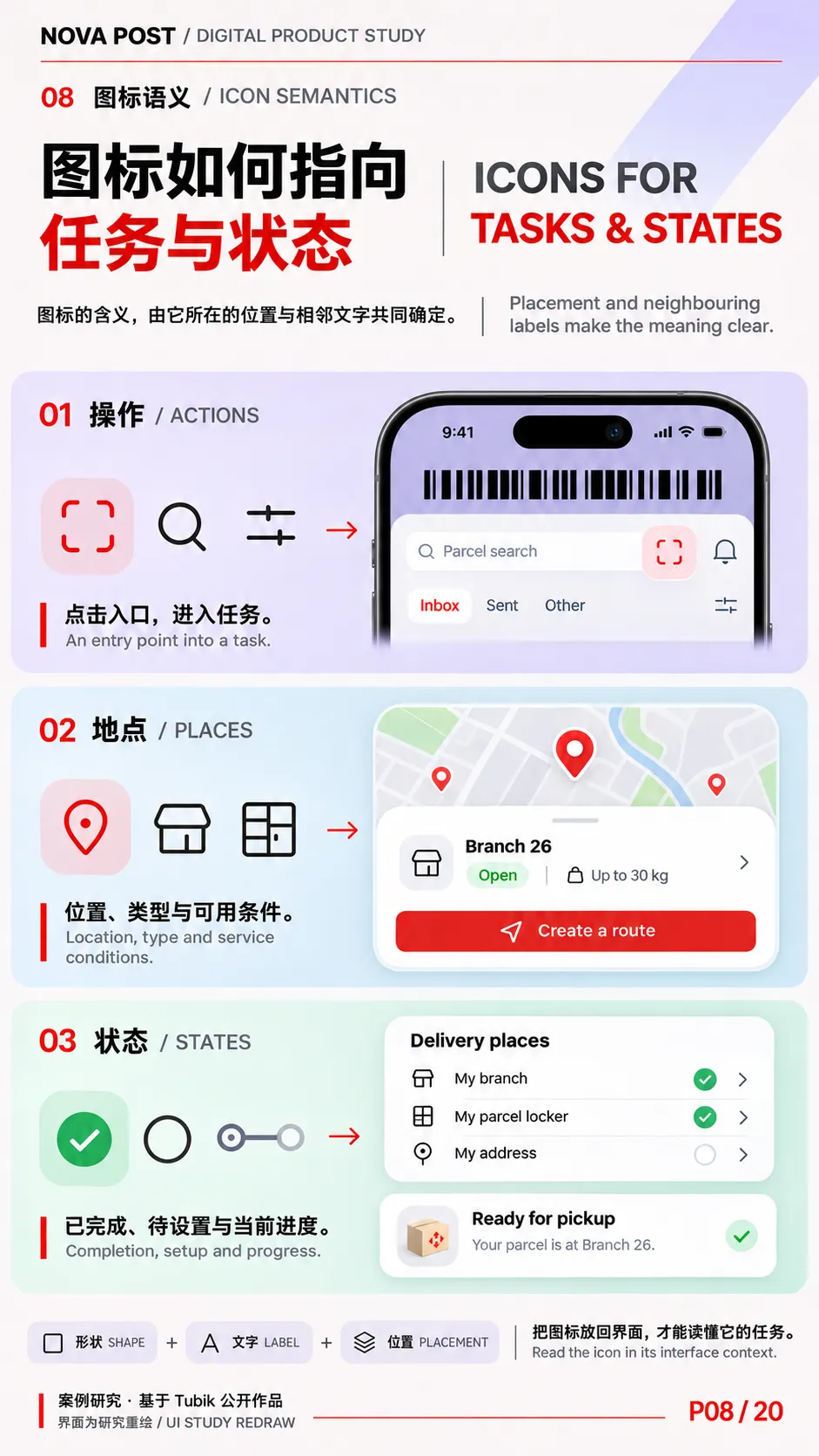
| 状态与地图标记 / Status & Map Symbols | 完成勾选、路线节点、定位针和通知角标各有不同信息任务。分析时应把图标放回列表、地图或卡片中,观察它指向哪条信息、是否可点击、旁边有哪些文字。 | Checkmarks, route nodes, map pins and notification badges gain meaning from their placement and neighbouring labels. Their role becomes clear in the interface. |
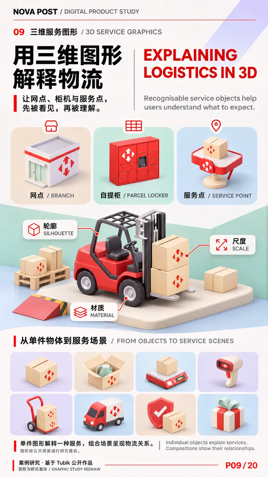
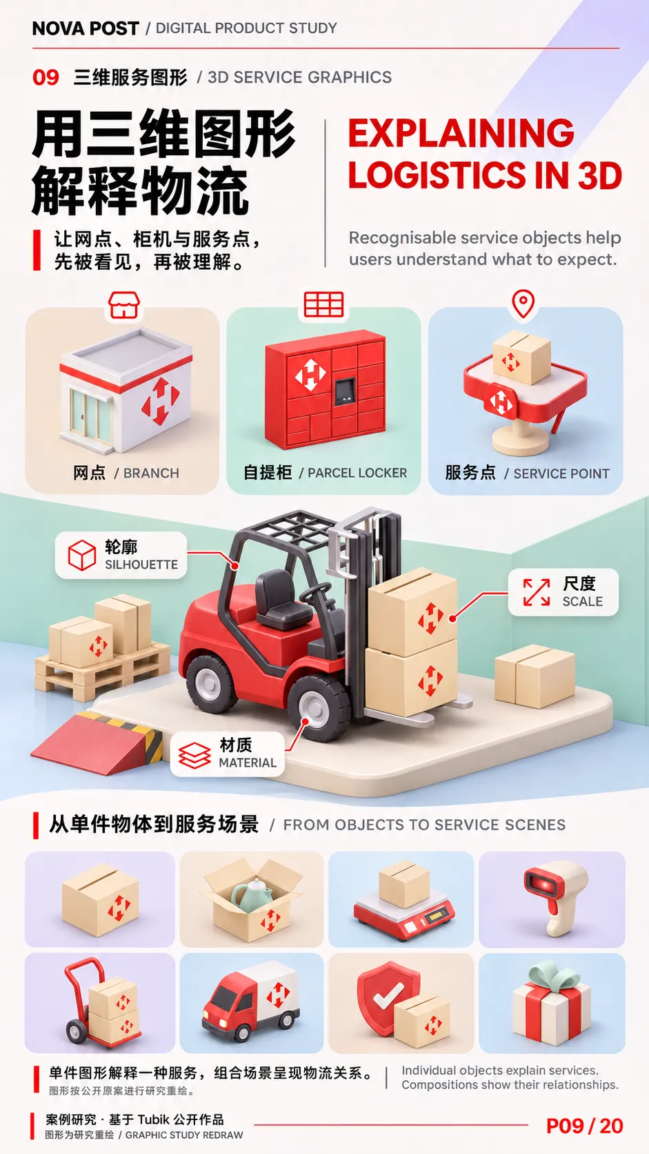
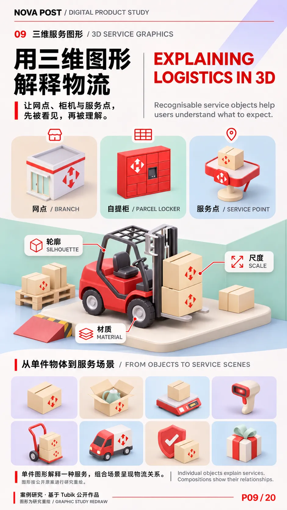
| 三维服务图形 / 3D Service Graphics | 网点、自提柜、服务点、叉车、纸箱与吊秤借助轮廓、材质和尺度区分用途。单件物体适合解释一种服务,多件组合适合呈现物流网络或推广主题。 | Recognisable forms, materials and scale distinguish branches, lockers, service points and equipment. Single objects explain services, while compositions show a wider system. |
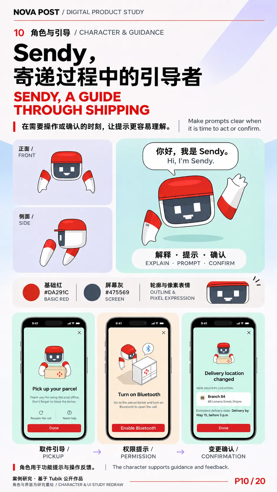
| Sendy 角色 / Sendy Character | 红色头壳、深色像素屏与分离式手臂,使角色在正面、侧面和手势变化中仍可辨认。原案用于取件提示、蓝牙开启、资料权限和改派确认等场景,可比较角色在「请操作」与「已完成」两种时刻的表现。 | A red shell, pixel display and articulated arms keep Sendy recognisable across poses. The character appears in pickup guidance, Bluetooth prompts, permissions and redirection confirmation. |
最值得借鉴的是图形的分工。 同一个自提柜,在底栏或资料列表中可以是几笔线条,在服务介绍中需要可辨认的实体形态,在取件指引中又成为 Sendy 演示操作的道具。三者共享识别特征,细节量随任务变化。角色名称按设定图和案例正文统一写作 Sendy。 Nova Post App
04|产品、交互与展示设计
Product, Interaction & Presentation Design
| | |
|---|
| 登录、客户卡与首页 / Onboarding, Client Card & Home | 登录、注册、客户条码、扫描、通知与包裹列表围绕首页组织。收件、已寄和其他分类承担第一层筛选,排序与单件管理菜单承接更细的任务。 | Sign-in, the client barcode, scanning, notifications and the parcel list converge on the home screen. Tabs, sorting and contextual menus progressively narrow the task. |
| 寄件、估价与支付 / Shipping, Pricing & Payment | 新建寄件按寄件范围、物品、申报价值、尺寸、寄达位置及收件人分步收集信息。页面底部的起价与下一步按钮并列,案例也展示了优惠码和付款界面。 | The flow gathers shipment scope, contents, declared value, size, destination and recipient in stages. A running starting price sits beside the next action. |
| 包裹详情与异常处理 / Parcel Details & Exceptions | 详情汇合运单编号、路线、预计时间与费用,并呈现改派、退回、延长存放或指定其他收件人等操作。可将「常规查件」和「需要处理的变化」作为两种阅读场景。 | The detail view combines the tracking number, route, estimated arrival and charges with actions such as redirection, returns and storage extensions. |
| 网点搜索与最后一公里 / Location Search & Last Mile | 网点地图解决去哪里以及该地点是否适用,依赖类型、营业时间和限重。派送地图解决何时收件和如何协调交付,原案演示了快递员位置、聊天、改址和评价。 | The location map helps users choose a suitable stop. The courier map helps them plan handover and coordinate with the courier close to delivery. |
| 个人资料与常用地点 / Profile & Preferences | 将个人资料、联系方式、安全设置、受托人和常用交付地点分组。常用网点、自提柜、地址的设置状态可直接扫读。 | Identity, contact details, security, trustees and preferred delivery places are grouped so users can see what is already configured. |
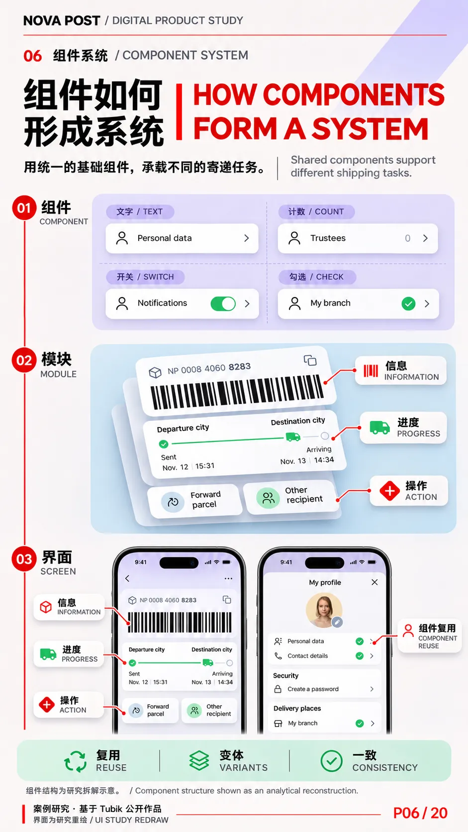
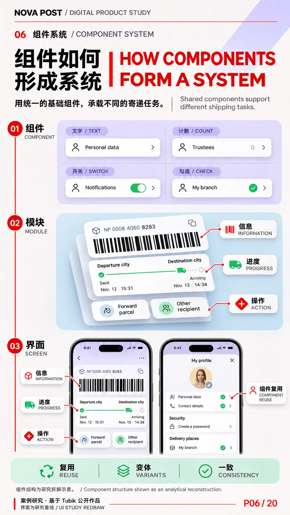
| 组件、动效与深色主题 / Components, Motion & Dark Mode | 同一组件规则覆盖卡片、地图针、开关、计数和勾选状态。演示中可观察寄件选项切换、改派确认和角色动作。深色样张延续信息层级,同时调整地图、卡片与文字的明暗关系。 | Shared component rules support cards, pins, switches, counters and checks. Motion illustrates state changes and character feedback. Dark mode preserves hierarchy while adapting surfaces, type and maps. |
| 推广页面与案例展示 / Landing Pages & Case Presentation | 推广页以设备界面和服务物件解释下载前能获得什么。案例展示则结合终端、车辆、取件影像和界面局部,把数字功能放回真实服务情境。 | Landing pages pair screens with service imagery to explain the app before download. The case study places those screens alongside physical logistics and handover scenes. |
产品流程以 Tubik 的设计演示为依据。涉及上线能力时,可引用 Nova Post 摩尔多瓦官方页面作为地区实例。展板上的实时报位、聊天、改址和支付应带上相应的案例或市场标注。
05|20 张 9∶16 竖版展板文字规划
Twenty 9∶16 Portrait Boards
母版采用原案红、白、灰作为骨架,保留淡紫、薄荷绿、浅蓝与浅黄作为场景色。每页上部放中文主标题和英文同级标题,中段设置一幅主视觉或一组可读的对照证据,下部放双语论点、来源与右下页码 P01 / 20。封面、图标构造、角色设定和深色模式可以换底色,标题位置和页码始终统一。
P01–P05|项目背景与视觉识别 / Context & Visual Identity
| | | |
|---|
| P01 | Nova Post 移动应用 | 看清包裹到了哪一步,就知道下一步怎么做。See where your parcel is. Know what to do next. | 封面主视觉。 让首页手机从物流园区场景中立起。放大顶部条码与一条包裹状态,底部以细红路线串联寄件、追踪、交付三个章节词。 |
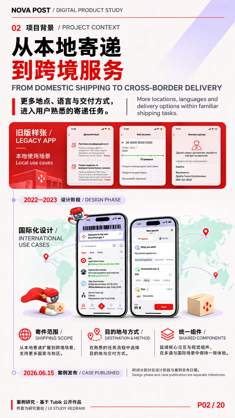
| P02 | 从本地寄递到跨境服务From Domestic Shipping to Cross-Border Delivery | 跨境扩展带来了更多地点、语言与服务条件,界面需要把这些差异纳入用户熟悉的任务。Cross-border shipping brings more locations, languages and service conditions into familiar tasks. | 上下对读。 上部放旧版样张,下部放新版首页和寄件范围选择。中段以细时间轴分别标注设计阶段与案例发布日期。 |
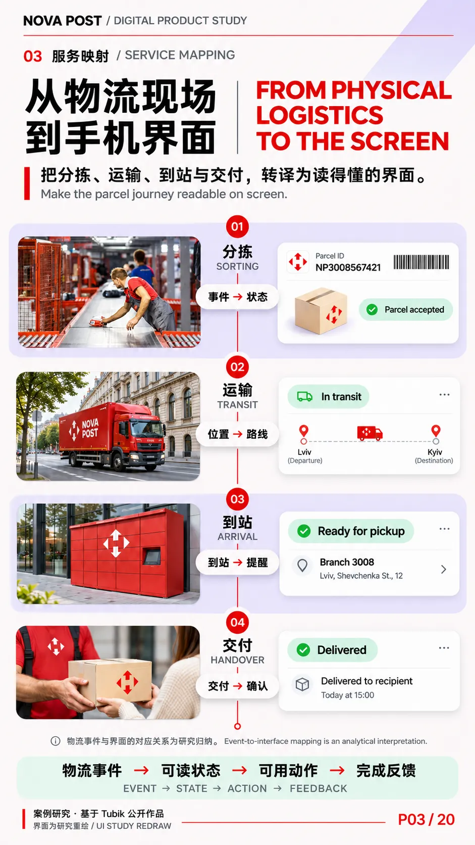
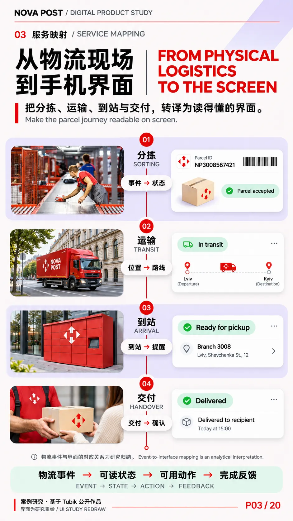
| P03 | 从物流现场到手机界面From Physical Logistics to the Screen | 分拣、运输、到站与交付,在手机上分别变成状态、路线、地点和操作。Sorting, transit, arrival and handover become statuses, routes, locations and actions on screen. | 四段纵向序列。 用分拣终端、车辆、柜机与交付画面对应界面局部。中轴用一条红线串起包裹旅程,明确哪些是分析配对。 |
| P04 | 品牌符号与界面色彩Brand Marks & Interface Colour | 四向标志建立识别,红色将注意力引向品牌入口与关键操作。The four-way mark anchors recognition, while red directs attention to brand cues and key actions. | 红底标志特写。 上半部用车辆与品牌标记,下半部用菱形加号、主按钮和定位针作三组对照,旁列中性色与辅助色。 |
| P05 | 字体与信息层级Typography & Information Hierarchy | 列表让人认出是哪件包裹,详情让人核对它何时到、费用多少。The list identifies the parcel. The detail view makes arrival time and cost easy to check. | 界面局部排版。 放大一条列表与一张详情卡,用引线标出包裹名称、状态、日期、金额和运单编号,另设小窗区分两类条码。 |
P06–P10|设计系统与图形资产 / Design System & Graphic Assets
| | | |
|---|
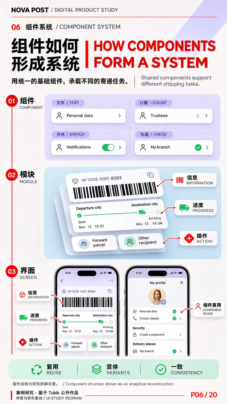
| P06 | 组件如何形成系统How Components Form a System | 同一行组件可承载文字、计数、开关或勾选,并延伸到不同业务页面。A shared row component accommodates labels, counts, switches and checks across different screens. | 由小到大拆解。 上部做四种列表行对照,中部组装路线卡和运单卡,底部展示组件如何进入资料页与详情页。 |
| P07 | 线性图标的构造 | 统一的笔画、角度与圆角,让不同对象在小尺寸下仍像同一套图标。Consistent strokes, angles and corners give different objects a shared visual language at small sizes. | 红白图标标本页。 上半部展示 6×6 原案样张,下半部放大设备图标,标注端点、圆角、重叠与留白。网格说明按原图观察绘制。 |
| P08 | 图标如何指向任务与状态 | 扫描框指向操作,定位针指向地点,勾选和路线节点说明当前状态。A scan frame points to an action, a pin to a place, and a check or route node to a state. | 三组情境标本。 分设操作、地点和状态三栏,每栏同时放孤立图形与原界面裁切,比较图标放回界面后新增了什么信息。 |
| P09 | 用三维图形解释物流Explaining Logistics in 3D | 网点、自提柜和服务点各有清晰的实体轮廓,用户可以预先辨认将接触的设施。Distinct silhouettes make branches, lockers and service points recognisable before the user arrives. | 三维物件陈列。 顶部并列三种服务设施,下部用纸箱、叉车和吊秤构成物流场景。保留原案的浅色底、红色部件与柔和投影。 |
| P10 | Sendy,寄递过程中的引导者Sendy, a Guide Through Shipping | Sendy 在需要用户操作或确认时出现,把系统提示变成更容易理解的指引。Sendy makes prompts easier to understand when the user needs to act or confirm a change. | 角色设定页。 上部放挥手主形象,中段放正侧面及角色用色,下部并列取件、蓝牙和改派确认三个应用小样。 |
P11–P15|关键任务与操作路径 / Core Tasks & User Flows
| | | |
|---|
| P11 | 让动效说明变化Motion That Explains Change | 选项切换让人看见输入发生了变化,确认动效让人知道新的交付安排已经生效。Selection motion shows an input changing. Confirmation motion signals that the new delivery arrangement has taken effect. | 双轨时间带。 第一轨拆寄件选项切换,第二轨拆改派确认中的 Sendy 动效。每轨采用演示关键帧和短注释,区分界面状态与角色动作。 |
| P12 | 首页如何组织包裹The Home Screen as a Parcel Hub | 常用入口集中在首页,包裹通过分类、搜索和排序逐步缩小查找范围。The home screen keeps frequent actions close and narrows the parcel list through categories, search and sorting. | 中心手机与局部放大。 以原案首页为中心,向外连接客户卡、扫描与通知、分类筛选、单件操作四组局部。登录入口以小图补充。 |
| P13 | 从填写资料到创建运单From Parcel Details to a Waybill | 先说明寄什么,再确认从哪里寄、寄到哪里、由谁收件。起价随步骤可见。Define what is being sent, then specify its origin, destination and recipient. A starting price stays visible along the way. | 纵向三段表单。 依次展示物品与申报价值、寄达方式与收件人、费用与优惠入口。放大底部价格和主按钮,展示它们与当前步骤的关系。 |
| P14 | 把运输过程读成时间线Reading the Parcel Timeline | 出发地、当前进度与预计到达时间,让用户判断该继续等待还是处理变化。Origin, progress and estimated arrival help users decide whether to wait or respond to a change. | 一条贯穿画面的运输线。 顶部放包裹信息卡,中部拆路线和时间窗,下部放付款、改派或其他收件人等案例操作。 |
| P15 | 找到合适的网点与自提柜Finding the Right Branch or Locker | 距离只是选择条件之一。营业时间、重量限制和服务类型决定该地点能否满足这次寄取。Distance is one factor. Hours, weight limits and service type determine whether a location fits the shipment. | 地图与地点卡。 用地图占据主视觉,中段叠放附近筛选和网点详情,下段比较网点、自提柜、服务点的类型标识。 |
P16–P20|交付、媒介与方法 / Delivery, Media & Method
| | | |
|---|
| P16 | 看得见的最后一公里 | 临近交付时,位置和预计时间帮助收件人安排见面,聊天和改址入口支持临时协调。Location and timing help recipients plan the handover, while chat and address changes support last-minute coordination. | 交付叙事页。 上部放快递员地图和预计时间,中部放聊天与地址变更,下部用交付影像和评价界面收尾。标注为原案演示。 |
| P17 | 个人资料与常用交付地点Profile & Preferred Delivery Places | 用户可以预设常用网点、自提柜或地址,并快速看出哪些已完成设置。Users can save a preferred branch, locker or address and see which options are already configured. | 资料页拆层。 左侧放原案资料页,右侧抽取身份、安全、地点和受托人分组。底部对比绿色勾选与空心状态。 |
| P18 | 同一套界面的浅色与深色One Interface in Light & Dark | 页面底色和地图明度可以变化,状态、路线与主要操作仍需保持清楚的阅读顺序。Surfaces and map tones can change while status, route and primary actions retain a clear reading order. | 同类界面并排对照。 重点比较首页与网点页,下部用放大细节比较卡片边界、地图标记、状态绿和按钮红。背景借鉴原案夜间终端影像。 |
| P19 | 从应用到推广页面 | 应用中的界面、物件和品牌色进入推广页,帮助用户在下载前理解服务内容。Screens, service objects and brand colours carry into the landing page so users can understand the app before downloading it. | 跨媒介接力。 上部为网页首屏,中段对照其中的手机界面和三维物件,下部以物流现场图对应推广页所解释的服务。 |
| P20 | 从物流事件到用户行动From Logistics Events to User Actions | 每个关键物流节点都可以用四个问题检验。发生了什么、用户看见什么、此刻能做什么、如何知道操作已完成。Test each milestone with four questions. What happened? What does the user see? What can they do now? How is the outcome confirmed? | 收束方法页。 以「已到柜」和「交付地点变更」两例做纵向对照,依次连接事件、状态、动作和反馈。底部回收首页、详情、地图与 Sendy 四类设计证据。 |