 夜雨聆风
夜雨聆风
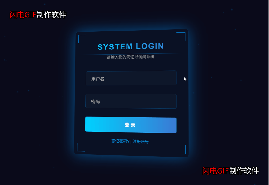
效果展示

完整源码

<!DOCTYPE html><htmllang="zh-CN"><head><metacharset="UTF-8"><metaname="viewport"content="width=device-width, initial-scale=1.0"><title>科技感登录系统</title><style>* {margin: 0;padding: 0;box-sizing: border-box;font-family: 'Arial', sans-serif;}body {background-color: #0a0a1a;color: #fff;overflow: hidden;height: 100vh;display: flex;justify-content: center;align-items: center;}/* 粒子背景 */.particles {position: absolute;top: 0;left: 0;width: 100%;height: 100%;z-index: 1;}.particle {position: absolute;background: rgba(0, 150, 255, 0.5);border-radius: 50%;filter: blur(1px);animation: float linear infinite;}@keyframes float {0% { transform: translateY(0) translateX(0); }50% { transform: translateY(-100px) translateX(100px); }100% { transform: translateY(0) translateX(0); }}/* 登录框 */.login-container {position: relative;z-index: 2;width: 400px;padding: 40px;background: rgba(10, 20, 40, 0.7);border-radius: 10px;box-shadow: 0 0 30px rgba(0, 150, 255, 0.3);backdrop-filter: blur(10px);border: 1px solid rgba(0, 150, 255, 0.2);transform-style: preserve-3d;transform: perspective(1000px);transition: all 0.5s ease;}.login-container:hover {box-shadow: 0 0 50px rgba(0, 150, 255, 0.5);}.login-header {text-align: center;margin-bottom: 40px;}.login-header h1 {font-size: 28px;margin-bottom: 10px;background: linear-gradient(90deg, #00d2ff, #3a7bd5);-webkit-background-clip: text;-webkit-text-fill-color: transparent;letter-spacing: 2px;}.login-header p {color: #aaa;font-size: 14px;}/* 输入框样式 */.input-group {position: relative;margin-bottom: 30px;}.input-group input {width: 100%;padding: 15px 20px;background: rgba(20, 30, 50, 0.5);border: 1px solid rgba(0, 150, 255, 0.3);border-radius: 5px;color: #fff;font-size: 16px;outline: none;transition: all 0.3s;}.input-group input:focus {border-color: #0096ff;box-shadow: 0 0 10px rgba(0, 150, 255, 0.5);}.input-group label {position: absolute;top: 15px;left: 20px;color: #aaa;font-size: 16px;pointer-events: none;transition: all 0.3s;}.input-group input:focus + label,.input-group input:valid + label {top: -10px;left: 10px;font-size: 12px;background: rgba(10, 20, 40, 0.9);padding: 0 5px;color: #0096ff;}/* 按钮样式 */.login-btn {width: 100%;padding: 15px;background: linear-gradient(90deg, #00d2ff, #3a7bd5);border: none;border-radius: 5px;color: #fff;font-size: 16px;font-weight: bold;cursor: pointer;transition: all 0.3s;position: relative;overflow: hidden;}.login-btn:hover {transform: translateY(-3px);box-shadow: 0 10px 20px rgba(0, 150, 255, 0.3);}.login-btn:active {transform: translateY(-1px);}.login-btn::after {content: "";display: block;position: absolute;width: 100%;height: 100%;top: 0;left: -100%;background: linear-gradient(90deg, transparent, rgba(255, 255, 255, 0.2), transparent);transition: all 0.5s;}.login-btn:hover::after {left: 100%;}/* 底部链接 */.login-footer {margin-top: 20px;text-align: center;font-size: 14px;color: #aaa;}.login-footer a {color: #0096ff;text-decoration: none;transition: all 0.3s;}.login-footer a:hover {text-decoration: underline;color: #00d2ff;}/* 科技感装饰元素 */.tech-decoration {position: absolute;width: 100%;height: 100%;top: 0;left: 0;pointer-events: none;z-index: -1;}.corner {position: absolute;width: 30px;height: 30px;border: 2px solid #0096ff;opacity: 0.7;}.corner-top-left {top: 10px;left: 10px;border-right: none;border-bottom: none;}.corner-top-right {top: 10px;right: 10px;border-left: none;border-bottom: none;}.corner-bottom-left {bottom: 10px;left: 10px;border-right: none;border-top: none;}.corner-bottom-right {bottom: 10px;right: 10px;border-left: none;border-top: none;}.scan-line {position: absolute;top: 0;left: 0;width: 100%;height: 1px;background: linear-gradient(90deg, transparent, #0096ff, transparent);animation: scan 3s linear infinite;opacity: 0.5;}@keyframes scan {0% { top: 0; }100% { top: 100%; }}</style></head><body><!-- 粒子背景 --><divclass="particles"id="particles"></div><!-- 登录框 --><divclass="login-container"><!-- 科技感装饰元素 --><divclass="tech-decoration"><divclass="corner corner-top-left"></div><divclass="corner corner-top-right"></div><divclass="corner corner-bottom-left"></div><divclass="corner corner-bottom-right"></div><divclass="scan-line"></div></div><divclass="login-header"><h1>SYSTEM LOGIN</h1><p>请输入您的凭证以访问系统</p></div><form><divclass="input-group"><inputtype="text"id="username"required><labelfor="username">用户名</label></div><divclass="input-group"><inputtype="password"id="password"required><labelfor="password">密码</label></div><buttontype="submit"class="login-btn">登 录</button></form><divclass="login-footer"><ahref="#">忘记密码?</a> | <ahref="#">注册账号</a></div></div><script>// 创建粒子效果document.addEventListener('DOMContentLoaded', function() {const particles = document.getElementById('particles');const particleCount = 50;for (let i = 0; i < particleCount; i++) {const particle = document.createElement('div');particle.classList.add('particle');// 随机大小const size = Math.random() * 5 + 1;particle.style.width = `${size}px`;particle.style.height = `${size}px`;// 随机位置particle.style.left = `${Math.random() * 100}%`;particle.style.top = `${Math.random() * 100}%`;// 随机透明度particle.style.opacity = Math.random() * 0.5 + 0.1;// 随机动画时间和延迟const duration = Math.random() * 20 + 10;const delay = Math.random() * 10;particle.style.animationDuration = `${duration}s`;particle.style.animationDelay = `${delay}s`;particles.appendChild(particle);}// 3D倾斜效果const loginContainer = document.querySelector('.login-container');document.addEventListener('mousemove', (e) => {const xAxis = (window.innerWidth / 2 - e.pageX) / 25;const yAxis = (window.innerHeight / 2 - e.pageY) / 25;loginContainer.style.transform = `perspective(1000px) rotateY(${xAxis}deg) rotateX(${yAxis}deg)`;});// 鼠标进入时恢复原状loginContainer.addEventListener('mouseenter', () => {loginContainer.style.transition = 'all 0.3s ease';});// 鼠标离开时恢复动画loginContainer.addEventListener('mouseleave', () => {loginContainer.style.transition = 'all 0.5s ease';loginContainer.style.transform = 'perspective(1000px) rotateY(0deg) rotateX(0deg)';});});</script></body></html>
