ARTICLE · 1149381
HTML 实现玻璃卡片滚动切换效果(附源码)
HTML 实现玻璃卡片滚动切换效果(附源码)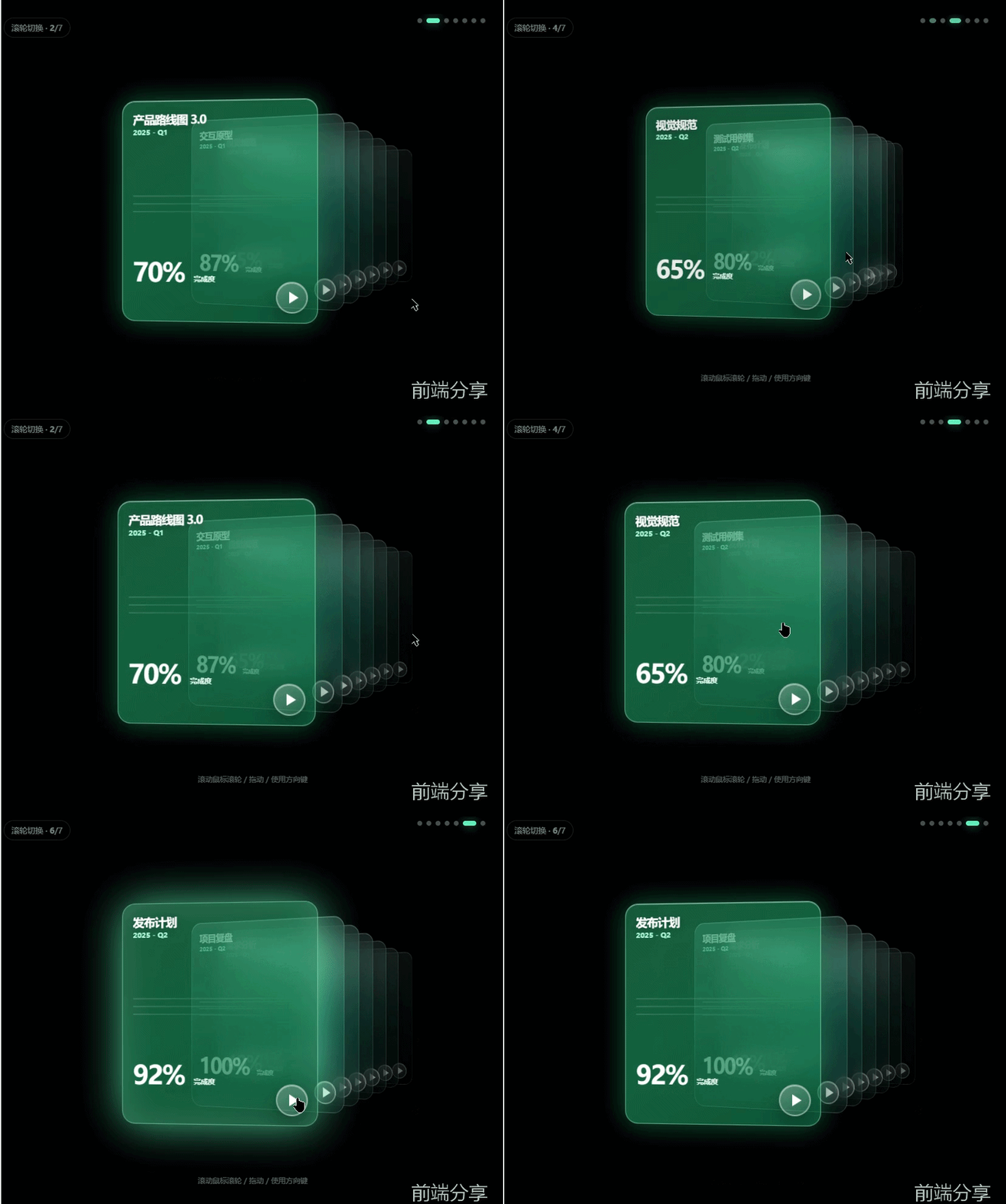
源码获取
私信回复玻璃卡片获取完整源码
演示效果
完整代码
<!doctype html><html lang="zh-CN"><head> <meta charset="UTF-8" /> <meta name="viewport" content="width=device-width,initial-scale=1" /> <title>玻璃卡片滑轮切换</title> <style> * { box-sizing: border-box } html, body { height: 100%; margin: 0 } body { display: grid; place-items: center; overflow: hidden; background: #000; color: #fff; font-family: Inter, "PingFang SC", "Microsoft YaHei", sans-serif } .scene { position: relative; width: min(100vw, 1100px); height: min(76vw, 780px); min-height: 560px; overflow: hidden; isolation: isolate; background: radial-gradient(circle at 56% 43%, rgba(0, 255, 174, .18), transparent 34%), radial-gradient(circle at 72% 50%, rgba(0, 179, 158, .13), transparent 31%), linear-gradient(115deg, #010705, #000) } .scene:before { content: ""; position: absolute; inset: 0; pointer-events: none; background: radial-gradient(circle at 50% 50%, transparent 30%, rgba(0, 0, 0, .62) 100%) } .counter { position: absolute; top: 18px; left: 16px; z-index: 30; padding: 7px 12px; border: 1px solid rgba(255, 255, 255, .12); border-radius: 20px; background: rgba(0, 0, 0, .32); color: rgba(255, 255, 255, .48); font-size: 13px } .dots { position: absolute; top: 16px; right: 30px; display: flex; gap: 7px; z-index: 30 } .dot { width: 8px; height: 8px; padding: 0; border: 0; border-radius: 50%; background: rgba(255, 255, 255, .3); cursor: pointer; transition: .35s } .dot.active { width: 22px; border-radius: 8px; background: #50e4bd; box-shadow: 0 0 18px rgba(80, 228, 189, .55) } .deck { position: absolute; inset: 65px 0 35px; perspective: 1350px; transform-style: preserve-3d } .card { --x: 0; --z: 0; --ry: 0; --scale: 1; position: absolute; left: 50%; top: 50%; width: 570px; height: 630px; padding: 42px 38px; border-radius: 35px; overflow: hidden; transform: translate(-50%, -50%) translateX(var(--x)) translateZ(var(--z)) rotateY(var(--ry)) scale(var(--scale)); transform-origin: center; transition: transform .72s cubic-bezier(.2, .8, .2, 1), opacity .55s, filter .55s; cursor: pointer; background: linear-gradient(145deg, rgba(36, 255, 185, .43), rgba(0, 98, 73, .7)); border: 2px solid rgba(181, 255, 231, .38); box-shadow: inset 0 1px rgba(255, 255, 255, .35), inset 0 -40px 80px rgba(0, 48, 37, .2), 0 30px 75px rgba(0, 0, 0, .62), 0 0 45px rgba(0, 255, 180, .08); backdrop-filter: blur(22px) saturate(150%); -webkit-backdrop-filter: blur(22px) saturate(150%) } .card:before { content: ""; position: absolute; inset: 0; border-radius: inherit; pointer-events: none; background: linear-gradient(125deg, rgba(255, 255, 255, .15), transparent 30%, transparent 70%, rgba(255, 255, 255, .05)) } .card.active { --x: -145px; --z: 130px; --ry: 0deg; --scale: 1; z-index: 20; opacity: 1 } .card.next-1 { --x: 110px; --z: 10px; --ry: -3deg; --scale: .9; z-index: 15; opacity: .66 } .card.next-2 { --x: 265px; --z: -110px; --ry: -5deg; --scale: .78; z-index: 14; opacity: .48 } .card.next-3 { --x: 370px; --z: -220px; --ry: -7deg; --scale: .67; z-index: 13; opacity: .36 } .card.next-4 { --x: 450px; --z: -310px; --ry: -9deg; --scale: .58; z-index: 12; opacity: .29 } .card.next-far { --x: 520px; --z: -390px; --ry: -11deg; --scale: .51; z-index: 11; opacity: .22 } .card.prev-1 { --x: -375px; --z: -100px; --ry: 8deg; --scale: .8; z-index: 10; opacity: 0; pointer-events: none } .card.hidden { --x: 560px; --z: -500px; --ry: -12deg; --scale: .46; opacity: 0; pointer-events: none } .card h2 { margin: 0 0 12px; font-size: 30px; letter-spacing: -1px; text-shadow: 0 2px 14px rgba(0, 0, 0, .25) } .card .quarter { font-size: 19px; color: #a4f6da; font-weight: 700 } .lines { margin-top: 120px; display: grid; gap: 18px; opacity: .2 } .lines i { display: block; height: 3px; background: linear-gradient(90deg, rgba(255, 255, 255, .75), transparent); border-radius: 5px } .lines i:nth-child(2) { width: 78% } .lines i:nth-child(3) { width: 61% } .progress { position: absolute; left: 38px; bottom: 70px; display: flex; align-items: flex-end; gap: 14px } .progress strong { font-size: 62px; line-height: .9; letter-spacing: -4px } .progress span { font-size: 16px; font-weight: 700; color: #eafff8 } .play { position: absolute; right: 28px; bottom: 26px; width: 72px; height: 72px; border-radius: 50%; border: 2px solid rgba(255, 255, 255, .42); background: linear-gradient(145deg, rgba(255, 255, 255, .27), rgba(255, 255, 255, .08)); box-shadow: inset 0 1px rgba(255, 255, 255, .45), 0 12px 30px rgba(0, 0, 0, .32); display: grid; place-items: center; color: #fff; cursor: pointer } .play:after { content: ""; display: block; margin-left: 5px; border-left: 20px solid white; border-top: 13px solid transparent; border-bottom: 13px solid transparent } .hint { position: absolute; bottom: 12px; left: 50%; z-index: 40; transform: translateX(-50%); color: rgba(255, 255, 255, .35); font-size: 12px; opacity: 0; transition: .3s } .scene:hover .hint { opacity: 1 } .flash { animation: flash .5s } @keyframes flash { 50% { box-shadow: 0 0 65px rgba(83, 255, 198, .7), inset 0 0 55px rgba(255, 255, 255, .16) } } @media(max-width:760px) { .scene { height: 100vh; min-height: 520px } .deck { inset: 75px 0 45px } .card { width: min(76vw, 430px); height: min(108vw, 570px); padding: 30px 25px; border-radius: 26px } .card.active { --x: -10vw } .card.next-1 { --x: 26vw } .card.next-2 { --x: 45vw } .card.next-3, .card.next-4, .card.next-far { --x: 58vw } .card h2 { font-size: 24px } .lines { margin-top: 90px } .progress { left: 26px; bottom: 55px } .progress strong { font-size: 46px } .play { width: 58px; height: 58px } .dots { right: 18px } .hint { display: none } } /* Pixel-calibrated against the 576 × 431 reference frame */ html, body { width: 100%; height: 100% } .scene { width: min(100vw, calc(100vh * 1.33643)); height: auto; min-height: 0; max-height: 100vh; aspect-ratio: 576/431; background: #000 } .counter { top: 6px; left: 4px } .dots { top: 7px; right: 31px } .deck { perspective: 1600px; perspective-origin: 38% 50% } .card { left: 50%; top: 50%; width: clamp(180px, 52%, 300px); height: clamp(220px, 86%, 340px); padding: 16px; border-radius: 20px; transform: translate(-50%, -50%) translate3d(var(--x), var(--y), var(--z)) rotateY(var(--ry)) scale(var(--scale)); transform-origin: center; transition: transform .58s cubic-bezier(.34, 1.35, .64, 1), opacity .42s ease, background .38s ease, border-color .38s ease; will-change: transform; background: linear-gradient(160deg, rgba(255, 255, 255, .16) 0%, rgba(255, 255, 255, .04) 50%, rgba(180, 200, 220, .06) 100%); border: 1px solid rgba(255, 255, 255, .22); box-shadow: inset 0 1px 0 rgba(255, 255, 255, .35), inset 0 -1px 0 rgba(0, 0, 0, .15), 0 20px 40px rgba(0, 0, 0, .45); backdrop-filter: blur(28px) saturate(140%); -webkit-backdrop-filter: blur(28px) saturate(140%) } .card:before { display: none } .card.active { --x: -56px; --y: 0px; --z: 0px; --ry: -8deg; --scale: 1.08; z-index: 7; opacity: 1; background: linear-gradient(155deg, rgba(52, 211, 153, .55) 0%, rgba(16, 185, 129, .75) 40%, rgba(4, 120, 87, .85) 100%); border-color: rgba(167, 243, 208, .55); box-shadow: inset 0 1px 0 rgba(255, 255, 255, .45), 0 0 40px rgba(16, 185, 129, .45), 0 24px 50px rgba(0, 0, 0, .5) } .card.next-1 { --x: 24px; --y: 1.5px; --z: -58px; --ry: -29.4deg; --scale: .955; z-index: 6; opacity: .85 } .card.next-2 { --x: 66px; --y: 3px; --z: -116px; --ry: -30.8deg; --scale: .91; z-index: 5; opacity: .76 } .card.next-3 { --x: 108px; --y: 4.5px; --z: -174px; --ry: -32.2deg; --scale: .865; z-index: 4; opacity: .67 } .card.next-4 { --x: 150px; --y: 6px; --z: -232px; --ry: -33.6deg; --scale: .82; z-index: 3; opacity: .58 } .card.next-far { --x: 192px; --y: 7.5px; --z: -290px; --ry: -35deg; --scale: .775; z-index: 2; opacity: .49 } .card.next-6 { --x: 234px; --y: 9px; --z: -348px; --ry: -36.4deg; --scale: .76; z-index: 1; opacity: .4 } .hit-rail { position: absolute; inset: 0; z-index: 28; display: block; pointer-events: none } .card-hit { position: absolute; top: 12%; bottom: 10%; padding: 0; border: 0; outline: 0; color: transparent; background: transparent !important; box-shadow: none !important; filter: none !important; backdrop-filter: none !important; -webkit-backdrop-filter: none !important; appearance: none; -webkit-appearance: none; -webkit-tap-highlight-color: transparent; pointer-events: auto; cursor: pointer } .card-hit:hover, .card-hit:focus, .card-hit:focus-visible, .card-hit:active { color: transparent; background: transparent !important; border: 0; outline: 0; box-shadow: none !important; filter: none !important } .card-hit:nth-child(1) { left: 67%; width: 12% } .card-hit:nth-child(2) { left: 79%; width: 6% } .card-hit:nth-child(3) { left: 85%; width: 6% } .card-hit:nth-child(4) { left: 91%; width: 6% } .card-hit:nth-child(5) { left: 97%; width: 3% } .card:not(.active) .play { width: 40px; height: 40px } .card:not(.active) h2, .card:not(.active) .quarter, .card:not(.active) .progress { opacity: .5 } .deck:before, .deck:after { display: none !important; content: none !important } .deck:before { left: 18%; top: 10%; width: 65%; height: 80%; background: rgba(52, 211, 153, .20); filter: blur(90px); animation: pulseGlow 4.5s ease-in-out infinite } .deck:after { right: 6%; top: 25%; width: 160px; height: 160px; background: rgba(34, 211, 238, .10); filter: blur(60px) } .card { background: linear-gradient(160deg, rgba(175, 235, 225, .22) 0%, rgba(65, 160, 155, .12) 55%, rgba(8, 60, 60, .10) 100%); border-color: rgba(205, 255, 245, .24); backdrop-filter: blur(18px) saturate(130%); -webkit-backdrop-filter: blur(18px) saturate(130%) } .card.active { background: linear-gradient(145deg, rgba(27, 168, 116, .48) 0%, rgba(12, 157, 110, .56) 46%, rgba(5, 111, 78, .68) 100%); backdrop-filter: none !important; -webkit-backdrop-filter: none !important; transform-style: flat; isolation: isolate } .card:not(.active) h2, .card:not(.active) .quarter, .card:not(.active) .progress { opacity: .76 } .card h2 { font-size: clamp(15px, 2.8vw, 18px); margin: 0 } .card .quarter { font-size: 11px } .lines { margin-top: 34%; gap: 10px } .lines i { height: 2px } .progress { left: 16px; bottom: 58px } .progress strong { font-size: clamp(36px, 6vw, 40px); letter-spacing: -2px } .progress span { font-size: 11px } .play { right: 14px; bottom: 14px; width: 48px; height: 48px } .play:after { border-left-width: 14px; border-top-width: 9px; border-bottom-width: 9px } @media(max-width:760px) { .scene { height: auto; min-height: 0 } .deck { inset: 7.8% 0 8%; perspective: 1600px; perspective-origin: 38% 50% } .card { width: clamp(180px, 52%, 300px); height: clamp(220px, 86%, 340px); padding: 16px; border-radius: 20px } .card.active { --x: -56px; --y: 0px; --z: 0px; --ry: -8deg; --scale: 1.08 } .card.next-1 { --x: 24px; --y: 1.5px; --z: -58px; --ry: -29.4deg; --scale: .955 } .card.next-2 { --x: 66px; --y: 3px; --z: -116px; --ry: -30.8deg; --scale: .91 } .card.next-3 { --x: 108px; --y: 4.5px; --z: -174px; --ry: -32.2deg; --scale: .865 } .card.next-4 { --x: 150px; --y: 6px; --z: -232px; --ry: -33.6deg; --scale: .82 } .card.next-far { --x: 192px; --y: 7.5px; --z: -290px; --ry: -35deg; --scale: .775 } .card.next-6 { --x: 234px; --y: 9px; --z: -348px; --ry: -36.4deg; --scale: .76 } .card h2 { font-size: 16px } .lines { margin-top: 34% } .progress { left: 16px; bottom: 58px } .progress strong { font-size: 40px } .play { width: 48px; height: 48px } .dots { right: 31px } } .hit-rail { display: none !important } </style></head><body> <section class="scene" id="scene" tabindex="0" aria-label="文档卡片轮播"> <div class="counter">滚轮切换 · <b id="current">5</b>/<span id="total">7</span></div> <nav class="dots" id="dots" aria-label="选择卡片"></nav> <div class="deck" id="deck"></div> <div class="hit-rail" id="hitRail" aria-label="点击后排卡片切换"></div> <div class="hint">滚动鼠标滚轮 / 拖动 / 使用方向键</div> </section> <script> const data = [ ['需求分析', '2025 - Q1', 40], ['产品路线图 3.0', '2025 - Q1', 70], ['交互原型', '2025 - Q1', 87], ['视觉规范', '2025 - Q2', 65], ['测试用例集', '2025 - Q2', 80], ['发布计划', '2025 - Q2', 92], ['项目复盘', '2025 - Q2', 100] ]; const scene = document.querySelector('#scene'), deck = document.querySelector('#deck'), dots = document.querySelector('#dots'), current = document.querySelector('#current'), hitRail = document.querySelector('#hitRail'); let active = 4, busy = false, startX = 0, wheelAcc = 0, wheelLock = false, autoPlay = true, autoTimer; data.forEach((item, i) => { const card = document.createElement('article'); card.className = 'card'; card.innerHTML = `<h2>${item[0]}</h2><div class="quarter">${item[1]}</div><div class="lines"><i></i><i></i><i></i></div><div class="progress"><strong>${item[2]}%</strong><span>完成度</span></div><button class="play" aria-label="播放 ${item[0]}"></button>`; card.dataset.index = i; card.addEventListener('click', e => { e.stopPropagation(); if (i !== active) { go(i); return } if (e.target.classList.contains('play')) { card.classList.remove('flash'); void card.offsetWidth; card.classList.add('flash') } }); deck.append(card); const dot = document.createElement('button'); dot.className = 'dot'; dot.setAttribute('aria-label', `第 ${i + 1} 张`); dot.onclick = () => go(i); dots.append(dot); }); const cards = [...deck.children], dotList = [...dots.children], hitList = []; for (let d = 1; d <= 6; d++) { const hit = document.createElement('button'); hit.className = 'card-hit'; hit.addEventListener('click', e => { e.stopPropagation(); go(Number(hit.dataset.index)) }); hitRail.append(hit); hitList.push(hit) } function updateHits() { const sr = scene.getBoundingClientRect(); let right = cards[active].getBoundingClientRect().right; hitList.forEach((hit, i) => { const index = (active + i + 1) % data.length, r = cards[index].getBoundingClientRect(), start = Math.max(sr.left, right), end = Math.min(sr.right, r.right); hit.dataset.index = index; hit.setAttribute('aria-label', `切换到 ${data[index][0]}`); hit.style.left = `${start - sr.left}px`; hit.style.top = `${Math.max(0, r.top - sr.top)}px`; hit.style.width = `${Math.max(0, end - start)}px`; hit.style.height = `${Math.max(0, Math.min(sr.bottom, r.bottom) - Math.max(sr.top, r.top))}px`; hit.style.bottom = 'auto'; hit.style.display = end > start ? 'block' : 'none'; right = Math.max(right, r.right) }) } function render() { cards.forEach((card, i) => { const d = (i - active + data.length) % data.length; card.className = 'card ' + (d === 0 ? 'active' : d === 1 ? 'next-1' : d === 2 ? 'next-2' : d === 3 ? 'next-3' : d === 4 ? 'next-4' : d === 5 ? 'next-far' : 'next-6'); card.setAttribute('aria-current', d === 0 ? 'true' : 'false') }); dotList.forEach((d, i) => d.classList.toggle('active', i === active)); current.textContent = active + 1; requestAnimationFrame(updateHits); setTimeout(updateHits, 650) } function go(i) { active = (i + data.length) % data.length; render() } function step(dir) { if (wheelLock) return; wheelLock = true; go(active + dir); setTimeout(() => wheelLock = false, 320) } scene.addEventListener('wheel', e => { e.preventDefault(); e.stopPropagation(); wheelAcc += e.deltaY; if (wheelLock || Math.abs(wheelAcc) < 28) return; const dir = wheelAcc > 0 ? 1 : -1; wheelAcc = 0; step(dir) }, { passive: false }); scene.addEventListener('keydown', e => { if (e.key === 'ArrowRight' || e.key === 'ArrowDown') step(1); if (e.key === 'ArrowLeft' || e.key === 'ArrowUp') step(-1) }); scene.addEventListener('click', e => { const ar = cards[active].getBoundingClientRect(); if (e.clientX <= ar.right) return; let right = ar.right; for (let d = 1; d < data.length; d++) { const index = (active + d) % data.length, r = cards[index].getBoundingClientRect(); if (e.clientX > right && e.clientX <= r.right) { e.preventDefault(); e.stopPropagation(); go(index); return } right = Math.max(right, r.right) } }, true); scene.addEventListener('pointerdown', e => { startX = e.clientX }); scene.addEventListener('pointerup', e => { const dx = e.clientX - startX; if (Math.abs(dx) > 35) { e.preventDefault(); step(dx < 0 ? 1 : -1) } }); const startAuto = () => { clearInterval(autoTimer); if (autoPlay) autoTimer = setInterval(() => go(active + 1), 4500) }; scene.addEventListener('mouseenter', () => { autoPlay = false; clearInterval(autoTimer) }); scene.addEventListener('mouseleave', () => { autoPlay = true; startAuto() }); window.addEventListener('resize', updateHits); render(); startAuto(); scene.focus(); </script></body></html>