ARTICLE · 1066389
WPF控件样式和模板全解析-Button控件
在阅读本系列文章前需要你对WPF的样式和模板功能有一定的了解,如果还不熟悉样式和模板功能,可以访问以下链接
https://learn.microsoft.com/zh-cn/dotnet/desktop/wpf/controls/styles-templates-overview
还可以参考以下WPF示例代码
https://github.com/Microsoft/WPF-Samples/tree/main/Styles%20&%20Templates/IntroToStylingAndTemplating
如何通过Blend获取控件的默认样式
安装Visual Studio时,勾选了.NET桌面开发,会安装Blend组件。
通过Blend组件,我们可以快速获取控件的默认样式。
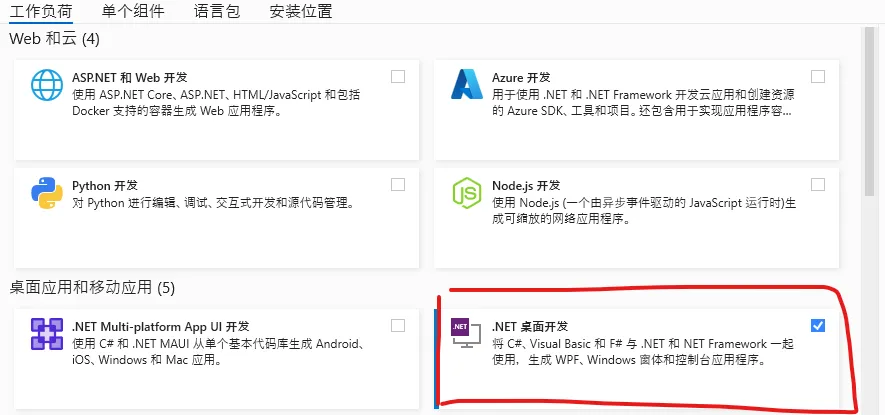
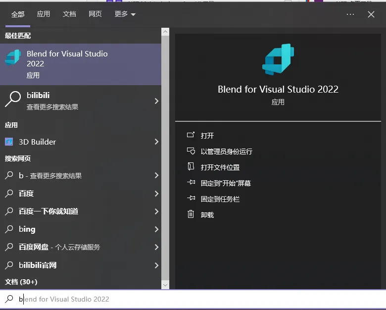
开始菜单搜索并启动Blend
创建一个WPF项目,并放置一个Button控件
<Grid><ButtonContent="Button"HorizontalAlignment="Left"Margin="388,172,0,0"VerticalAlignment="Top"Height="63"Width="129"Background="Pink"/></Grid>
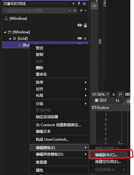
然后在对象和时间线窗口上选择这个Button,右键选择编辑模板-编辑副本
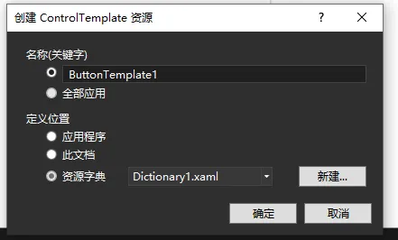
这里可以选择新建一个资源字典 ,点击 确定
这个时候我们就可以看到Button控件的默认样式和模板
Dictionary1.xaml
<ResourceDictionaryxmlns="http://schemas.microsoft.com/winfx/2006/xaml/presentation"xmlns:x="http://schemas.microsoft.com/winfx/2006/xaml"><Stylex:Key="FocusVisual"><SetterProperty="Control.Template"><Setter.Value><ControlTemplate><RectangleMargin="2"StrokeDashArray="1 2"Stroke="{DynamicResource {x:Static SystemColors.ControlTextBrushKey}}"SnapsToDevicePixels="true"StrokeThickness="1"/></ControlTemplate></Setter.Value></Setter></Style><SolidColorBrushx:Key="Button.Static.Background"Color="#FFDDDDDD"/><SolidColorBrushx:Key="Button.Static.Border"Color="#FF707070"/><SolidColorBrushx:Key="Button.MouseOver.Background"Color="#FFBEE6FD"/><SolidColorBrushx:Key="Button.MouseOver.Border"Color="#FF3C7FB1"/><SolidColorBrushx:Key="Button.Pressed.Background"Color="#FFC4E5F6"/><SolidColorBrushx:Key="Button.Pressed.Border"Color="#FF2C628B"/><SolidColorBrushx:Key="Button.Disabled.Background"Color="#FFF4F4F4"/><SolidColorBrushx:Key="Button.Disabled.Border"Color="#FFADB2B5"/><SolidColorBrushx:Key="Button.Disabled.Foreground"Color="#FF838383"/><Stylex:Key="ButtonStyle1"TargetType="{x:Type Button}"><SetterProperty="FocusVisualStyle"Value="{StaticResource FocusVisual}"/><SetterProperty="Background"Value="{StaticResource Button.Static.Background}"/><SetterProperty="BorderBrush"Value="{StaticResource Button.Static.Border}"/><SetterProperty="Foreground"Value="{DynamicResource {x:Static SystemColors.ControlTextBrushKey}}"/><SetterProperty="BorderThickness"Value="1"/><SetterProperty="HorizontalContentAlignment"Value="Center"/><SetterProperty="VerticalContentAlignment"Value="Center"/><SetterProperty="Padding"Value="1"/><SetterProperty="Template"><Setter.Value><ControlTemplateTargetType="{x:Type Button}"><Borderx:Name="border"Background="{TemplateBinding Background}"BorderBrush="{TemplateBinding BorderBrush}"BorderThickness="{TemplateBinding BorderThickness}"SnapsToDevicePixels="true"><ContentPresenterx:Name="contentPresenter"Focusable="False"HorizontalAlignment="{TemplateBinding HorizontalContentAlignment}"Margin="{TemplateBinding Padding}"RecognizesAccessKey="True"SnapsToDevicePixels="{TemplateBinding SnapsToDevicePixels}"VerticalAlignment="{TemplateBinding VerticalContentAlignment}"/></Border><ControlTemplate.Triggers><TriggerProperty="IsDefaulted"Value="true"><SetterProperty="BorderBrush"TargetName="border"Value="{DynamicResource {x:Static SystemColors.HighlightBrushKey}}"/></Trigger><TriggerProperty="IsMouseOver"Value="true"><SetterProperty="Background"TargetName="border"Value="{StaticResource Button.MouseOver.Background}"/><SetterProperty="BorderBrush"TargetName="border"Value="{StaticResource Button.MouseOver.Border}"/></Trigger><TriggerProperty="IsPressed"Value="true"><SetterProperty="Background"TargetName="border"Value="{StaticResource Button.Pressed.Background}"/><SetterProperty="BorderBrush"TargetName="border"Value="{StaticResource Button.Pressed.Border}"/></Trigger><TriggerProperty="IsEnabled"Value="false"><SetterProperty="Background"TargetName="border"Value="{StaticResource Button.Disabled.Background}"/><SetterProperty="BorderBrush"TargetName="border"Value="{StaticResource Button.Disabled.Border}"/><SetterProperty="TextElement.Foreground"TargetName="contentPresenter"Value="{StaticResource Button.Disabled.Foreground}"/></Trigger></ControlTemplate.Triggers></ControlTemplate></Setter.Value></Setter></Style></ResourceDictionary>
如何通过代码获取控件的默认模板
在前面的文章中,我介绍过这种方式
使用下面的代码替换默认MainWindow.xaml.cs的代码即可
public partial class MainWindow : Window{ListBox lbox;TextBox tbox;Grid grid;public MainWindow(){InitializeComponent();InitializeControl();LoadControlTemplate();}/// <summary>/// 创建界面/// </summary>private void InitializeControl(){grid = new Grid();ColumnDefinition col1 = new ColumnDefinition();ColumnDefinition col2 = new ColumnDefinition();col1.Width = GridLength.Auto;grid.ColumnDefinitions.Add(col1);grid.ColumnDefinitions.Add(col2);//Listlbox = new ListBox();lbox.SelectionChanged += (a, b) => { ShowControlTemplate(); };//TextBoxtbox = new TextBox();tbox.VerticalScrollBarVisibility = ScrollBarVisibility.Auto;tbox.HorizontalScrollBarVisibility = ScrollBarVisibility.Auto;grid.Children.Add(lbox);grid.Children.Add(tbox);Grid.SetColumn(lbox, 0);Grid.SetColumn(tbox, 1);this.Content = grid;}private void LoadControlTemplate(){Type type = typeof(System.Windows.Controls.Control);List<Type> controlType = new List<Type>();System.Reflection.Assembly assembly = System.Reflection.Assembly.GetAssembly(typeof(System.Windows.Controls.Control));foreach (Type item in assembly.GetTypes()){if (item.IsSubclassOf(type) && !item.IsAbstract && item.IsPublic){controlType.Add(item);}}lbox.ItemsSource = controlType;}private void ShowControlTemplate(){try{Type type = (Type)lbox.SelectedItem;System.Reflection.ConstructorInfo info = type.GetConstructor(Type.EmptyTypes);Control control = (Control)info.Invoke(null);control.Visibility = Visibility.Collapsed;grid.Children.Add(control);ControlTemplate template = control.Template;System.Xml.XmlWriterSettings setting = new System.Xml.XmlWriterSettings();setting.Indent = true;StringBuilder sb = new StringBuilder();System.Xml.XmlWriter writer = System.Xml.XmlWriter.Create(sb, setting);System.Windows.Markup.XamlWriter.Save(template, writer);tbox.Text = sb.ToString();grid.Children.Remove(control);}catch (Exception ex){tbox.Text = ex.Message;}}}
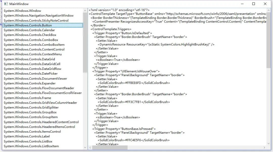
拆解Button样式和模板
1、首先我们看到资源定义部分,这部分主要是定义控件样式里用到的画刷
<SolidColorBrushx:Key="Button.Static.Background"Color="#FFDDDDDD"/><SolidColorBrushx:Key="Button.Static.Border"Color="#FF707070"/><SolidColorBrushx:Key="Button.MouseOver.Background"Color="#FFBEE6FD"/><SolidColorBrushx:Key="Button.MouseOver.Border"Color="#FF3C7FB1"/><SolidColorBrushx:Key="Button.Pressed.Background"Color="#FFC4E5F6"/><SolidColorBrushx:Key="Button.Pressed.Border"Color="#FF2C628B"/><SolidColorBrushx:Key="Button.Disabled.Background"Color="#FFF4F4F4"/><SolidColorBrushx:Key="Button.Disabled.Border"Color="#FFADB2B5"/><SolidColorBrushx:Key="Button.Disabled.Foreground"Color="#FF838383"/>
2、然后就是默认样式的属性设置部分,这部分也不用过多介绍。
如果对于某个属性不了解的,可以直接查看Button控件的官方文档
https://learn.microsoft.com/zh-cn/dotnet/desktop/wpf/controls/button
<Stylex:Key="ButtonStyle1"TargetType="{x:Type Button}"><SetterProperty="FocusVisualStyle"Value="{StaticResource FocusVisual}"/><SetterProperty="Background"Value="{StaticResource Button.Static.Background}"/><SetterProperty="BorderBrush"Value="{StaticResource Button.Static.Border}"/><SetterProperty="Foreground"Value="{DynamicResource {x:Static SystemColors.ControlTextBrushKey}}"/><SetterProperty="BorderThickness"Value="1"/><SetterProperty="HorizontalContentAlignment"Value="Center"/><SetterProperty="VerticalContentAlignment"Value="Center"/><SetterProperty="Padding"Value="1"/></Style>
3、接下来就是Button控件的样式的核心部分,Button的控件模板
<SetterProperty="Template"><Setter.Value><ControlTemplateTargetType="{x:Type Button}"><Borderx:Name="border"Background="{TemplateBinding Background}"BorderBrush="{TemplateBinding BorderBrush}"BorderThickness="{TemplateBinding BorderThickness}"SnapsToDevicePixels="true"><ContentPresenterx:Name="contentPresenter"Focusable="False"HorizontalAlignment="{TemplateBinding HorizontalContentAlignment}"Margin="{TemplateBinding Padding}"RecognizesAccessKey="True"SnapsToDevicePixels="{TemplateBinding SnapsToDevicePixels}"VerticalAlignment="{TemplateBinding VerticalContentAlignment}"/></Border></ControlTemplate></Setter.Value></Setter>
Button控件的模板比较简单,就是在一个Border里嵌套了一个ContentPresenter元素
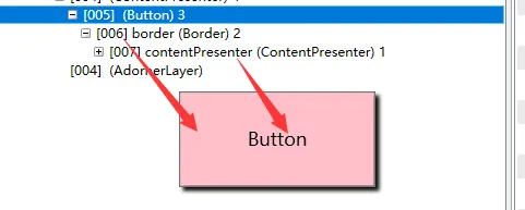
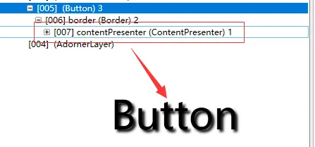
这里我们详细介绍一下ContentPresenter这个元素
在前面的文章中,我介绍过WPF中的内容控件
像Label、Button、TabItem等都是内容控件
ContentPresenter类就是用于显示 ContentControl内容的类
严格意义上来说,ContentPresenter并不是最终的呈现类,它类似于一个外壳,真正显示内容时,它实际的逻辑如下:
1.如果设置了ContentPresenter上的ContentTemplate属性,ContentPresenter会将该DataTemplate应用到Content属性,随后呈现生成的UIElement及其子元素(如果有)
2.如果设置了ContentPresenter上的ContentTemplateSelector属性,ContentPresenter会选用匹配的DataTemplate应用到Content属性,随后呈现生成的UIElement及其子元素(如果有)。
关于控件模板选择器可以参考:https://www.cnblogs.com/zhaotianff/p/18380995
3.如果存在与Content的类型关联的DataTemplate,ContentPresenter会将该DataTemplate应用到Content属性,随后呈现生成的`UIElement`及其子元素(如果有)。
4.如果Content是UIElement对象,则直接显示该UIElement。若该UIElement已存在父元素,将抛出异常。
5.如果存在可将Content类型转换为UIElement的TypeConverter,ContentPresenter会使用该类型转换器,并显示转换后得到的UIElement。
6.如果存在可将Content类型转换为字符串的TypeConverter,ContentPresenter会使用该类型转换器,并创建一个TextBlock承载该字符串,显示此TextBlock。
7.如果内容为XmlElement,会在TextBlock中显示其InnerText属性的值。
8.ContentPresenter会对Content调用ToString方法,创建TextBlock承载该方法返回的字符串,并显示该TextBlock。
4、然后就是一些设置状态的触发器
<ControlTemplate.Triggers><!--默认状态--><TriggerProperty="IsDefaulted"Value="true"><SetterProperty="BorderBrush"TargetName="border"Value="{DynamicResource {x:Static SystemColors.HighlightBrushKey}}"/></Trigger><!--鼠标悬停状态--><TriggerProperty="IsMouseOver"Value="true"><SetterProperty="Background"TargetName="border"Value="{StaticResource Button.MouseOver.Background}"/><SetterProperty="BorderBrush"TargetName="border"Value="{StaticResource Button.MouseOver.Border}"/></Trigger><!--鼠标按下状态--><TriggerProperty="IsPressed"Value="true"><SetterProperty="Background"TargetName="border"Value="{StaticResource Button.Pressed.Background}"/><SetterProperty="BorderBrush"TargetName="border"Value="{StaticResource Button.Pressed.Border}"/></Trigger><!--启用状态--><TriggerProperty="IsEnabled"Value="false"><SetterProperty="Background"TargetName="border"Value="{StaticResource Button.Disabled.Background}"/><SetterProperty="BorderBrush"TargetName="border"Value="{StaticResource Button.Disabled.Border}"/><SetterProperty="TextElement.Foreground"TargetName="contentPresenter"Value="{StaticResource Button.Disabled.Foreground}"/></Trigger></ControlTemplate.Triggers>
一个扁平化风格的按钮样式和模板案例
源码来自:https://github.com/WPFDevelopersOrg/WPFDevelopers/blob/master/src/WPFDevelopers.Net40/Themes/Theme.xaml (欢迎大家使用WPFDevelopers控件库)
最新 WPFDevelopers .Net4.5 至 Net8.0 版本如何编译
<SolidColorBrushx:Key="WD.PrimaryBrush"Color="#409EFF" /><SolidColorBrushx:Key="WD.PrimaryMouseOverBrush"Color="#EBF4FF" /><SolidColorBrushx:Key="WD.BackgroundBrush"Color="#FFFFFF" /><SolidColorBrushx:Key="WD.BaseBrush"Color="#DCDFE6" /><SolidColorBrushx:Key="WD.RegularTextBrush"Color="#606266" /><SolidColorBrushx:Key="WD.WindowTextBrush"Color="#FFFFFF" /><Stylex:Key="WD.DefaultButton"TargetType="{x:Type Button}"><SetterProperty="FocusVisualStyle"Value="{x:Null}" /><SetterProperty="FrameworkElement.OverridesDefaultStyle"Value="True" /><SetterProperty="HorizontalContentAlignment"Value="Center" /><SetterProperty="VerticalContentAlignment"Value="Center" /><SetterProperty="BorderThickness"Value="1" /><SetterProperty="Cursor"Value="Hand" /><SetterProperty="Background"Value="{DynamicResource WD.BackgroundBrush}" /><SetterProperty="BorderBrush"Value="{DynamicResource WD.BaseBrush}" /><SetterProperty="Foreground"Value="{DynamicResource WD.RegularTextBrush}" /><SetterProperty="Template"><Setter.Value><ControlTemplateTargetType="{x:Type Button}"><Borderx:Name="PART_Border"Background="{TemplateBinding Background}"BorderBrush="{TemplateBinding BorderBrush}"BorderThickness="{TemplateBinding BorderThickness}"CornerRadius="1"SnapsToDevicePixels="True" ><ContentPresenterx:Name="PART_ContentPresenter"Margin="{TemplateBinding Padding}"HorizontalAlignment="{TemplateBinding HorizontalContentAlignment}"VerticalAlignment="{TemplateBinding VerticalContentAlignment}"RecognizesAccessKey="True"TextElement.Foreground="{TemplateBinding Foreground}" /></Border><ControlTemplate.Triggers><TriggerProperty="IsFocused"Value="True"><SetterTargetName="PART_Border"Property="UIElement.Opacity"Value=".9" /></Trigger><TriggerProperty="IsPressed"Value="True"><SetterProperty="BorderBrush"Value="{DynamicResource WD.PrimaryBrush}" /><SetterProperty="Background"Value="{DynamicResource WD.PrimaryMouseOverBrush}" /><SetterProperty="Foreground"Value="{DynamicResource WD.PrimaryBrush}" /></Trigger><TriggerProperty="IsMouseOver"Value="True"><SetterProperty="BorderBrush"Value="{DynamicResource WD.PrimaryBrush}" /><SetterProperty="Background"Value="{DynamicResource WD.PrimaryMouseOverBrush}" /><SetterProperty="Foreground"Value="{DynamicResource WD.PrimaryBrush}" /></Trigger></ControlTemplate.Triggers></ControlTemplate></Setter.Value></Setter></Style>
这个样式是在原生样式的基础上改变了一些配色,理解起来并不困难。
核心的控件模板如下:
<Borderx:Name="PART_Border"Background="{TemplateBinding Background}"BorderBrush="{TemplateBinding BorderBrush}"BorderThickness="{TemplateBinding BorderThickness}"CornerRadius="1"SnapsToDevicePixels="True" ><ContentPresenterx:Name="PART_ContentPresenter"Margin="{TemplateBinding Padding}"HorizontalAlignment="{TemplateBinding HorizontalContentAlignment}"VerticalAlignment="{TemplateBinding VerticalContentAlignment}"RecognizesAccessKey="True"TextElement.Foreground="{TemplateBinding Foreground}" /></Border>
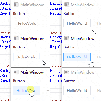
通过触发器控制各状态下的显示效果
<ControlTemplate.Triggers><!--焦点状态--><TriggerProperty="IsFocused"Value="True"><SetterTargetName="PART_Border"Property="UIElement.Opacity"Value=".9" /></Trigger><!--鼠标按下状态--><TriggerProperty="IsPressed"Value="True"><SetterProperty="BorderBrush"Value="{DynamicResource WD.PrimaryBrush}" /><SetterProperty="Background"Value="{DynamicResource WD.PrimaryMouseOverBrush}" /><SetterProperty="Foreground"Value="{DynamicResource WD.PrimaryBrush}" /></Trigger><!--鼠标划过状态--><TriggerProperty="IsMouseOver"Value="True"><SetterProperty="BorderBrush"Value="{DynamicResource WD.PrimaryBrush}" /><SetterProperty="Background"Value="{DynamicResource WD.PrimaryMouseOverBrush}" /><SetterProperty="Foreground"Value="{DynamicResource WD.PrimaryBrush}" /></Trigger></ControlTemplate.Triggers>
运行效果如下:
使用VisualState为Button增加动画效果
在前面的文章中,我介绍过WPF里控件的VisualState功能
如果对这一块的功能不了解,可以访问以下链接:
Button控件提供的VisualState如下
我们来看一下如何使用,完整示例代码如下:
<Stylex:Key="WD.WindowButtonStyle"TargetType="{x:Type Button}"><SetterProperty="Foreground"Value="#303133" /><SetterProperty="Padding"Value="3" /><SetterProperty="Margin"Value="0" /><SetterProperty="MinWidth"Value="30" /><SetterProperty="MinHeight"Value="28" /><SetterProperty="BorderThickness"Value="1" /><SetterProperty="Background"Value="White"></Setter><SetterProperty="Template"><Setter.Value><ControlTemplateTargetType="{x:Type Button}"><BorderBackground="{TemplateBinding Background}"x:Name="Border"><ContentPresenterx:Name="PART_ContentPresenter"Margin="{TemplateBinding Padding}"HorizontalAlignment="{TemplateBinding HorizontalContentAlignment}"VerticalAlignment="{TemplateBinding VerticalContentAlignment}"Content="{TemplateBinding Content}"ContentTemplate="{TemplateBinding ContentTemplate}"Opacity="0.7" /><VisualStateManager.VisualStateGroups><VisualStateGroupx:Name="CommonStates"><!--默认状态--><VisualStatex:Name="Normal"><Storyboard><ColorAnimationStoryboard.TargetName="Border"Storyboard.TargetProperty="Background.Color"To="White"/><ColorAnimationStoryboard.TargetName="PART_ContentPresenter"Storyboard.TargetProperty="(TextElement.Foreground).(SolidColorBrush.Color)"To="#606266"/></Storyboard></VisualState><!--鼠标悬停状态--><VisualStatex:Name="MouseOver"><Storyboard><ColorAnimationStoryboard.TargetName="Border"Storyboard.TargetProperty="Background.Color"To="#409EFF"/><ColorAnimationStoryboard.TargetName="PART_ContentPresenter"Storyboard.TargetProperty="(TextElement.Foreground).(SolidColorBrush.Color)"To="White"/></Storyboard></VisualState></VisualStateGroup></VisualStateManager.VisualStateGroups></Border></ControlTemplate></Setter.Value></Setter></Style>
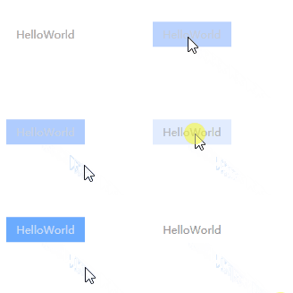
这里我只增加了Normal和MouseOver两种状态(其它状态可自行添加),并使用了两个ColorAnimation对背景和文字颜色进行动画
<VisualStateManager.VisualStateGroups><VisualStateGroupx:Name="CommonStates"><!--默认状态--><VisualStatex:Name="Normal"><Storyboard><!--背景颜色动画--><ColorAnimationStoryboard.TargetName="Border"Storyboard.TargetProperty="Background.Color"To="White"/><!--文字颜色动画--><ColorAnimationStoryboard.TargetName="PART_ContentPresenter"Storyboard.TargetProperty="(TextElement.Foreground).(SolidColorBrush.Color)"To="#606266"/></Storyboard></VisualState><!--鼠标划过状态--><VisualStatex:Name="MouseOver"><Storyboard><!--背景颜色动画--><ColorAnimationStoryboard.TargetName="Border"Storyboard.TargetProperty="Background.Color"To="#409EFF"/><!--文字颜色动画--><ColorAnimationStoryboard.TargetName="PART_ContentPresenter"Storyboard.TargetProperty="(TextElement.Foreground).(SolidColorBrush.Color)"To="White"/></Storyboard></VisualState></VisualStateGroup></VisualStateManager.VisualStateGroups>
运行效果如下:
图形按钮效果
我们可以借助WPF中的绘图功能,来实现一些图形按钮效果。
原理就是使用Path作为ContentPresenter的呈现控件。
运行效果如下:
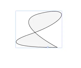
具体实现细节不做过多介绍,可以参考下面的文章:
此外,我们还可以对原来的模板进行一些破坏性的操作来实现一些自定义的显示,也就是不使用ContentPresenter控件来呈现内容。
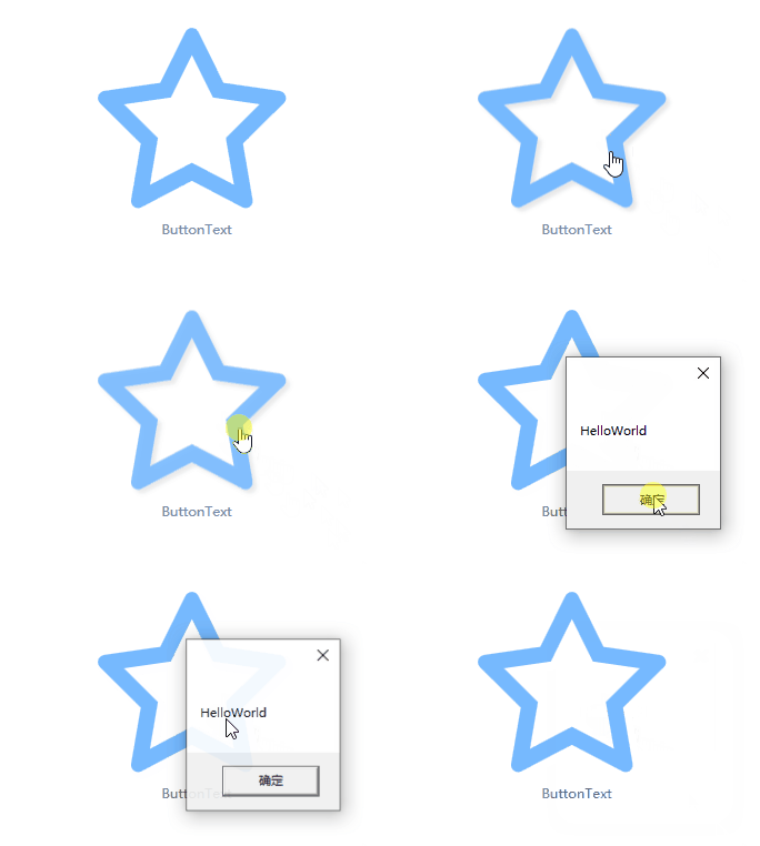
例如,我绘制了一个五角星图形,我想让它作为按钮的图标,当鼠标划过时,这个图形会有一定的效果显示。
如果使用Border嵌套ContentPresenter来进行呈现,就无法很好的控制图形的一些状态效果。
这个时候我们可以抛弃原来的模板结构,直接将目标控件放置在模板中。
这里我们直接放置一个Grid在Border中,并显示一个图形和文本,如下所示:
<Stylex:Key="ShapeButton"TargetType="{x:Type Button}"><SetterProperty="FocusVisualStyle"Value="{x:Null}" /><SetterProperty="FrameworkElement.OverridesDefaultStyle"Value="True" /><SetterProperty="HorizontalContentAlignment"Value="Center" /><SetterProperty="VerticalContentAlignment"Value="Center" /><SetterProperty="BorderThickness"Value="1" /><SetterProperty="Cursor"Value="Hand" /><SetterProperty="Background"Value="Transparent" /><SetterProperty="BorderBrush"Value="Transparent" /><SetterProperty="Foreground"Value="{DynamicResource WD.RegularTextBrush}" /><SetterProperty="Template"><Setter.Value><ControlTemplateTargetType="{x:Type Button}"><!--如果需要在外部对控件的内容进行动态控制,可以使用自定义控件功能--><!--也就是下面的图形和文本不是固定的,可以在使用控制时动态设置--><!--可以先参考:https://www.cnblogs.com/zhaotianff/p/9844457.html--><!--后续再更新一篇WPF自定义控件的详细使用教程--><Borderx:Name="PART_Border"Background="{TemplateBinding Background}"BorderBrush="{TemplateBinding BorderBrush}"BorderThickness="{TemplateBinding BorderThickness}"CornerRadius="1"SnapsToDevicePixels="True" ><!--不使用原始的ContentPresenter控件--><!--使用Grid控件,并定义两行,用于显示图标和按钮文本--><Grid><Grid.RowDefinitions><RowDefinitionHeight="5*"/><RowDefinitionHeight="*"/></Grid.RowDefinitions><!--显示图形--><PathFill="#66b1ff"StrokeThickness="1"x:Name="path"Data="m 163.915 56.9601 l -50.78 -7.38 l -22.7 -46.02 c -0.62 -1.26 -1.64 -2.28 -2.9 -2.9 c -3.16 -1.56 -7 -0.26 -8.58 2.9 l -22.7 46.02 l -50.78 7.38 c -1.4 0.2 -2.68 0.86 -3.66 1.86 c -2.46 2.54 -2.42 6.58 0.12 9.06 l 36.74 35.82 l -8.68 50.58 c -0.24 1.38 -0.02 2.82 0.64 4.06 c 1.64 3.12 5.52 4.34 8.64 2.68 l 45.42 -23.88 l 45.42 23.88 c 1.24 0.66 2.68 0.88 4.06 0.64 c 3.48 -0.6 5.82 -3.9 5.22 -7.38 l -8.68 -50.58 l 36.74 -35.82 c 1 -0.98 1.66 -2.26 1.86 -3.66 c 0.54 -3.5 -1.9 -6.74 -5.4 -7.26 z m -48.66 41.7 l 7.22 42.06 l -37.78 -19.84 l -37.78 19.86 l 7.22 -42.06 l -30.56 -29.8 l 42.24 -6.14 l 18.88 -38.26 l 18.88 38.26 l 42.24 6.14 z"></Path><!--显示文本--><TextBlockHorizontalAlignment="Center"Text="ButtonText"Grid.Row="1"></TextBlock></Grid></Border><ControlTemplate.Triggers><TriggerProperty="IsFocused"Value="True"><SetterTargetName="PART_Border"Property="UIElement.Opacity"Value=".9" /></Trigger><TriggerProperty="IsPressed"Value="True"><SetterProperty="Opacity"TargetName="path"Value=".9"></Setter></Trigger><TriggerProperty="IsMouseOver"Value="True"><SetterProperty="Effect"TargetName="path"><Setter.Value><DropShadowEffectOpacity=".1"></DropShadowEffect></Setter.Value></Setter></Trigger></ControlTemplate.Triggers></ControlTemplate></Setter.Value></Setter></Style>
运行效果:
示例代码:
https://github.com/zhaotianff/cnblog-demo-code/tree/main/WPFStyleAndTemplateDemo
参考资料:
.net - What's the difference between ContentControl and ContentPresenter? - Stack Overflow
你可能还想看:
01
02
03
04
05
06
07
08
09

Happy Time


Win开发者
[
粉丝微信群
].

github丨https://github.com/zhaotianffAdvertisement
Advertisement
欢迎转载
