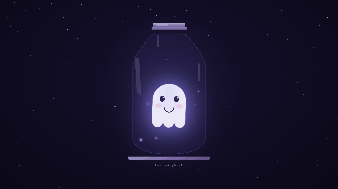
 夜雨聆风
夜雨聆风效果演示
文末可一键复制完整代码
源代码
<!DOCTYPE html><htmllang="zh-CN"><head><metacharset="UTF-8"><metaname="viewport"content="width=device-width, initial-scale=1.0"><title>瓶中小幽灵</title><linkrel="preconnect"href="https://fonts.googleapis.com"><linkrel="preconnect"href="https://fonts.gstatic.com"crossorigin><linkhref="https://fonts.googleapis.com/css2?family=Lora:ital@0;1&display=swap"rel="stylesheet"><style> *,*::before,*::after{box-sizing:border-box;margin:0;padding:0}:root{--deep:#0a0817;--mid:#16102e;--lavender:#a29bfe;--pale:#c8c2e8;--ghost:#eceaf7;--rim:rgba(162,155,254,0.35);--fill:rgba(108,92,231,0.06);--shine:rgba(255,255,255,0.12)}body{background:radial-gradient(ellipse at 50%40%,var(--mid) 0%,var(--deep) 100%);min-height:100vh;display:flex;flex-direction:column;align-items:center;justify-content:center;overflow:hidden;font-family:'Lora',serif}.stars::before,.stars::after{content:'';position:fixed;top:0;left:0;width:2px;height:2px;border-radius:50%;background:white}.stars::before{box-shadow:73px12px1px1pxrgba(255,255,255,.9),198px45px01pxrgba(255,255,255,.6),320px88px1px1pxrgba(255,255,255,.8),55px134px01pxrgba(255,255,255,.5),410px22px1px2pxrgba(255,255,255,1.0),540px67px01pxrgba(255,255,255,.6),620px110px1px1pxrgba(255,255,255,.8),700px33px01pxrgba(255,255,255,.7),790px78px1px1pxrgba(255,255,255,.9),155px280px01pxrgba(255,255,255,.7),390px195px1px1pxrgba(255,255,255,.8),510px360px01pxrgba(255,255,255,.6),680px285px1px1pxrgba(255,255,255,.9),940px55px01pxrgba(255,255,255,.7),270px500px01pxrgba(255,255,255,.5),1060px110px1px1pxrgba(255,255,255,.8),450px680px01pxrgba(255,255,255,.6),1130px430px1px1pxrgba(255,255,255,.7),90px720px01pxrgba(255,255,255,.5),580px540px1px2pxrgba(255,255,255,.9),1200px88px1px1pxrgba(255,255,255,.7),1280px310px01pxrgba(255,255,255,.6),1350px175px1px1pxrgba(255,255,255,.9),1420px55px01pxrgba(255,255,255,.5),1500px420px01pxrgba(255,255,255,.8),1580px240px1px1pxrgba(255,255,255,.6),1650px90px1px2pxrgba(255,255,255,1.0),1720px500px01pxrgba(255,255,255,.7),1800px160px01pxrgba(255,255,255,.5),1880px380px1px1pxrgba(255,255,255,.8),730px800px1px1pxrgba(255,255,255,.6),1100px750px01pxrgba(255,255,255,.7),1400px820px01pxrgba(255,255,255,.5),1650px700px1px1pxrgba(255,255,255,.8),300px950px1px1pxrgba(255,255,255,.6),900px980px01pxrgba(255,255,255,.5),1200px920px01pxrgba(255,255,255,.7),1750px960px1px1pxrgba(255,255,255,.6);animation:twinkle-a 5s ease-in-out infinite}.stars::after{box-shadow:130px55px1px1pxrgba(255,255,255,.7),260px20px01pxrgba(255,255,255,.9),480px95px01pxrgba(255,255,255,.5),760px48px1px1pxrgba(255,255,255,.8),880px82px01pxrgba(255,255,255,.6),90px160px1px1pxrgba(255,255,255,.8),350px320px01pxrgba(255,255,255,.6),600px290px1px1pxrgba(255,255,255,.7),840px300px1px1pxrgba(255,255,255,.9),220px370px01pxrgba(255,255,255,.5),460px610px1px1pxrgba(255,255,255,.7),710px480px01pxrgba(255,255,255,.6),100px840px1px1pxrgba(255,255,255,.8),40px90px01pxrgba(255,255,255,.7),340px150px1px2pxrgba(255,255,255,1.0),800px700px01pxrgba(255,255,255,.6),170px560px1px1pxrgba(255,255,255,.7),650px440px01pxrgba(255,255,255,.5),980px320px1px1pxrgba(255,255,255,.6),1050px180px01pxrgba(255,255,255,.8),1160px540px1px1pxrgba(255,255,255,.7),1240px95px01pxrgba(255,255,255,.5),1320px360px01pxrgba(255,255,255,.9),1450px200px1px1pxrgba(255,255,255,.6),1530px480px1px1pxrgba(255,255,255,.8),1610px130px01pxrgba(255,255,255,.7),1700px600px01pxrgba(255,255,255,.5),1780px70px1px1pxrgba(255,255,255,.9),1850px440px1px2pxrgba(255,255,255,1.0),1920px280px01pxrgba(255,255,255,.6),550px880px01pxrgba(255,255,255,.7),1000px860px1px1pxrgba(255,255,255,.5),1300px900px01pxrgba(255,255,255,.8),1600px840px1px1pxrgba(255,255,255,.6),80px1020px01pxrgba(255,255,255,.5),500px1040px1px1pxrgba(255,255,255,.7);animation:twinkle-b 7s ease-in-out infinite}@keyframes twinkle-a{0%,100%{opacity:.4}50%{opacity:1}}@keyframes twinkle-b{0%,100%{opacity:.9}50%{opacity:.15}}.scene{display:flex;flex-direction:column;align-items:center;gap:14px}.lid{width:162px;display:flex;flex-direction:column;align-items:center;position:relative;z-index:2;margin-bottom:-1px}.lid-cap{width:162px;height:22px;background:linear-gradient(180deg,#b0a2d8 0%,#7060a8 100%);border-radius:8px8px00;position:relative}.lid-cap::after{content:'';position:absolute;top:6px;left:16px;width:60px;height:9px;background:rgba(255,255,255,.2);border-radius:5px}.lid-skirt{width:176px;height:17px;background:linear-gradient(180deg,#8878b8 0%,#584880100%);border-radius:004px4px}.jar{position:relative;width:420px;height:616px;animation:jar-breathe 6s ease-in-out infinite}@keyframes jar-breathe{0%,100%{filter:drop-shadow(0024px rgba(108,92,231,.3)) drop-shadow(08px65px rgba(108,92,231,.12))}50%{filter:drop-shadow(0060px rgba(162,155,254,.65)) drop-shadow(08px100px rgba(162,155,254,.26))}}.jar-fill{position:absolute;inset:0;background:var(--fill);clip-path:path('M 140 0 L 280 0 C 280 0 308 14 322 39 C 350 77 390 119 395 182 L 395 518 Q 395 614 210 614 Q 25 614 25 518 L 25 182 C 30 119 70 77 98 39 C 112 14 140 0 140 0 Z')}.jar-border{position:absolute;inset:0;pointer-events:none}.jar-bordersvg{width:100%;height:100%;display:block}.jar-shine-neck{position:absolute;top:10px;left:150px;width:9px;height:62px;background:var(--shine);border-radius:5px;pointer-events:none;z-index:5}.jar-shine-l{position:absolute;top:126px;left:42px;width:22px;height:182px;background:var(--shine);border-radius:11px;transform:rotate(-3deg);pointer-events:none;z-index:5}.jar-shine-r{position:absolute;top:154px;right:54px;width:9px;height:90px;background:var(--shine);border-radius:5px;pointer-events:none;z-index:5}.ghost{position:absolute;bottom:112px;left:50%;transform:translateX(-50%);z-index:3;animation:float 3.2s ease-in-out infinite}@keyframes float{0%,100%{transform:translateX(-50%) translateY(0) rotate(-1.5deg)}50%{transform:translateX(-50%) translateY(-56px) rotate(1.5deg)}}.ghost-body{width:168px;height:190px;background:var(--ghost);border-radius:84px84px00;position:relative;filter:drop-shadow(08px36px rgba(108,92,231,.52))}.ghost-body::before{content:'';position:absolute;inset:0;border-radius:inherit;background:radial-gradient(ellipse 28px18px at 30px112px,rgba(255,120,170,.45) 0%,rgba(255,120,170,.15) 50%,transparent 100%),radial-gradient(ellipse 28px18px at 138px112px,rgba(255,120,170,.45) 0%,rgba(255,120,170,.15) 50%,transparent 100%);pointer-events:none}.ghost-body::after{content:'';position:absolute;inset:0;border-radius:inherit;background:radial-gradient(ellipse at 50%25%,rgba(162,155,254,.22) 0%,transparent 65%);pointer-events:none}.eye{position:absolute;width:25px;height:29px;background:#1e1640;border-radius:50%;top:62px;animation:blink 5s ease-in-out infinite;transform-origin:center}.eye.left{left:36px;animation-delay:0s}.eye.right{right:36px;animation-delay:0.06s}@keyframes blink{0%,82%,100%{transform:scaleY(1)}86%,92%{transform:scaleY(0.05)}}.eye::after{content:'';position:absolute;top:4px;right:4px;width:7px;height:7px;background:rgba(255,255,255,.82);border-radius:50%}.mouth{position:absolute;width:53px;height:27px;border:4px solid #1e1640;border-top:none;border-radius:0053px53px;bottom:45px;left:50%;transform:translateX(-50%)}.bumps{position:absolute;bottom:-31px;left:0;right:0;height:62px;display:flex}.bump{flex:1;background:var(--ghost);border-radius:0050%50%}.orb-container{position:absolute;inset:0;clip-path:path('M 140 0 L 280 0 C 280 0 308 14 322 39 C 350 77 390 119 395 182 L 395 518 Q 395 614 210 614 Q 25 614 25 518 L 25 182 C 30 119 70 77 98 39 C 112 14 140 0 140 0 Z');pointer-events:none}.orb{position:absolute;border-radius:50%;background:var(--lavender);box-shadow:008px4pxrgba(162,155,254,.55);opacity:0;animation:rise var(--dur) var(--delay) ease-in-out infinite}.orb:nth-child(1){width:11px;height:11px;left:62px;bottom:44px;--dur:3s;--delay:0s}.orb:nth-child(2){width:7px;height:7px;right:76px;bottom:84px;--dur:3.8s;--delay:1s}.orb:nth-child(3){width:8px;height:8px;left:140px;bottom:28px;--dur:2.8s;--delay:2s}.orb:nth-child(4){width:7px;height:7px;right:128px;bottom:140px;--dur:4.2s;--delay:.5s}.orb:nth-child(5){width:14px;height:14px;left:95px;bottom:245px;--dur:3.5s;--delay:1.8s}.orb:nth-child(6){width:5px;height:5px;right:59px;bottom:213px;--dur:4.8s;--delay:2.8s}.orb:nth-child(7){width:8px;height:8px;left:218px;bottom:73px;--dur:3.2s;--delay:3.5s}@keyframes rise{0%{opacity:0;transform:translateY(0) scale(1)}20%{opacity:.8}80%{opacity:.3;transform:translateY(-196px) scale(.5)}100%{opacity:0;transform:translateY(-259px) scale(.1)}}.base{width:414px;height:20px;background:linear-gradient(160deg,#9b8fc0 0%,#5a4a80 100%);border-radius:0014px14px;margin-top:-4px}.label{color:var(--pale);font-size:.82rem;letter-spacing:.38em;font-style:italic;opacity:.5;text-transform:lowercase;animation:label-pulse 6s ease-in-out infinite}@keyframes label-pulse{0%,100%{opacity:.5}50%{opacity:.82}}</style></head><body><divclass="stars"></div><divclass="scene"><divclass="lid"><divclass="lid-cap"></div><divclass="lid-skirt"></div></div><divclass="jar"><divclass="jar-fill"></div><divclass="jar-border"><svgviewBox="0 0 420 616"fill="none"xmlns="http://www.w3.org/2000/svg"><pathd="M 140 0 L 280 0 C 280 0 308 14 322 39 C 350 77 390 119 395 182 L 395 518 Q 395 614 210 614 Q 25 614 25 518 L 25 182 C 30 119 70 77 98 39 C 112 14 140 0 140 0 Z"stroke="rgba(162,155,254,0.35)"stroke-width="1.5"fill="none" /><linex1="140"y1="1"x2="280"y2="1"stroke="rgba(162,155,254,0.22)"stroke-width="1" /></svg></div><divclass="jar-shine-neck"></div><divclass="jar-shine-l"></div><divclass="jar-shine-r"></div><divclass="ghost"><divclass="ghost-body"><divclass="eye left"></div><divclass="eye right"></div><divclass="mouth"></div><divclass="bumps"><divclass="bump"></div><divclass="bump"></div><divclass="bump"></div></div></div></div><divclass="orb-container"><divclass="orb"></div><divclass="orb"></div><divclass="orb"></div><divclass="orb"></div><divclass="orb"></div><divclass="orb"></div><divclass="orb"></div></div></div><divclass="base"></div><pclass="label">bottled ghost</p></div></body></html>实现思路拆分
瓶中小幽灵是怎么画出来的?
瓶中小幽灵用 div 拼出玻璃罐、瓶盖和小幽灵,全程纯 CSS 动画;星星闪烁、幽灵漂浮、光球上升,不用 JavaScript。
说白了就三件事
HTML: .scene里叠瓶盖、罐体、幽灵、光球和底座。CSS:变量管配色, clip-path裁出罐形,多层@keyframes负责呼吸光、漂浮、眨眼、光球上升。动效:星星用 box-shadow点画,::before/::after双层闪烁;罐体drop-shadow缓慢呼吸。
改颜色动 CSS 变量,改形状动 HTML 结构,别搅在一起。
颜色为啥长这样
深空背景:#0a0817 → #16102e 径向渐变 薰衣草紫:#a29bfe(罐沿、光球、外发光) 幽灵体:#eceaf7,带淡紫顶光与腮红渐变 罐内填充:rgba(108, 92, 231, 0.06) 半透明紫 瓶盖:#b0a2d8 → #7060a8 纵向渐变 眼睛与嘴:#1e1640 深紫黑
动起来是啥感觉
页面背景是中心略亮、四周渐暗的深紫夜空,固定星点两层交替闪烁。玻璃罐居中,宽度约 420px,整体随视口居中展示。
罐体外发光缓慢呼吸,像有能量在脉动 小幽灵在罐内上下漂浮,带轻微左右摇摆 幽灵会周期性眨眼,左右眼略有延迟更自然 七颗薰衣草光球在罐内随机位置升起、缩小、消失 底部标签 bottled ghost 透明度缓慢起伏
怎么一层层画出来
先铺底
星空: .stars::before/::after用超长box-shadow画星点,两套动画反相闪烁。罐体轮廓:SVG path描边 +clip-path: path(...)裁切填充与光球区域。
瓶盖与罐身
瓶盖: .lid-cap圆角矩形 + 高光伪元素;.lid-skirt略宽的裙边。罐内液体感: .jar-fill半透明紫填充。玻璃反光: .jar-shine-neck/-l/-r三条白色半透明条。
小幽灵
身体:圆顶矩形 + 底部三瓣 .bump波浪边。腮红与顶光: ::before/::after径向渐变。五官:椭圆眼 + 高光点,弧形嘴; blink动画压扁眼睑。
氛围细节
光球:七个 .orb不同尺寸、位置、--dur/--delay,rise动画向上飘。底座: .base紫灰渐变块接在罐底。标签:斜体小字,letter-spacing 拉开。
渐变用在哪
瓶盖与底座(纵向 / 斜向 linear-gradient) 幽灵腮红与顶光(radial-gradient) 页面背景(radial-gradient)
源码获取
