 夜雨聆风
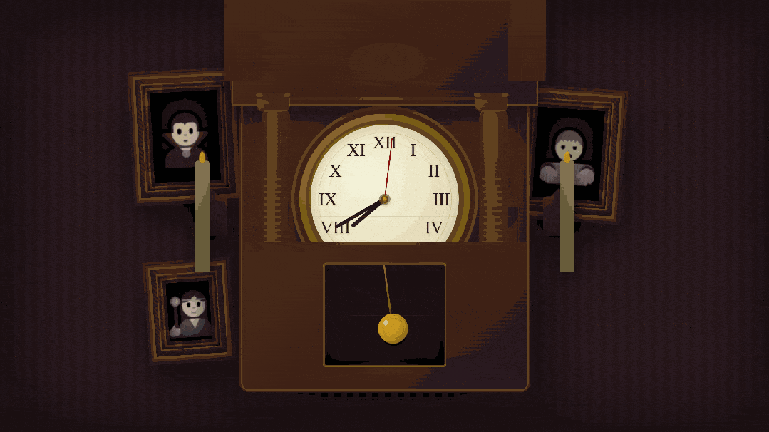
夜雨聆风效果演示
文末可一键复制完整代码
源代码
<!DOCTYPE html><htmllang="zh-CN"><head><metacharset="UTF-8"><metaname="viewport"content="width=device-width, initial-scale=1.0"><title>闹鬼房间</title><style> * { margin: 0; padding: 0; box-sizing: border-box; } body { background: #0a0508; min-height: 100vh; overflow: hidden; font-family: 'Times New Roman', serif; } .haunted-room { position: relative; width: 100vw; height: 100vh; background: repeating-linear-gradient(90deg, #2a1a20 0px, #2a1a20 8px, #2515188px, #25151816px), linear-gradient(180deg, #2a1a20 0%, #1f1418 100%); box-shadow: inset 00100pxrgba(0, 0, 0, 0.7); } .sconce { position: absolute; width: 40px; height: 50px; background: linear-gradient(180deg, #4a3020 0%, #2a1810 100%); border-radius: 5px; box-shadow: 05px20pxrgba(0, 0, 0, 0.8), inset 02px5pxrgba(139, 105, 20, 0.2); top: 50%; transform: translateY(-50%); } .sconce::before { content: ''; position: absolute; top: -10px; left: 50%; transform: translateX(-50%); width: 0; height: 0; border-left: 15px solid transparent; border-right: 15px solid transparent; border-bottom: 15px solid #4a3020; } .sconce-left { left: calc(50% - 240px); } .sconce-right { right: calc(50% - 240px); } .picture-frame { position: absolute; width: 120px; height: 150px; background: repeating-linear-gradient(45deg, #3d2415 0px, #3d2415 2px, #4a2c1a 2px, #4a2c1a 4px), linear-gradient(135deg, #4a2c1a 0%, #3d2415 50%, #2f1710 100%); border: 0; padding: 18px; box-shadow: 0003px#654d0f, 0006pxrgba(139, 105, 20, 0.4), 0007px#2a1810, 00010pxrgba(139, 105, 20, 0.2), 020px50pxrgba(0, 0, 0, 0.9), inset 0030pxrgba(0, 0, 0, 0.5), inset 03px8pxrgba(139, 105, 20, 0.3), inset 0 -3px8pxrgba(0, 0, 0, 0.6); } .picture-frame::after { content: ''; position: absolute; top: 12px; left: 12px; right: 12px; bottom: 12px; border: 2px solid rgba(139, 105, 20, 0.3); box-shadow: inset 0020pxrgba(0, 0, 0, 0.8), 0001pxrgba(139, 105, 20, 0.2); } .frame-inner-detail { position: absolute; top: 6px; left: 6px; right: 6px; bottom: 6px; border: 3px ridge rgba(139, 105, 20, 0.5); box-shadow: inset 0020pxrgba(0, 0, 0, 0.7), inset 2px2px5pxrgba(139, 105, 20, 0.2), inset -2px -2px5pxrgba(0, 0, 0, 0.5); } .frame-inner-detail::before { content: ''; position: absolute; top: 3px; left: 3px; right: 3px; bottom: 3px; border: 1px solid rgba(139, 105, 20, 0.15); } .frame-corner { position: absolute; width: 30px; height: 30px; } .corner-tl { top: 3px; left: 3px; background: radial-gradient(circle at 100%100%, rgba(139, 105, 20, 0.6) 0%, rgba(139, 105, 20, 0.3) 40%, transparent 70%); } .corner-tr { top: 3px; right: 3px; background: radial-gradient(circle at 0%100%, rgba(139, 105, 20, 0.6) 0%, rgba(139, 105, 20, 0.3) 40%, transparent 70%); } .corner-bl { bottom: 3px; left: 3px; background: radial-gradient(circle at 100%0%, rgba(139, 105, 20, 0.6) 0%, rgba(139, 105, 20, 0.3) 40%, transparent 70%); } .corner-br { bottom: 3px; right: 3px; background: radial-gradient(circle at 0%0%, rgba(139, 105, 20, 0.6) 0%, rgba(139, 105, 20, 0.3) 40%, transparent 70%); } .portrait-canvas { position: absolute; top: 18px; left: 18px; right: 18px; bottom: 18px; background: radial-gradient(ellipse at 50%30%, #2a2420 0%, #1a1410 40%, #0f0a08 100%); box-shadow: inset 0040pxrgba(0, 0, 0, 0.9), inset 05px15pxrgba(0, 0, 0, 0.8); overflow: hidden; } .portrait-canvas::before { content: ''; position: absolute; top: 0; left: 0; right: 0; bottom: 0; background: repeating-linear-gradient(0deg, transparent 0px, rgba(80, 70, 60, 0.03) 1px, transparent 2px); opacity: 0.5; } .portrait-character { position: absolute; top: 50%; left: 50%; transform: translate(-50%, -50%); font-size: 70px; filter: grayscale(0.8) sepia(0.4) blur(0.5px); opacity: 0.7; text-shadow: 0020pxrgba(100, 100, 120, 0.4); } .portrait-vignette { position: absolute; top: 0; left: 0; right: 0; bottom: 0; background: radial-gradient(ellipse at center, transparent 20%, rgba(0, 0, 0, 0.3) 70%, rgba(0, 0, 0, 0.6) 100%); pointer-events: none; } .frame-1 { top: 18vh; left: 18%; transform: rotate(-3deg); } .frame-3 { top: 22vh; right: 20%; transform: rotate(4deg); } .frame-5 { bottom: 18vh; left: 20%; width: 90px; height: 110px; transform: rotate(-4deg); } .frame-5.portrait-character { font-size: 60px; } .wall-clock { position: absolute; top: 50%; left: 50%; transform: translate(-50%, -50%); width: min(360px, 80vw); height: min(576px, 80vh); background: linear-gradient(135deg, #4a2c1a 0%, #3d1f14 50%, #2f1710 100%), repeating-linear-gradient(90deg, transparent 0px, transparent 8px, rgba(0, 0, 0, 0.1) 8px, rgba(0, 0, 0, 0.1) 9px); background-blend-mode: normal, multiply; border-radius: 8px; box-shadow: 0002px#654d0f, 0004pxrgba(139, 105, 20, 0.3), 030px80pxrgba(0, 0, 0, 0.8), inset 02px0rgba(139, 105, 20, 0.2), inset 0050pxrgba(0, 0, 0, 0.3), inset 0001pxrgba(139, 105, 20, 0.1); animation: clock-presence 12s ease-in-out infinite; z-index: 10; } .wall-clock::before { content: ''; position: absolute; top: 10px; left: 10px; right: 10px; bottom: 10px; border: 1px solid rgba(139, 105, 20, 0.2); border-radius: 6px; pointer-events: none; } .wall-clock::after { content: ''; position: absolute; top: 50%; left: 15px; right: 15px; height: 1px; background: linear-gradient(90deg, transparent 0%, rgba(139, 105, 20, 0.2) 50%, transparent 100%); } .pediment { position: absolute; top: -54px; left: 50%; transform: translateX(-50%); width: 384px; height: 132px; background: linear-gradient(135deg, #4a2c1a 0%, #3d1f14 50%, #2f1710 100%); border-radius: 15px15px00; box-shadow: 0002px#654d0f, 015px40pxrgba(0, 0, 0, 0.6), inset 02px0rgba(139, 105, 20, 0.2); } .pediment::before { content: ''; position: absolute; top: 54px; left: 50%; transform: translateX(-50%); width: 96px; height: 48px; background: radial-gradient(ellipse at center, rgba(139, 105, 20, 0.3) 0%); border-radius: 50%50%40%40%; opacity: 0.6; } .pediment::after { content: ''; position: absolute; bottom: 6px; left: 50%; transform: translateX(-50%); width: 336px; height: 3px; background: linear-gradient(90deg, transparent 0%, rgba(139, 105, 20, 0.4) 50%, transparent 100%); } .pediment-crown { position: absolute; top: -42px; left: 50%; transform: translateX(-50%); width: 72px; height: 84px; background: linear-gradient(180deg, #4a2c1a 0%, #3d1f14 100%); border-radius: 0; clip-path: polygon(50%0%, 70%20%, 85%35%, 90%50%, 85%65%, 70%80%, 50%100%, 30%80%, 15%65%, 10%50%, 15%35%, 30%20%); box-shadow: 0002px#654d0f, 08px20pxrgba(0, 0, 0, 0.6); } .scroll-left, .scroll-right { position: absolute; top: -18px; width: 48px; height: 120px; background: linear-gradient(180deg, #4a2c1a 0%, #3d1f14 100%); border-radius: 0; } .scroll-left { left: -12px; } .scroll-right { right: -12px; } .scroll-left::before, .scroll-right::before { content: ''; position: absolute; top: -24px; left: 50%; transform: translateX(-50%); width: 36px; height: 36px; background: radial-gradient(circle, #3d1f14 0%, #2f1710 100%); border-radius: 50%; box-shadow: 0002px#654d0f; } .columns { position: absolute; top: 78px; left: 0; right: 0; height: 312px; } .column { position: absolute; width: 36px; background: linear-gradient(90deg, #4a2c1a 0%, #5d3521 30%, #4a2c1a 100%); border-radius: 18px; box-shadow: inset 0001pxrgba(139, 105, 20, 0.2), inset -4px08pxrgba(0, 0, 0, 0.3); } .column::before { content: ''; position: absolute; top: 30%; left: 50%; transform: translateX(-50%); width: 30px; height: 40%; background: repeating-linear-gradient(180deg, rgba(139, 105, 20, 0.15) 0px, rgba(139, 105, 20, 0.15) 3px, transparent 3px, transparent 8px); } .column-left { left: 24px; height: 100%; } .column-right { right: 24px; height: 100%; } .column-capital, .column-base { position: absolute; width: 40px; height: 20px; background: linear-gradient(135deg, #5d3521 0%, #4a2c1a 100%); border-radius: 6px; left: -5px; box-shadow: 0001pxrgba(139, 105, 20, 0.3); } .column-capital { top: -12px; } .column-capital::before { content: ''; position: absolute; top: -3px; left: 50%; transform: translateX(-50%); width: 44px; height: 6px; background: linear-gradient(90deg, #5d3521 0%, #4a2c1a 50%, #5d3521 100%); border-radius: 3px; box-shadow: 01px3pxrgba(0, 0, 0, 0.3); } .column-base { bottom: -12px; } .column-base::after { content: ''; position: absolute; bottom: -3px; left: 50%; transform: translateX(-50%); width: 44px; height: 6px; background: linear-gradient(90deg, #5d3521 0%, #4a2c1a 50%, #5d3521 100%); border-radius: 3px; box-shadow: 02px4pxrgba(0, 0, 0, 0.4); } .clock-housing { position: absolute; top: 90px; left: 50%; transform: translateX(-50%); width: 216px; height: 216px; background: radial-gradient(circle at 30%30%, #8b6914 0%, #654d0f 100%); border-radius: 50%; box-shadow: 0006pxrgba(47, 23, 16, 0.8), 00010pxrgba(139, 105, 20, 0.4), 015px40pxrgba(0, 0, 0, 0.6); } .clock-housing::before { content: ''; position: absolute; top: 50%; left: 50%; transform: translate(-50%, -50%); width: 200px; height: 200px; border-radius: 50%; box-shadow: inset 0020pxrgba(0, 0, 0, 0.4), inset 0 -5px10pxrgba(139, 105, 20, 0.3); } .clock-face { position: absolute; top: 14px; left: 14px; width: 188px; height: 188px; background: radial-gradient(circle at 35%35%, #f5f5dc 0%, #e6dbb7 70%, #d4c49a 100%); border-radius: 50%; box-shadow: inset 03px15pxrgba(0, 0, 0, 0.15); } .clock-face::before { content: ''; position: absolute; top: 50%; left: 50%; transform: translate(-50%, -50%); width: 168px; height: 168px; border: 1px solid rgba(139, 105, 20, 0.2); border-radius: 50%; } .clock-face::after { content: ''; position: absolute; top: 50%; left: 50%; transform: translate(-50%, -50%); width: 144px; height: 144px; border: 1px solid rgba(139, 105, 20, 0.1); border-radius: 50%; } .numbers { position: absolute; width: 100%; height: 100%; font-family: 'Times New Roman', serif; font-weight: normal; font-size: 22px; color: #2f1e15; z-index: 2; } .number { position: absolute; top: 50%; left: 50%; text-shadow: 01px2pxrgba(0, 0, 0, 0.1), 001pxrgba(139, 105, 20, 0.3); } .num-12 { transform: translate(-50%, -50%) rotate(0deg) translateY(-72px) rotate(0deg); } .num-1 { transform: translate(-50%, -50%) rotate(30deg) translateY(-72px) rotate(-30deg); } .num-2 { transform: translate(-50%, -50%) rotate(60deg) translateY(-72px) rotate(-60deg); } .num-3 { transform: translate(-50%, -50%) rotate(90deg) translateY(-72px) rotate(-90deg); } .num-4 { transform: translate(-50%, -50%) rotate(120deg) translateY(-72px) rotate(-120deg); } .num-5 { transform: translate(-50%, -50%) rotate(150deg) translateY(-72px) rotate(-150deg); } .num-6 { transform: translate(-50%, -50%) rotate(180deg) translateY(-72px) rotate(-180deg); } .num-7 { transform: translate(-50%, -50%) rotate(210deg) translateY(-72px) rotate(-210deg); } .num-8 { transform: translate(-50%, -50%) rotate(240deg) translateY(-72px) rotate(-240deg); } .num-9 { transform: translate(-50%, -50%) rotate(270deg) translateY(-72px) rotate(-270deg); } .num-10 { transform: translate(-50%, -50%) rotate(300deg) translateY(-72px) rotate(-300deg); } .num-11 { transform: translate(-50%, -50%) rotate(330deg) translateY(-72px) rotate(-330deg); } .clock-hands { position: absolute; top: 50%; left: 50%; transform: translate(-50%, -50%); } .hand { position: absolute; background: linear-gradient(180deg, #2f1e15 0%, #1a1008 100%); transform-origin: bottom center; border-radius: 1px; } .hour-hand { width: 5px; height: 54px; top: -54px; left: -2.5px; border-radius: 2.5px2.5px00; } .minute-hand { width: 4px; height: 72px; top: -72px; left: -2px; border-radius: 2px2px00; } .second-hand { width: 1.5px; height: 78px; background: #8b0000; top: -78px; left: -0.75px; } .center-hub { position: absolute; width: 10px; height: 10px; background: radial-gradient(circle, #8b6914 0%, #2f1e15 100%); border-radius: 50%; top: -5px; left: -5px; box-shadow: 0002pxrgba(139, 105, 20, 0.6), 02px4pxrgba(0, 0, 0, 0.5), inset 01px2pxrgba(218, 165, 32, 0.4); } .center-hub::before { content: ''; position: absolute; top: 50%; left: 50%; transform: translate(-50%, -50%); width: 6px; height: 6px; background: radial-gradient(circle at 30%30%, rgba(218, 165, 32, 0.8) 0%, rgba(139, 105, 20, 0.4) 100%); border-radius: 50%; } .lower-case { position: absolute; bottom: 0; left: 0; right: 0; height: 186px; background: linear-gradient(135deg, #4a2c1a 0%, #3d1f14 50%, #2f1710 100%); border-radius: 008px8px; } .lower-case::before { content: ''; position: absolute; top: 0; left: 50%; transform: translateX(-50%); width: 312px; height: 3px; background: linear-gradient(90deg, transparent 0%, rgba(139, 105, 20, 0.4) 50%, transparent 100%); } .lower-case::after { content: ''; position: absolute; bottom: 12px; left: 50%; transform: translateX(-50%); width: 120px; height: 24px; background: radial-gradient(ellipse at center, rgba(139, 105, 20, 0.2) 0%, transparent 70%); border-radius: 50%; } .pendulum-window { position: absolute; top: 26px; left: 50%; transform: translateX(-50%); width: 156px; height: 132px; background: rgba(0, 0, 0, 0.6); border: 3px solid #654d0f; border-radius: 4px; box-shadow: inset 0020pxrgba(0, 0, 0, 0.8), inset 02px5pxrgba(139, 105, 20, 0.1); } .pendulum-window::before { content: ''; position: absolute; top: -3px; left: -3px; right: -3px; bottom: -3px; border: 1px solid rgba(139, 105, 20, 0.3); border-radius: 5px; } .pendulum-window::after { content: ''; position: absolute; top: 50%; left: 0; right: 0; height: 1px; background: linear-gradient(90deg, transparent 0%, rgba(139, 105, 20, 0.2) 50%, transparent 100%); } .pendulum-assembly { position: absolute; top: -22px; left: 50%; transform: translateX(-50%); width: 120px; height: 132px; } .pendulum { position: absolute; top: 22px; left: 50%; transform-origin: top center; animation: pendulum-swing 2s ease-in-out infinite alternate; } .pendulum-rod { width: 2.5px; height: 78px; background: linear-gradient(180deg, #8b6914 0%, #654d0f 100%); margin-left: -1.25px; } .pendulum-bob { position: absolute; bottom: -22px; left: 50%; transform: translateX(-50%); width: 38px; height: 38px; background: radial-gradient(circle at 30%30%, #daa520 0%, #8b6914 100%); border-radius: 50%; box-shadow: 04px15pxrgba(0, 0, 0, 0.6), inset 0010pxrgba(218, 165, 32, 0.4), inset -2px -2px5pxrgba(0, 0, 0, 0.3); } .pendulum-bob::before { content: ''; position: absolute; top: 50%; left: 50%; transform: translate(-50%, -50%); width: 24px; height: 24px; border: 2px solid rgba(139, 105, 20, 0.4); border-radius: 50%; } .pendulum-bob::after { content: ''; position: absolute; top: 7px; left: 7px; width: 10px; height: 10px; background: radial-gradient(circle at 30%30%, rgba(255, 255, 200, 0.6) 0%, transparent 70%); border-radius: 50%; } .candle { position: absolute; width: 18px; height: 140px; background: linear-gradient(180deg, #8b7355 0%, #6b5940 100%); border-radius: 3px3px00; box-shadow: 05px20pxrgba(0, 0, 0, 0.6); top: 50%; transform: translateY(-50%); } .candle::before { content: ''; position: absolute; top: -5px; left: 50%; transform: translateX(-50%); width: 8px; height: 8px; background: #4a3830; border-radius: 50%; } .flame { position: absolute; top: -12px; left: 50%; transform: translateX(-50%); width: 8px; height: 15px; background: radial-gradient(ellipse at bottom, #ff6b00 0%, #ff9500 30%, #ffaa00 60%, transparent 100%); border-radius: 50%50%50%50% / 60%60%40%40%; animation: flicker 1.5s ease-in-out infinite alternate; filter: blur(0.5px); } .candle-left { left: calc(50% - 240px); } .candle-right { right: calc(50% - 240px); } .ghost { position: absolute; font-size: 300px; color: rgba(200, 220, 255, 0.3); text-shadow: 0080pxrgba(200, 220, 255, 0.5); z-index: 10; bottom: 15vh; left: 60%; animation: ghost-float 6s ease-in-out infinite; } @keyframes pendulum-swing { 0% { transform: translateX(-50%) rotate(-8deg); } 100% { transform: translateX(-50%) rotate(8deg); } } @keyframes flicker { 0%, 100% { transform: translateX(-50%) scale(1); opacity: 0.8; } 50% { transform: translateX(-50%) scale(1.1) rotate(2deg); opacity: 1; } } @keyframes ghost-float { 0% { transform: translateX(-50%) translate(0, 0) scale(1) rotate(0deg); opacity: 0; } 25% { transform: translateX(-50%) translate(-20px, -25px) scale(1.2) rotate(-8deg); opacity: 0.5; } 50% { transform: translateX(-50%) translate(20px, -45px) scale(1.5) rotate(10deg); opacity: 1; } 75% { transform: translateX(-50%) translate(-15px, -30px) scale(1.3) rotate(-5deg); opacity: 0.6; } 90% { transform: translateX(-50%) translate(0, -10px) scale(1.1) rotate(0deg); opacity: 0.3; } 100% { transform: translateX(-50%) translate(0, 0) scale(1) rotate(0deg); opacity: 0; } }</style></head><body><divclass="haunted-room"><divclass="picture-frame frame-1"><divclass="frame-inner-detail"></div><divclass="frame-corner corner-tl"></div><divclass="frame-corner corner-tr"></div><divclass="frame-corner corner-bl"></div><divclass="frame-corner corner-br"></div><divclass="portrait-canvas"><divclass="portrait-character">🧛🏻♂️</div><divclass="portrait-vignette"></div></div></div><divclass="picture-frame frame-3"><divclass="frame-inner-detail"></div><divclass="frame-corner corner-tl"></div><divclass="frame-corner corner-tr"></div><divclass="frame-corner corner-bl"></div><divclass="frame-corner corner-br"></div><divclass="portrait-canvas"><divclass="portrait-character">🧟</div><divclass="portrait-vignette"></div></div></div><divclass="picture-frame frame-5"><divclass="frame-inner-detail"></div><divclass="frame-corner corner-tl"></div><divclass="frame-corner corner-tr"></div><divclass="frame-corner corner-bl"></div><divclass="frame-corner corner-br"></div><divclass="portrait-canvas"><divclass="portrait-character">🧙🏻♀️</div><divclass="portrait-vignette"></div></div></div><divclass="sconce sconce-left"></div><divclass="sconce sconce-right"></div><divclass="candle candle-left"><divclass="flame"></div></div><divclass="candle candle-right"><divclass="flame"></div></div><divclass="wall-clock"><divclass="pediment"><divclass="pediment-crown"></div><divclass="scroll-left"></div><divclass="scroll-right"></div></div><divclass="columns"><divclass="column column-left"><divclass="column-capital"></div><divclass="column-base"></div></div><divclass="column column-right"><divclass="column-capital"></div><divclass="column-base"></div></div></div><divclass="clock-housing"><divclass="clock-face"><divclass="numbers"><divclass="number num-12">XII</div><divclass="number num-1">I</div><divclass="number num-2">II</div><divclass="number num-3">III</div><divclass="number num-4">IV</div><divclass="number num-5">V</div><divclass="number num-6">VI</div><divclass="number num-7">VII</div><divclass="number num-8">VIII</div><divclass="number num-9">IX</div><divclass="number num-10">X</div><divclass="number num-11">XI</div></div><divclass="clock-hands"><divclass="hand hour-hand"id="hourHand"></div><divclass="hand minute-hand"id="minuteHand"></div><divclass="hand second-hand"id="secondHand"></div><divclass="center-hub"></div></div></div></div><divclass="lower-case"><divclass="pendulum-window"><divclass="pendulum-assembly"><divclass="pendulum"><divclass="pendulum-rod"></div><divclass="pendulum-bob"></div></div></div></div></div></div><divclass="ghost">👻</div></div><script> (() => { functionupdateClock() { const now = newDate(); const hours = now.getHours() % 12; const minutes = now.getMinutes(); const seconds = now.getSeconds(); const milliseconds = now.getMilliseconds(); const smoothSeconds = seconds + (milliseconds / 1000); const hourAngle = (hours * 30) + (minutes * 0.5) + (smoothSeconds * 0.00833); const minuteAngle = (minutes * 6) + (smoothSeconds * 0.1); const secondAngle = smoothSeconds * 6; const hourHand = document.getElementById('hourHand'); const minuteHand = document.getElementById('minuteHand'); const secondHand = document.getElementById('secondHand'); if (hourHand) hourHand.style.transform = `rotate(${hourAngle}deg)`; if (minuteHand) minuteHand.style.transform = `rotate(${minuteAngle}deg)`; if (secondHand) secondHand.style.transform = `rotate(${secondAngle}deg)`; } updateClock(); setInterval(updateClock, 50); })();</script></body></html>实现思路拆分
闹鬼房间是怎么画出来的?
闹鬼房间用 div 拼出一面维多利亚风格的鬼屋墙:三幅肖像画、壁灯蜡烛、落地钟和游荡的小幽灵;时钟指针靠 JavaScript 实时走动,其余氛围全靠 CSS 动画。
说白了就三件事
HTML: .haunted-room里叠画框、烛台、落地钟与幽灵 emoji。CSS:条纹墙纸、画框金边、烛火摇曳、钟摆、幽灵飘动,多层 @keyframes营造阴森光感。JavaScript: updateClock()读取系统时间,平滑驱动时、分、秒针旋转。
改配色动 CSS,改时钟逻辑动 JS,结构保持分层别搅在一起。
颜色为啥长这样
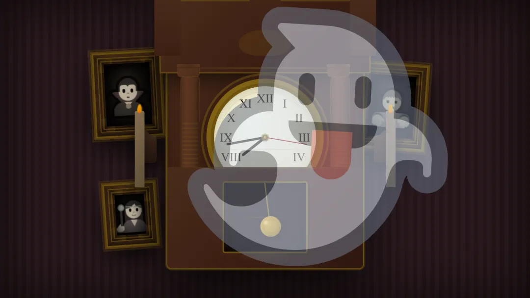
墙纸:#2a1a20 / #251518 竖条纹,底部渐暗 画框:深棕木色 + 金色 #8b6914装饰边烛光:橙黄 #ff9933→#ff6600渐变,外圈暖色光晕钟面:象牙白 #f5f0e8,罗马数字深棕幽灵:emoji 👻,带半透明与飘动轨迹
动起来是啥感觉
整页铺满视口,像站在一间点着蜡烛的暗室里。三幅肖像微微泛光,两侧烛火持续摇曳,落地钟秒针顺滑转动、钟摆左右摆,小幽灵在房间里缓慢漂移并淡入淡出。
烛火 flicker动画随机感摇曳,照亮附近墙面钟摆以底部为轴左右摆动,与钟表古典造型配合 幽灵沿曲线路径漂浮,缩放与透明度同步变化 画框内角色 emoji 可替换,暗角 .portrait-vignette压暗四角
怎么一层层画出来
墙面与灯光
墙纸: repeating-linear-gradient竖纹 + 整体纵向渐暗。壁灯 .sconce:梯形装饰 + 阴影,左右对称摆放。蜡烛 .candle:柱体 +.flame椭圆火焰,多层 box-shadow 模拟光晕。
肖像画
画框 .picture-frame:外框、四角.frame-corner、内线.frame-inner-detail。画布 .portrait-canvas:居中 emoji + 暗角遮罩。
落地钟
顶部 .pediment:三角楣 + 卷草装饰。柱廊 .columns:左右柱身与柱头柱础。表盘 .clock-face:罗马数字定位 + 三根指针与中心 hub。钟摆 .pendulum:杆 + 摆锤,CSS 摆动;JS 只管指针。
幽灵
.ghost:大号 emoji,绝对定位 + 飘动 keyframes。
源码获取
