 夜雨聆风
夜雨聆风效果演示
文末可一键复制完整代码
源代码
<!DOCTYPE html><htmllang="zh-CN"><head><metacharset="UTF-8"><metaname="viewport"content="width=device-width, initial-scale=1.0"><title>复古电视机</title><linkrel="preconnect"href="https://fonts.googleapis.com"><linkrel="preconnect"href="https://fonts.gstatic.com"crossorigin><linkhref="https://fonts.googleapis.com/css2?family=Bebas+Neue&family=Josefin+Sans:wght@400;600&display=swap"rel="stylesheet"><style> *, *::before, *::after { box-sizing: border-box; margin: 0; padding: 0; } :root { --wood-light: #a0663a; --wood-mid: #7a4a24; --wood-dark: #4e2e10; --wood-grain: rgba(0, 0, 0, 0.07); --chrome-bright: #e8e4dc; --chrome-mid: #b8b4ac; --chrome-dark: #787060; --chrome-shadow: #484038; --screen-glass: #b0b8b0; --screen-deep: #787e78; --screen-edge: #505850; --dial-outer: #c8c4bc; --dial-mid: #686460; --dial-dark: #282420; --panel-dark: #2a2420; --louvre-dark: #3a2a1a; --louvre-light: #5a4030; --phosphor: #38e060; } body { background: radial-gradient(ellipse 90%80% at 50%44%, #f0e8dc, #d8cfc4); min-height: 100vh; display: flex; align-items: center; justify-content: center; font-family: 'Josefin Sans', sans-serif; } .tv { position: relative; display: flex; flex-direction: column; align-items: center; filter: drop-shadow(024px48px rgba(0, 0, 0, 0.32)) drop-shadow(06px12px rgba(0, 0, 0, 0.18)); } .tv-body { position: relative; display: flex; background: repeating-linear-gradient(92deg, var(--wood-grain) 0px, transparent 1px, transparent 3px, var(--wood-grain) 4px, transparent 5px, transparent 9px), repeating-linear-gradient(178deg, rgba(0, 0, 0, 0.03) 0px, transparent 2px, transparent 12px, rgba(0, 0, 0, 0.03) 14px), linear-gradient(175deg, var(--wood-light) 0%, var(--wood-mid) 30%, var(--wood-dark) 65%, #3a2008100%); border-radius: 12px12px8px8px; padding: 20px18px18px18px; } .tv-body::before { content: ''; position: absolute; inset: 0; border-radius: inherit; background: linear-gradient(to bottom, rgba(255, 255, 255, 0.12) 0%, transparent 40%, rgba(0, 0, 0, 0.1) 100%); pointer-events: none; } .screen-section { display: flex; flex-direction: column; gap: 0; } .chrome-frame { position: relative; padding: 14px; background: linear-gradient(145deg, var(--chrome-bright) 0%, var(--chrome-mid) 30%, var(--chrome-dark) 55%, var(--chrome-shadow) 75%, var(--chrome-dark) 85%, var(--chrome-mid) 100%); border-radius: 8px; box-shadow: inset 02px4pxrgba(255, 255, 255, 0.5), inset 0 -2px4pxrgba(0, 0, 0, 0.4), 02px0rgba(255, 255, 255, 0.2); } .chrome-frame::before { content: ''; position: absolute; inset: 3px; border-radius: 5px; background: linear-gradient(135deg, rgba(255, 255, 255, 0.4) 0%, transparent 50%, rgba(0, 0, 0, 0.15) 100%); pointer-events: none; } .screen { position: relative; width: 440px; height: 344px; border-radius: 22px; background: radial-gradient(ellipse 90%85% at 50%50%, var(--screen-glass) 0%, var(--screen-deep) 65%, var(--screen-edge) 100%); overflow: hidden; box-shadow: inset 0002pxrgba(0, 0, 0, 0.3), inset 04px16pxrgba(0, 0, 0, 0.4), inset 0 -4px12pxrgba(0, 0, 0, 0.3); } .screen::before { content: ''; position: absolute; inset: 0; border-radius: inherit; background: radial-gradient(ellipse 60%40% at 32%28%, rgba(255, 255, 255, 0.22) 0%, rgba(255, 255, 255, 0.06) 50%, transparent 70%); z-index: 3; } .screen::after { content: ''; position: absolute; inset: 0; border-radius: inherit; background: repeating-linear-gradient(to bottom, transparent 0px, transparent 2px, rgba(0, 0, 0, 0.06) 2px, rgba(0, 0, 0, 0.06) 3px); z-index: 2; } .screen-content { position: absolute; inset: 0; display: flex; flex-direction: column; align-items: center; justify-content: center; gap: 6px; z-index: 1; opacity: 0.88; } .test-bars { display: flex; width: 88%; height: 54%; overflow: hidden; border-radius: 1px; } .bar { flex: 1; } .bar-white { background: #ccdacc; } .bar-yellow { background: #aaaa30; } .bar-cyan { background: #30aaaa; } .bar-green { background: #30aa30; } .bar-magenta { background: #aa30aa; } .bar-red { background: #aa3030; } .bar-blue { background: #3030aa; } .bars-bottom { display: flex; width: 88%; height: 11%; } .bar-black { flex: 3; background: #181a18; } .bar-shimmer { flex: 1; background: #282870; } .bar-grey { flex: 6; background: #686868; } .channel-bug { position: absolute; top: 10px; right: 14px; font-family: 'Bebas Neue', sans-serif; font-size: 11px; letter-spacing: 0.2em; color: var(--phosphor); text-shadow: 006pxvar(--phosphor); z-index: 4; animation: flicker 7s ease-in-out infinite; } .standby-text { font-family: 'Bebas Neue', sans-serif; font-size: 11px; letter-spacing: 0.35em; color: var(--phosphor); text-shadow: 008pxvar(--phosphor), 0020pxrgba(56, 224, 96, 0.4); animation: flicker 7s ease-in-out infinite; } @keyframes flicker { 0%, 94%, 100% { opacity: 1; } 95% { opacity: 0.65; } 96% { opacity: 1; } 98% { opacity: 0.4; } 99% { opacity: 1; } } .brand-strip { padding: 6px002px; font-family: 'Bebas Neue', sans-serif; font-size: 11px; letter-spacing: 0.4em; color: rgba(255, 255, 255, 0.25); text-shadow: 01px0rgba(0, 0, 0, 0.4); } .controls-panel { width: 128px; flex-shrink: 0; display: flex; flex-direction: column; background: linear-gradient(to bottom, var(--panel-dark) 0%, #1e1a14100%); border-radius: 04px4px0; margin: -20px -18px -18px14px; padding: 18px14px14px; justify-content: space-between; align-items: center; box-shadow: inset 2px06pxrgba(0, 0, 0, 0.4); } .dial-group { display: flex; flex-direction: column; align-items: center; gap: 6px; width: 100%; } .dial-scale { display: flex; justify-content: space-between; width: 68px; padding: 02px; } .dial-scalespan { font-size: 6px; color: rgba(255, 255, 255, 0.3); } .dial { position: relative; width: 74px; height: 74px; border-radius: 50%; background: radial-gradient(circle at 42%36%, var(--dial-outer) 0%, var(--dial-mid) 55%, var(--dial-dark) 100%); box-shadow: 04px12pxrgba(0, 0, 0, 0.7), 01px0rgba(255, 255, 255, 0.15), inset 02px4pxrgba(255, 255, 255, 0.2), inset 0 -2px4pxrgba(0, 0, 0, 0.4); } .dial-notches { position: absolute; inset: 0; border-radius: 50%; background: repeating-conic-gradient(from 0deg, transparent 0deg, transparent 10deg, rgba(0, 0, 0, 0.25) 10deg, rgba(0, 0, 0, 0.25) 11deg); } .dial::before { content: ''; position: absolute; width: 4px; height: 22px; background: linear-gradient(to bottom, rgba(255, 255, 255, 0.7), rgba(255, 255, 255, 0.1)); border-radius: 2px; top: 8px; left: 50%; transform: translateX(-50%); box-shadow: 01px3pxrgba(0, 0, 0, 0.4); z-index: 1; } .dial::after { content: ''; position: absolute; inset: 26%; border-radius: 50%; background: radial-gradient(circle at 40%35%, #3a3630, #0e0c0a); box-shadow: inset 02px4pxrgba(0, 0, 0, 0.9); z-index: 1; } .dial-label { font-size: 6px; font-weight: 600; letter-spacing: 0.22em; text-transform: uppercase; color: rgba(255, 255, 255, 0.3); } .speaker-louvres { width: 100%; display: flex; flex-direction: column; gap: 3px; padding: 4px0; } .louvre { height: 5px; width: 100%; background: linear-gradient(to bottom, var(--louvre-light) 0%, var(--louvre-dark) 60%, rgba(0, 0, 0, 0.7) 100%); border-radius: 1px; box-shadow: 02px2pxrgba(0, 0, 0, 0.5); } .indicator-row { display: flex; align-items: center; gap: 8px; width: 100%; } .power-led { width: 6px; height: 6px; border-radius: 50%; background: radial-gradient(circle, #ff4030, #800000); box-shadow: 006pxrgba(255, 60, 40, 0.6); } .indicator-label { font-size: 5.5px; letter-spacing: 0.18em; text-transform: uppercase; color: rgba(255, 255, 255, 0.25); } .tv-base { width: calc(100% - 8px); height: 14px; background: linear-gradient(to bottom, #1a1410, #0e0a08); border-radius: 006px6px; margin: 0 -4px; box-shadow: 04px12pxrgba(0, 0, 0, 0.4); display: flex; align-items: center; justify-content: center; gap: 40px; } .base-text { font-size: 5px; letter-spacing: 0.3em; color: rgba(255, 255, 255, 0.15); text-transform: uppercase; }</style></head><body><divclass="tv"><divclass="tv-body"><divclass="screen-section"><divclass="chrome-frame"><divclass="screen"><divclass="channel-bug">CH 4</div><divclass="screen-content"><divclass="test-bars"><divclass="bar bar-white"></div><divclass="bar bar-yellow"></div><divclass="bar bar-cyan"></div><divclass="bar bar-green"></div><divclass="bar bar-magenta"></div><divclass="bar bar-red"></div><divclass="bar bar-blue"></div></div><divclass="bars-bottom"><divclass="bar bar-black"></div><divclass="bar bar-shimmer"></div><divclass="bar bar-grey"></div></div><spanclass="standby-text">Please Stand By</span></div></div></div><divclass="brand-strip">Novavision</div></div><divclass="controls-panel"><divclass="dial-group"><divclass="dial-scale"><span>2</span><span>7</span><span>13</span></div><divclass="dial"><divclass="dial-notches"></div></div><divclass="dial-label">Channel</div></div><divclass="dial-group"><divclass="dial"><divclass="dial-notches"></div></div><divclass="dial-label">Volume</div></div><divclass="speaker-louvres"><divclass="louvre"></div><divclass="louvre"></div><divclass="louvre"></div><divclass="louvre"></div><divclass="louvre"></div><divclass="louvre"></div><divclass="louvre"></div><divclass="louvre"></div></div><divclass="indicator-row"><divclass="power-led"></div><spanclass="indicator-label">Power</span></div></div></div><divclass="tv-base"><spanclass="base-text">VHF · UHF</span><spanclass="base-text">Model NV-19</span></div></div></body></html>实现思路拆分
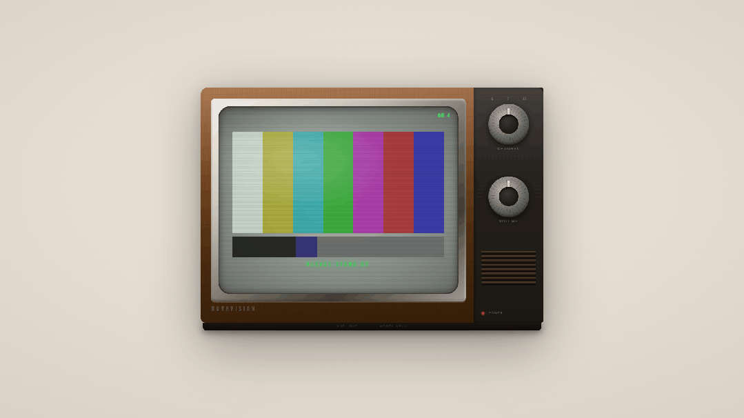
复古电视机是怎么画出来的?
复古电视机用 div 拼出一台 Novavision 牌老式 CRT 电视:木纹机身、镀铬边框、彩色测试信号与「Please Stand By」待机字样,全程纯 CSS,不用 JavaScript。
说白了就三件事
HTML: .tv里叠屏幕区、控制面板、底座;屏幕内是彩条与待机文字。CSS:变量管木色 / 镀铬 / 荧光绿, repeating-linear-gradient模拟木纹与扫描线,多层阴影做 CRT 玻璃感。动效:频道角标与待机文字共用 flicker关键帧,模拟磷光屏轻微闪烁。
改配色动 CSS 变量,改结构动 HTML,别搅在一起。
颜色为啥长这样
木纹:#a0663a → #4e2e10 多层渐变 + 细纹 镀铬边框:#e8e4dc → #484038 金属渐变 屏幕玻璃:#b0b8b0 → #505850 径向灰绿 彩条:白 / 黄 / 青 / 绿 / 品红 / 红 / 蓝 + 底部黑条 荧光字:#38e060 磷光绿,带 glow 阴影 电源灯:#ff4030 红色 LED 光晕
动起来是啥感觉
米色渐变背景上,一台宽屏复古电视居中展示,整体带柔和投影。
屏幕内是经典 SMPTE 彩条测试图,下方黑条与灰条 右上角「CH 4」与中央「Please Stand By」磷光绿闪烁 右侧控制面板有频道 / 音量旋钮刻度、扬声器栅格、红色电源灯 机身木纹在光线下有轻微高光,镀铬框有内凹金属质感 屏幕叠加扫描线,CRT 曲面反光在左上角
怎么一层层画出来
机身与屏幕
.tv-body:三重背景叠木纹纹理 + 木色纵向渐变,圆角外壳。.chrome-frame:镀铬 padding 框,内外阴影模拟金属槽。.screen:圆角 CRT 面板,径向渐变 + 扫描线::after+ 高光::before。
屏幕内容
.test-bars:七条 flex 等宽彩条。.bars-bottom:黑 / 蓝紫 / 灰三段底栏。.channel-bug/.standby-text:Bebas Neue 大写荧光字 +flicker动画。
控制面板
.dial:径向渐变圆盘 +repeating-conic-gradient刻度 + 指针伪元素。.speaker-louvres:八条.louvre横栅模拟扬声器。.power-led:红色径向渐变小圆点 + 外发光。
底座
.tv-base:深色横条,VHF · UHF / Model NV-19 字样。
源码获取
