ARTICLE · 1035786
uni-app自定义导航栏:胶囊对齐与高度计算
做沉浸式头图、自定义搜索栏、固定导航时,顶部区域的高度就得自己算。网上教程大多教「statusBarHeight + 44」,但这个写法在刘海屏、灵动岛、Android 全面屏上各有各的翻车姿势。这篇文章从胶囊按钮出发,给你一套推导严谨、多端可用的顶部计算方案——含已验证的封装工具函数和避坑速查表。
一、顶部区域解剖:先分清 5 个高度概念
很多 bug 的根源是概念混着叫。先统一语言:
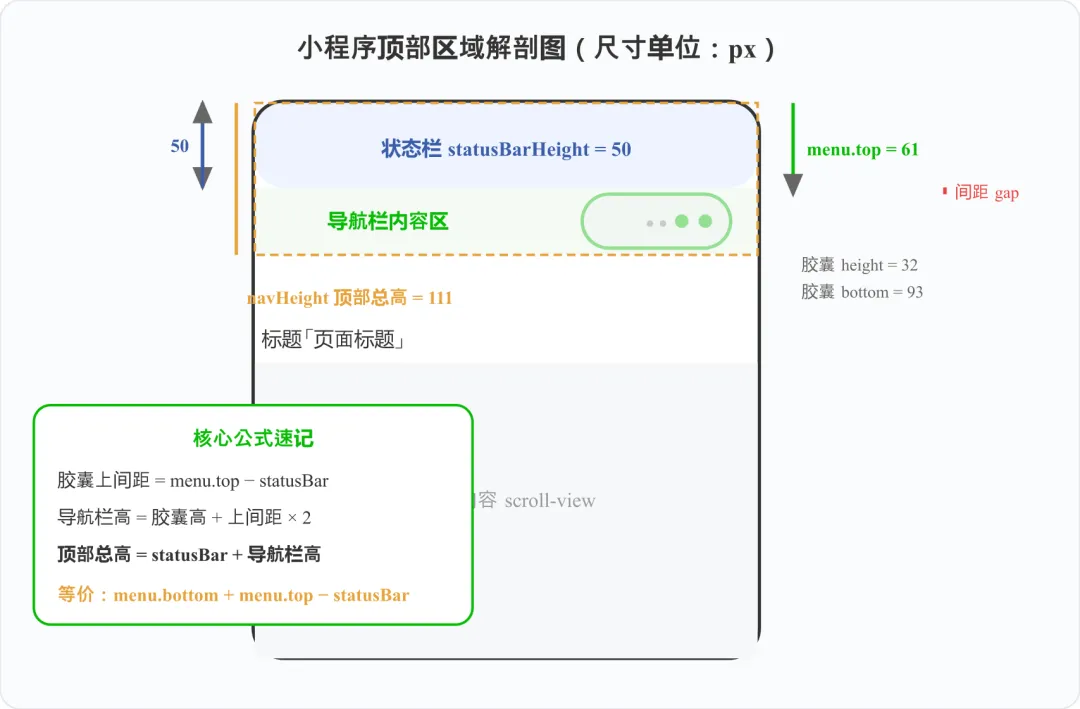
状态栏、胶囊间距、导航栏内容区、顶部总高——一张图分清
- 状态栏高度 statusBarHeight
:系统时间、电量那一条;
- 胶囊按钮信息
:右上角「···⊙」胶囊,由 uni.getMenuButtonBoundingClientRect() 提供,是唯一稳定的布局标尺;
- 胶囊上间距
:胶囊 top 与状态栏底部的距离;
- 导航栏内容高度
:胶囊高 + 上下间距,保证标题与胶囊垂直居中;
- 顶部总高度 navHeight
:状态栏 + 导航栏,页面内容的让位基准。
二、核心公式:以胶囊按钮为基准推导
先拿原始数据:
// 胶囊按钮位置(仅微信小程序支持)const menu = uni.getMenuButtonBoundingClientRect()// { top: 61, bottom: 93, height: 32, left: 278, right: 365, ... }
推导链只需三步:
① 胶囊上间距 gap = menu.top − statusBarHeight② 导航栏内容高 = menu.height + gap × 2 ← 保证与胶囊垂直居中③ 顶部总高 navHeight = statusBarHeight + 导航栏内容高
💡 数学等价式:navHeight = menu.bottom + menu.top − statusBarHeight。展开推导用的是 height + (top−statusBar)×2,代入 bottom = top + height 就能化简。两种写法都对,封装里用哪个都行。
三、别再用 getSystemInfoSync 了
大部分教程还在用 uni.getSystemInfoSync(),但微信官方早已把它标记为废弃:返回字段大而全、初始化慢,而且未来版本有移除风险。正确做法是用拆分后的轻量 API:
// ✅ 新 API:只拿窗口尺寸(含 statusBarHeight)const win = uni.getWindowInfo()// ✅ 机型信息单独拿const device = uni.getDeviceInfo()// ❌ 旧写法:字段冗余、启动慢、已废弃uni.getSystemInfoSync()
⚠️ 兼容性说明:uni-app 3.x 已代理这两个新 API;如果项目基线较低(HBuilderX 3.4.13 之前),做一个 fallback 判断即可,代码在下面封装里已处理。
四、通用封装:一次计算,全局复用
把「计算 + 兜底 + 多端适配」全部收进一个模块。模块级缓存:这些值在 App 生命周期内不会变,算一次就够了,别每个页面重复调:
// utils/nav.js —— 顶部区域计算(带缓存与兜底)let cached = nullexport function getNavInfo() { if (cached) return cached // 全局只算一次 // 新 API 优先,旧基线降级 const win = uni.getWindowInfo ? uni.getWindowInfo() : uni.getSystemInfoSync() const statusBarHeight = win.statusBarHeight || 0 let navigationBarHeight = 44 let navHeight = statusBarHeight + 44 let menuButtonInfo = null let menuAvoidWidth = 0 // 胶囊避让宽度(搜索框用) // #ifdef MP-WEIXIN try { menuButtonInfo = uni.getMenuButtonBoundingClientRect() if (menuButtonInfo && menuButtonInfo.height > 0) { const gap = menuButtonInfo.top - statusBarHeight navigationBarHeight = menuButtonInfo.height + gap * 2 navHeight = statusBarHeight + navigationBarHeight menuAvoidWidth = win.windowWidth - menuButtonInfo.left } } catch (e) { /* 兜底值已就位 */ } // #endif // #ifndef MP-WEIXIN // H5/App/其他小程序:按平台给默认导航栏高 // #ifdef H5 navigationBarHeight = 44 // #endif // #ifdef APP-PLUS navigationBarHeight = win.platform === 'android' ? 50 : 45 // #endif navHeight = statusBarHeight + navigationBarHeight // #endif cached = { statusBarHeight, navigationBarHeight, navHeight, menuButtonInfo, menuAvoidWidth, windowWidth: win.windowWidth, windowHeight: win.windowHeight, } return cached}
💡 注意 try/catch + 「height > 0」双重校验:个别安卓机或某些微信版本可能返回全 0 的胶囊信息,此时自动退回默认导航栏高度,页面不会崩。
五、页面里怎么用:封装成导航栏组件
比「每个页面写一遍」更好的做法是封装成组件,一处维护,处处使用:
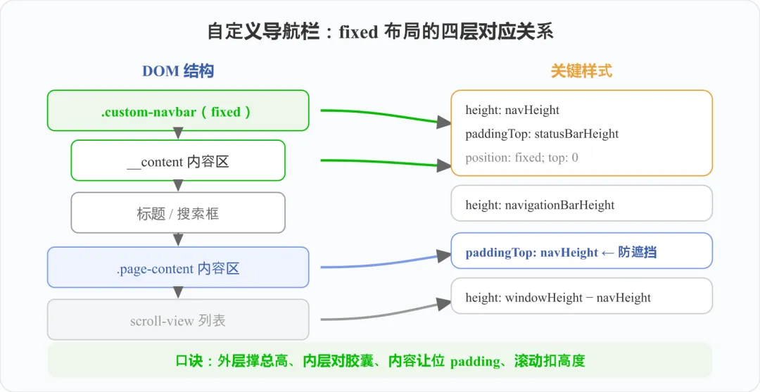
口诀:外层撑总高、内层对胶囊、内容让位 padding、滚动扣高度
<!-- components/custom-navbar.vue --><template> <view class="navbar" :style="{ height: nav.navHeight + 'px' }"> <view class="navbar__content" :style="{ height: nav.navigationBarHeight + 'px' }" > <text class="navbar__title">{{ title }}</text> </view> </view></template><script setup>import { reactive } from 'vue'import { getNavInfo } from '@/utils/nav'defineProps({ title: String })const nav = reactive(getNavInfo()) // 直接用缓存,零开销</script><style scoped>.navbar { position: fixed; top: 0; left: 0; z-index: 100; width: 100%; box-sizing: border-box; background: #fff;}.navbar__content { display: flex; align-items: center; justify-content: center;}.navbar__title { font-size: 32rpx; font-weight: 600; }</style><!-- 页面使用:内容区记得让位 --><view :style="{ paddingTop: nav.navHeight + 'px' }"> 页面内容...</view>
六、搜索框避让胶囊 & scroll-view 高度
搜索框避让:胶囊左侧到屏幕左边缘之外的区域不能占用,用 menuAvoidWidth 一行搞定:
<view class="search-row" :style="{ height: nav.navigationBarHeight + 'px', paddingRight: nav.menuAvoidWidth + 10 + 'px' }"> <view class="search-box" :style="{ height: nav.menuButtonInfo.height + 'px', borderRadius: nav.menuButtonInfo.height / 2 + 'px' }" >搜索</view></view>
scroll-view 高度:窗口高度减去所有固定区块,别再写 100vh:
const scrollHeight = nav.windowHeight - nav.navHeight // 顶部 - uni.upx2px(96) // 底部筛选栏(设计稿 96rpx)
七、为什么「写死 44px」必翻车?
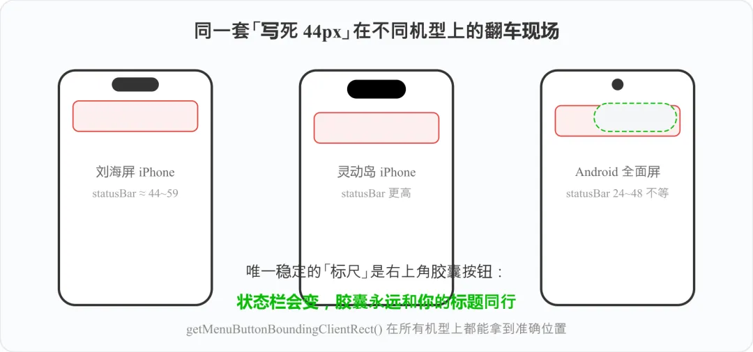
状态栏高度因机型而异,胶囊位置才是稳定标尺
statusBarHeight 在不同设备上从 20px 到 59px 都有:iPhone 刘海屏约 44~48px、灵动岛机型更高、Android 全面屏从 24 到 48px 不等。写死任何值都是赌运气。唯一永远正确的参照物是胶囊按钮——因为你的标题、搜索框,视觉上本来就要和它对齐。
八、避坑速查表
💡 单位纪律:系统 API 返回的全是 px,设计稿是 rpx。参与计算的 rpx 值必须先过 uni.upx2px() 转换,别把两种单位直接相减——这类「数值看着正常但就是差一点」的 bug 最难查。
写在最后
顶部区域计算的本质就一句话:不写死任何高度,以胶囊按钮为唯一标尺动态推导。把公式和封装收进项目,以后无论 iPhone 出什么新形态,你的导航栏都能稳稳对齐。
本文灵感来自「web前端驿站」的同主题文章,在其方案基础上补充了新 API(getWindowInfo)、模块级缓存与组件化封装。如果这篇对你有帮助,点赞、在看、转发三连支持一下。下一篇实战选题已在路上,欢迎在评论区留言你想看的内容。