 夜雨聆风
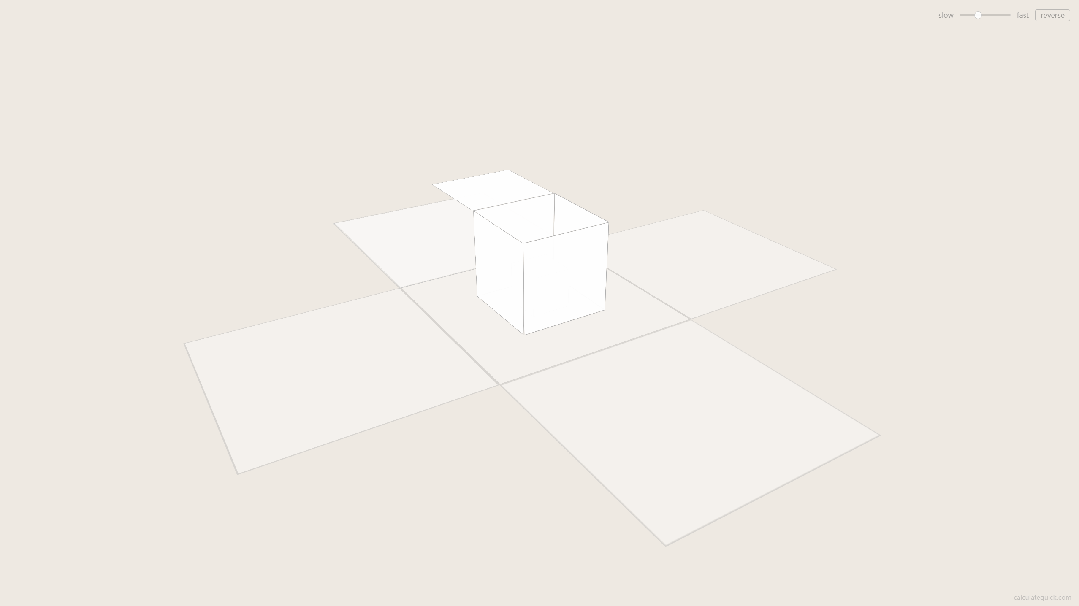
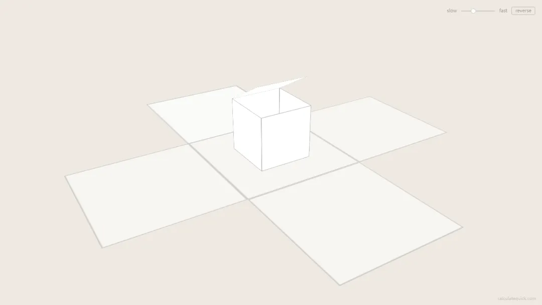
夜雨聆风效果演示
文末可一键复制完整代码
源代码
<!DOCTYPE html><htmllang="zh-CN"><head><metacharset="UTF-8"><metaname="viewport"content="width=device-width, initial-scale=1.0"><title>无限拆盒</title><style> * { margin: 0; padding: 0; box-sizing: border-box; } html, body { height: 100%; overflow: hidden; background: #eee9e2; } .scene { position: fixed; inset: 0; perspective: 1200px; display: flex; align-items: center; justify-content: center; } .camera { transform-style: preserve-3d; transform: rotateX(-28deg) rotateY(32deg); } .box { position: absolute; transform-style: preserve-3d; } .hinge { position: absolute; transform-style: preserve-3d; } .face { position: absolute; } .controls { position: fixed; top: 16px; right: 16px; display: flex; align-items: center; gap: 10px; font: 11px/1 system-ui, sans-serif; color: rgba(0,0,0,0.35); } .controlsinput[type="range"] { -webkit-appearance: none; width: 80px; height: 2px; background: rgba(0,0,0,0.15); border-radius: 1px; outline: none; } .controlsinput[type="range"]::-webkit-slider-thumb { -webkit-appearance: none; width: 12px; height: 12px; background: rgba(255,255,255,0.9); border: 1px solid rgba(0,0,0,0.2); border-radius: 50%; cursor: pointer; } .controlsbutton { background: none; border: 1px solid rgba(0,0,0,0.2); border-radius: 3px; padding: 3px8px; font: inherit; color: inherit; cursor: pointer; transition: border-color 0.3s; } .controlsbutton:hover { border-color: rgba(0,0,0,0.4); } .credit { position: fixed; bottom: 10px; right: 14px; font: 10px/1 system-ui, sans-serif; color: rgba(0,0,0,0.18); text-decoration: none; transition: color 0.3s; } .credit:hover { color: rgba(0,0,0,0.45); }</style></head><body><divclass="scene"><divclass="camera"id="cam"></div></div><divclass="controls"><span>slow</span><inputtype="range"id="speed"min="1"max="10"value="4"step="0.5"><span>fast</span><buttonid="reverse">reverse</button></div><aclass="credit"href="https://calculatequick.com"target="_blank">calculatequick.com</a><script> (() => { const SIZE = 120; const RATIO = 0.44; const LID_DURATION = 0.40; const LID_SWEEP = 270; const WALL_DELAY = 0.38; const WALL_DURATION = 0.30; const FADE_IN_START = 1.5; const FADE_IN_RATE = 2; const FADE_OUT_START = 0.7; const FADE_OUT_RATE = 1.1; const cam = document.getElementById('cam'); const slider = document.getElementById('speed'); const reverseBtn = document.getElementById('reverse'); let speed = 0.0004; let direction = 1; let phase = 0; let lastTime = 0; functioncreateElement(className) { const el = document.createElement('div'); if (className) el.className = className; return el; } functioncreateFace() { const face = createElement('face'); face.style.width = `${SIZE}px`; face.style.height = `${SIZE}px`; return face; } functioncreateBox(index) { const box = createElement('box'); const floor = createFace(); floor.style.left = `${-SIZE / 2}px`; floor.style.top = `${-SIZE /2}px`; floor.style.transform = 'rotateX(90deg)'; box.appendChild(floor); functioncreateWall(hingeTf, hasChild) { const hinge = createElement('hinge'); hinge.style.transform = hingeTf; const wall = createFace(); wall.style.left = `${-SIZE / 2}px`; wall.style.top = `${-SIZE}px`; wall.style.transformOrigin = 'center bottom'; if (hasChild) wall.style.transformStyle = 'preserve-3d'; hinge.appendChild(wall); box.appendChild(hinge); return wall; } const half = SIZE /2; const front = createWall(`translateZ(${half}px)`); const back = createWall(`translateZ(${-half}px) rotateY(180deg)`, true); const left = createWall(`translateX(${-half}px) rotateY(-90deg)`); const right = createWall(`translateX(${half}px) rotateY(90deg)`); const lid = createFace(); lid.style.left = '0'; lid.style.top = `${-SIZE}px`; lid.style.transformOrigin = 'center bottom'; back.appendChild(lid); return { el: box, index, floor, lid, walls: [front, back, left, right] }; } const boxes = []; for (let i = -2; i <= 3; i++) { const box = createBox(i); cam.appendChild(box.el); boxes.push(box); } function clamp(v) { return v < 0 ? 0 : v > 1 ? 1 : v; } function lidEase(t) { if (t <= 0) return 0; if (t >= 1) return 1; return (1 - Math.cos(t * Math.PI)) / 2; } function styleFace(face, alpha) { face.style.background = `rgba(255,255,255,${0.96 * alpha})`; face.style.border = `0.5px solid rgba(0,0,0,${0.3 * alpha})`; } slider.addEventListener('input', function () { speed = this.value * 0.0001; }); reverseBtn.addEventListener('click', function () { direction *= -1; }); function animate(now) { requestAnimationFrame(animate); phase += (now - lastTime) * speed * direction; lastTime = now; const t = ((phase % 1) + 1) % 1; for (let k = 0; k < boxes.length; k++) { const box = boxes[k]; const depth = box.index - t; const scale = Math.pow(RATIO, depth); box.el.style.transform = `scale3d(${scale},${scale},${scale})`; const progress = clamp(-depth); const lidProgress = clamp(progress / LID_DURATION); const lidAngle = 90 - LID_SWEEP * lidEase(lidProgress); box.lid.style.transform = `rotateX(${lidAngle}deg)`; const wallProgress = clamp((progress - WALL_DELAY) / WALL_DURATION); const wallAngle = -90 * wallProgress * wallProgress; for (let j = 0; j < 4; j++) { box.walls[j].style.transform = `rotateX(${wallAngle}deg)`; } let alpha = 1; if (depth > FADE_IN_START) alpha = Math.max(0, 1 - (depth - FADE_IN_START) * FADE_IN_RATE); if (depth < -FADE_OUT_START) alpha = Math.max(0, 1 - (-depth - FADE_OUT_START) * FADE_OUT_RATE); styleFace(box.floor, alpha); styleFace(box.lid, alpha); for (let j = 0; j < 4; j++) styleFace(box.walls[j], alpha); } } requestAnimationFrame(animate); })();</script></body></html>实现思路拆分
无限拆盒是怎么画出来的?
无限拆盒(Unboxing)用 JS 动态生成 3D 盒子,大盒打开露出小盒、再打开再露出更小的盒,循环不止;CSS perspective + preserve-3d 负责空间,JS 驱动盖子与四壁旋转。
说白了就三件事
HTML: .scene透视容器 +#cam相机节点,右上角速度滑块与 reverse 按钮。CSS:固定视角 rotateX/Y,.box/.hinge/.face分层 3D 结构。JavaScript:递归 createBox()拼六面体;requestAnimationFrame按相位缩放、开盖、倒墙、淡入淡出。
改速度动 slider 映射的 speed,改比例动 RATIO,改节奏动 LID_DURATION 等常量。
颜色为啥长这样
背景:暖灰 #eee9e2盒面:半透明白 rgba(255,255,255,0.96)+ 细黑描边控件:低对比灰字与细边框,不抢主体 整体极简、纸模感
动起来是啥感觉
斜 45° 俯视一串嵌套白盒,像俄罗斯套娃式开箱。
最前盒盖子先掀起,四壁向外倒下 露出内部缩小的下一层盒,继续同样动作 远处盒淡入、近处盒淡出,形成无限循环 滑块调快慢,reverse 按钮反转拆盒方向 约 0.4s 开盖 + 0.3s 倒墙,节奏干脆
怎么一层层画出来
3D 结构
createBox():floor + 四面墙(hinge 定位)+ back 面上的 lid。scale3d(RATIO^depth):按层级指数缩小。.camera:整体 rotateX(-28deg) rotateY(32deg) 定视角。
动画相位
phase递增,每盒depth = index - t算进度。lid: rotateX从 90° 扫到开盖角度,cosine ease。walls:延迟后 rotateX(-90deg)倒下;alpha 远淡近淡。
源码获取
