 夜雨聆风
夜雨聆风uni-app 多类型进度条组件 cxl-progress 详解
前言
在文件上传、数据加载、任务进度等场景中,「进度条」是最常见的交互元素之一。一个美观、易用的进度条组件能极大提升用户体验。
今天介绍一个功能全面的进度条组件 —— cxl-progress,它支持线型、环形、仪表盘三种类型,四种状态显示,支持渐变色、分段进度、动态控制等特性,完美适配 uni-app 多端(H5、微信小程序、App)。
组件特性
- 三种类型
:线型(line)、环形(circle)、仪表盘(dashboard),覆盖各种进度展示场景 - 四种状态
:正常(normal)、成功(success)、异常(exception)、活动(active),直观反映当前进度状态 - 分段进度
: successPercent属性支持在一个进度条中展示总进度和已完成进度 - 渐变色支持
:线型进度条支持 CSS 渐变色( linear-gradient) - 自定义样式
:线条粗细、端点形状、颜色、尺寸均可灵活配置 - 缺口控制
:环形和仪表盘支持缺口角度和位置自定义 - 跨端适配
:H5 使用原生 SVG 渲染,小程序端使用 SVG 转 base64 方案,保证多端一致效果 - easycom 自动注册
:放在 components目录下即可直接使用,无需手动引入
属性速查表
type | 'line' | line(线型)、circle(环形)、dashboard(仪表盘) | |
percent | 0 | ||
success-percent | 0 | ||
status | 'normal' | normal、success、exception、active(active 仅支持线型) | |
show-info | true | ||
stroke-width | 6 | ||
stroke-color | '' | ||
stroke-shape | 'round' | round(圆角)、square(直角) | |
width | 80 | ||
gap-degree | 0 | ||
gap-position | 'top' | top、bottom、left、right |
快速开始
安装使用
将 cxl-progress 组件放入项目的 components/cxl-progress/ 目录下,uni-app 的 easycom 机制会自动注册,无需手动 import。
直接在模板中使用:
<cxl-progress:percent=”50”></cxl-progress>就这么简单!一行代码即可展示一个 50% 的线型进度条。
实战示例
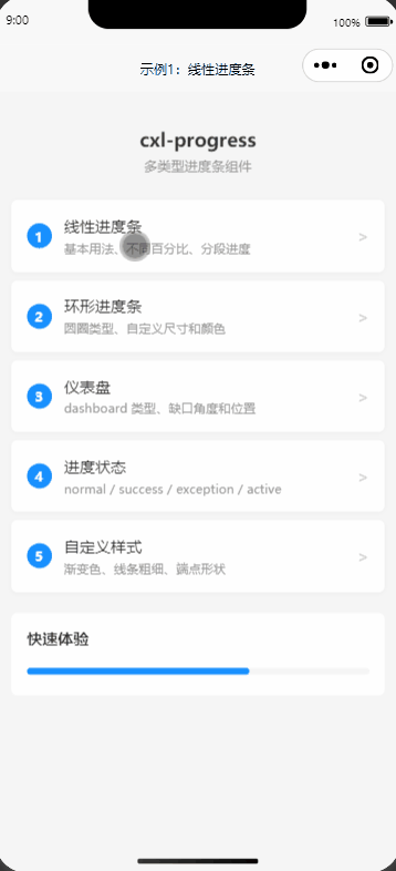
示例1:线性进度条
线型进度条是最基础也是最常用的类型,适用于大多数进度展示场景。
基本用法:
<!-- 不同百分比 --><cxl-progress:percent=”30” /><cxl-progress:percent=”50” /><cxl-progress:percent=”75” />
隐藏进度信息:
<!-- 不显示右侧百分比文字 --><cxl-progress:percent=”40”:showInfo=”false” />
分段进度:
当需要同时展示「总进度」和「已完成进度」时,使用 successPercent:
<!-- 总进度 60%,其中已完成 30%(绿色部分) --><cxl-progress:percent=”60”:successPercent=”30”:showInfo=”false” /><!-- 总进度 80%,其中已完成 50% --><cxl-progress:percent=”80”:successPercent=”50”:showInfo=”false” />
动态控制进度:
通过数据绑定实现动态进度控制:
<template><view><cxl-progress:percent=”dynamicPercent”strokeColor=”#1890ff” /><buttonsize=”mini” @click=”changePercent(-10)”>-10</button><buttonsize=”mini” @click=”changePercent(10)”>+10</button><buttonsize=”mini” @click=”dynamicPercent = 0”>重置</button></view></template><script>export default {data() {return {dynamicPercent: 40}},methods: {changePercent(val) {let newVal = this.dynamicPercent + valif (newVal < 0) newVal = 0if (newVal > 100) newVal = 100this.dynamicPercent = newVal}}}</script>
示例2:环形进度条
环形进度条适合用在需要更紧凑展示的场景,比如卡片内、统计面板中。
基本用法:
<!-- 设置 type=”circle” 和宽度 --><cxl-progresstype=”circle”:percent=”25”:width=”80” /><cxl-progresstype=”circle”:percent=”50”:width=”80” /><cxl-progresstype=”circle”:percent=”75”:width=”80” />
自定义尺寸:
通过 width 属性调整圆形大小,配合 strokeWidth 调整线条粗细:
<cxl-progresstype=”circle”:percent=”60”:width=”50”:strokeWidth=”4” /> <!-- 小号 --><cxl-progresstype=”circle”:percent=”60”:width=”80”:strokeWidth=”6” /> <!-- 中号 --><cxl-progresstype=”circle”:percent=”60”:width=”120”:strokeWidth=”8” /> <!-- 大号 -->
自定义颜色:
<cxl-progresstype=”circle”:percent=”70”:width=”80”strokeColor=”#f5222d” /> <!-- 红色 --><cxl-progresstype=”circle”:percent=”70”:width=”80”strokeColor=”#52c41a” /> <!-- 绿色 --><cxl-progresstype=”circle”:percent=”70”:width=”80”strokeColor=”#faad14” /> <!-- 橙色 -->
缺口位置:
<!-- gapPosition 控制缺口方向,gapDegree 控制缺口角度大小 --><cxl-progresstype=”circle”:percent=”65”:width=”80”gapPosition=”top”:gapDegree=”60” /><cxl-progresstype=”circle”:percent=”65”:width=”80”gapPosition=”bottom”:gapDegree=”60” /><cxl-progresstype=”circle”:percent=”65”:width=”80”gapPosition=”right”:gapDegree=”60” />
示例3:仪表盘
仪表盘类型默认底部有缺口,非常适合用在评分、健康度等可视化场景。
基本用法:
<cxl-progresstype=”dashboard”:percent=”30”:width=”100” /><cxl-progresstype=”dashboard”:percent=”60”:width=”100” /><cxl-progresstype=”dashboard”:percent=”90”:width=”100” />
自定义尺寸和颜色:
<!-- 警告色 + 小号 --><cxl-progresstype=”dashboard”:percent=”45”:width=”80”strokeColor=”#faad14”:strokeWidth=”8” /><!-- 正常色 + 中号 --><cxl-progresstype=”dashboard”:percent=”75”:width=”100”strokeColor=”#1890ff”:strokeWidth=”10” /><!-- 优秀色 + 大号 --><cxl-progresstype=”dashboard”:percent=”95”:width=”120”strokeColor=”#52c41a”:strokeWidth=”12” />
动态仪表盘(结合 slider 控制):
<template><view><cxl-progresstype=”dashboard”:percent=”dashPercent”:width=”140”:strokeWidth=”10”:strokeColor=”dashColor”/><slider:value=”dashPercent” @change=”onSliderChange”min=”0”max=”100” /></view></template><script>export default {data() {return {dashPercent: 60}},computed: {// 根据进度值动态改变颜色dashColor() {if (this.dashPercent < 30) return '#f5222d' // 红色-危险if (this.dashPercent < 70) return '#faad14' // 黄色-警告return '#52c41a' // 绿色-安全}},methods: {onSliderChange(e) {this.dashPercent = e.detail.value}}}</script>
这个示例展示了仪表盘根据进度值自动变色:低于 30% 显示红色(危险),30%-70% 显示黄色(警告),高于 70% 显示绿色(安全)。
示例4:进度状态
cxl-progress 支持四种状态,每种状态都有独特的颜色和图标,帮助用户快速理解当前进度状况。
线型四种状态:
<!-- 正常 - 蓝色 --><cxl-progress:percent=”50”status=”normal” /><!-- 成功 - 绿色 --><cxl-progress:percent=”70”status=”success” /><!-- 异常 - 红色 --><cxl-progress:percent=”40”status=”exception” /><!-- 活动 - 蓝色 + 流动动画 --><cxl-progress:percent=”60”status=”active” />
normal:默认蓝色,正常进行中 success:绿色 + 对勾图标,表示完成 exception:红色 + 叉号图标,表示失败或异常 active:蓝色 + 白色流动动画,表示正在活跃执行(仅线型支持)
环形状态:
<cxl-progresstype=”circle”:percent=”70”:width=”80”status=”normal” /><cxl-progresstype=”circle”:percent=”100”:width=”80”status=”success” /><cxl-progresstype=”circle”:percent=”40”:width=”80”status=”exception” />
自动完成状态:
当 percent 达到 100 时,组件会自动切换为成功状态,无需手动设置:
<cxl-progress:percent=”100” /> <!-- 线型自动成功 --><cxl-progresstype=”circle”:percent=”100”:width=”80” /> <!-- 环形自动成功 --><cxl-progresstype=”dashboard”:percent=”100”:width=”80” /> <!-- 仪表盘自动成功 -->
动态状态切换:
<template><view><cxl-progress:percent=”statusPercent”:status=”currentStatus” /><button @click=”currentStatus = 'normal'; statusPercent = 50”>正常</button><button @click=”currentStatus = 'active'; statusPercent = 60”>活动</button><button @click=”currentStatus = 'success'; statusPercent = 100”>成功</button><button @click=”currentStatus = 'exception'; statusPercent = 40”>异常</button></view></template><script>export default {data() {return {currentStatus: 'normal',statusPercent: 50}}}</script>
示例5:自定义样式
cxl-progress 提供了丰富的自定义属性,让你可以打造出各种风格的进度条。
颜色自定义(含渐变色):
<!-- 纯色 --><cxl-progress:percent=”50”strokeColor=”#1890ff” /><cxl-progress:percent=”65”strokeColor=”#722ed1” /><!-- 渐变色(仅线型支持) --><cxl-progress:percent=”70”strokeColor=”linear-gradient(90deg, #1890ff, #13c2c2)” /><cxl-progress:percent=”80”strokeColor=”linear-gradient(90deg, #f5222d, #faad14)” />
线条粗细对比:
<cxl-progress:percent=”60”:strokeWidth=”3”:showInfo=”false” /> <!-- 细线 --><cxl-progress:percent=”60”:strokeWidth=”6”:showInfo=”false” /> <!-- 默认 --><cxl-progress:percent=”60”:strokeWidth=”12”:showInfo=”false” /> <!-- 粗线 --><cxl-progress:percent=”60”:strokeWidth=”20”:showInfo=”false” /> <!-- 超粗 -->
端点形状:
<!-- 圆角(默认) --><cxl-progress:percent=”60”:strokeWidth=”10”strokeShape=”round” /><!-- 直角 --><cxl-progress:percent=”60”:strokeWidth=”10”strokeShape=”square” />
组合效果:
多种属性组合使用,打造独特的进度条:
<!-- 渐变 + 粗线 + 圆角 --><cxl-progress:percent=”85”:strokeWidth=”14”strokeColor=”linear-gradient(90deg, #722ed1, #eb2f96)”strokeShape=”round”/><!-- 紫色环形 --><cxl-progresstype=”circle”:percent=”88”:width=”100”:strokeWidth=”10”strokeColor=”#722ed1”/><!-- 青色仪表盘 --><cxl-progresstype=”dashboard”:percent=”72”:width=”100”:strokeWidth=”10”strokeColor=”#13c2c2”/>
跨端说明
cxl-progress 在跨端适配上做了专门的处理:
- H5 端
:直接使用原生 <svg>标签渲染环形进度条,效果最佳 - 小程序/App 端
:由于小程序不支持内联 SVG,组件自动将 SVG 转换为 data:image/svg+xml的 base64 URL 形式,通过background-image方式显示
这些处理对使用者是完全透明的,你只需正常使用组件,无需关心底层渲染差异。
常见使用场景
<cxl-progress :percent="uploadPercent" /> | ||
<cxl-progress :percent="80" :successPercent="50" /> | ||
<cxl-progress :percent="60" status="active" /> | ||
<cxl-progress type="circle" :percent="used" :width="100" /> | ||
<cxl-progress type="dashboard" :percent="score" /> | ||
注意事项
percent值范围为 0-100,超出范围会被自动修正 active状态(流动动画)仅支持线型(line) 渐变色 linear-gradient仅支持线型(line)successPercent分段进度仅支持线型(line) width属性仅对 circle 和 dashboard 类型生效 环形进度条的 strokeWidth建议根据width大小适当调整,避免线条过粗或过细
总结
cxl-progress 是一个功能丰富、开箱即用的 uni-app 进度条组件。三种类型覆盖了从简单到复杂的所有进度展示需求,四种状态让进度反馈更加直观,丰富的自定义属性让你可以轻松适配各种 UI 风格。
如果你的项目中需要进度条组件,不妨试试 cxl-progress,一行代码即可使用!
Gitee 地址
本文示例代码已开源:
👉 https://gitee.com/hszcxl/TestUniapp/tree/cxl-progress
如果觉得本文对你有帮助,欢迎点赞、评论、转发支持!
