 夜雨聆风
夜雨聆风


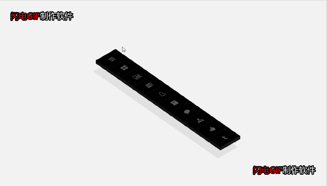
纯CSS3图标菜单倾斜3d立体!!附源码!!

效果展示

完整源码

<!DOCTYPE html><html><head><metacharset="UTF-8"><title>CSS3图标菜单倾斜3d立体</title><linkrel="stylesheet"href="css/style.css"media="screen"type="text/css" /></head><body><!--下面是无用代码--><astyle="display:none"href="http://www.bootstrapmb.com">bootstrap模板库</a><!--上面是无用代码--><divstyle="text-align:center;clear:both;position:absolute;top:0;left:260px"><scriptsrc="/gg_bd_ad_720x90.js"type="text/javascript"></script><scriptsrc="/follow.js"type="text/javascript"></script></div><ul><li><aclass='list-item'href=''><iclass='icon-reorder'></i></a></li><li><aclass='list-item'href=''><iclass='icon-th-large'></i></a></li><li><aclass='list-item'href=''><iclass='icon-bar-chart'></i></a></li><li><aclass='list-item'href=''><iclass='icon-tasks'></i></a></li><li><aclass='list-item'href=''><iclass='icon-bell'></i></a></li><li><aclass='list-item'href=''><iclass='icon-archive'></i></a></li><li><aclass='list-item'href=''><iclass='icon-comment'></i></a></li><li><aclass='list-item'href=''><iclass='icon-sitemap'></i></a></li><li><aclass='list-item'href=''><iclass='icon-thumbs-up'></i></a></li><li><aclass='list-item'href=''><iclass='icon-tumblr'></i></a></li></ul></body></html>

@import url(http://netdna.bootstrapcdn.com/font-awesome/3.2.1/css/font-awesome.min.css);* {-webkit-box-sizing: border-box;-moz-box-sizing: border-box;box-sizing: border-box;list-style:none;}html {width: 100%;height: 100%;}body {width: 100%;height: 100%;display: -webkit-box;display: -moz-box;display: -ms-box;display: box;-webkit-box-align: center;-moz-box-align: center;-ms-box-align: center;box-align: center;-webkit-box-pack: center;-moz-box-pack: center;-ms-box-pack: center;box-pack: center;-webkit-transform: translate3d(0, 0, 0);}.clearfix {zoom: 1;}.clearfix:before, .clearfix:after {content: "\0020";display: block;height: 0;overflow: hidden;}.clearfix:after {clear: both;}body {background: #f2f2f2;}ul {position: relative;-webkit-transform: rotate(-35deg) skew(20deg, 5deg);-moz-transform: rotate(-35deg) skew(20deg, 5deg);-ms-transform: rotate(-35deg) skew(20deg, 5deg);-o-transform: rotate(-35deg) skew(20deg, 5deg);transform: rotate(-35deg) skew(20deg, 5deg);}.list-item {background: #000000;color: #575757;text-align: center;height: 2.5em;width: 4em;vertical-align: middle;line-height: 2.5em;border-bottom: 1px solid #060606;position: relative;display: block;text-decoration: none;-webkit-box-shadow: -2em 1.5em 0 #e1e1e1;-moz-box-shadow: -2em 1.5em 0 #e1e1e1;box-shadow: -2em 1.5em 0 #e1e1e1;-webkit-transition: top 0.25s linear, left 0.25s linear, background 0.1s linear, color 0.1s linear;-moz-transition: top 0.25s linear, left 0.25s linear, background 0.1s linear, color 0.1s linear;-o-transition: top 0.25s linear, left 0.25s linear, background 0.1s linear, color 0.1s linear;transition: top 0.25s linear, left 0.25s linear, background 0.1s linear, color 0.1s linear;}.list-item:hover {background: #ff6e42;color: #fffcfb;top: -0.5em;left: 0.5em;-webkit-transition: top 0.25s linear, left 0.25s linear, background 0.1s linear, color 0.1s linear;-moz-transition: top 0.25s linear, left 0.25s linear, background 0.1s linear, color 0.1s linear;-o-transition: top 0.25s linear, left 0.25s linear, background 0.1s linear, color 0.1s linear;transition: top 0.25s linear, left 0.25s linear, background 0.1s linear, color 0.1s linear;-webkit-box-shadow: -2em 2em 0 #e1e1e1;-moz-box-shadow: -2em 2em 0 #e1e1e1;box-shadow: -2em 2em 0 #e1e1e1;}.list-item:hover:before, .list-item:hover:after {-webkit-transition: all 0.25s linear;-moz-transition: all 0.25s linear;-o-transition: all 0.25s linear;transition: all 0.25s linear;}.list-item:hover:before {background: #b65234;width: 1em;top: 0.5em;left: -1em;}.list-item:hover:after {background: #b65234;width: 1em;bottom: -2.5em;left: 1em;height: 4em;}.list-item:before, .list-item:after {-webkit-transition: all 0.25s linear;-moz-transition: all 0.25s linear;-o-transition: all 0.25s linear;transition: all 0.25s linear;}.list-item:after {content: "";position: absolute;height: 4em;background: #181818;width: 0.5em;bottom: -2.25em;left: 1.5em;-webkit-transform: rotate(90deg) skew(0deg, 45deg);-moz-transform: rotate(90deg) skew(0deg, 45deg);-ms-transform: rotate(90deg) skew(0deg, 45deg);-o-transform: rotate(90deg) skew(0deg, 45deg);transform: rotate(90deg) skew(0deg, 45deg);}.list-item:before {content: "";position: absolute;height: 2.5em;background: #121212;width: 0.5em;top: 0.215em;left: -0.45em;-webkit-transform: skewY(-45deg);-moz-transform: skewY(-45deg);-ms-transform: skewY(-45deg);-o-transform: skewY(-45deg);transform: skewY(-45deg);}